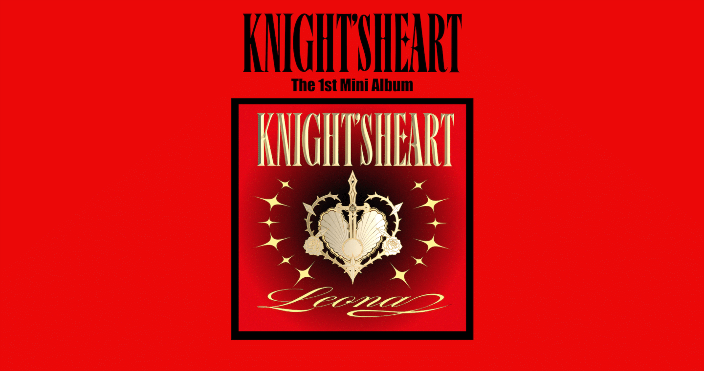
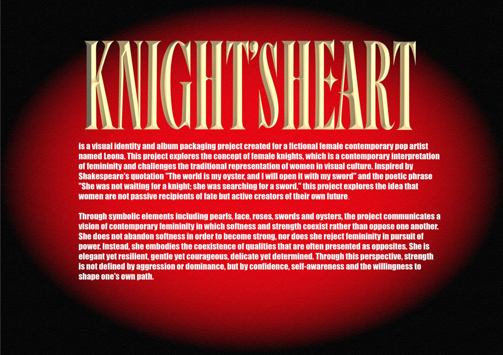
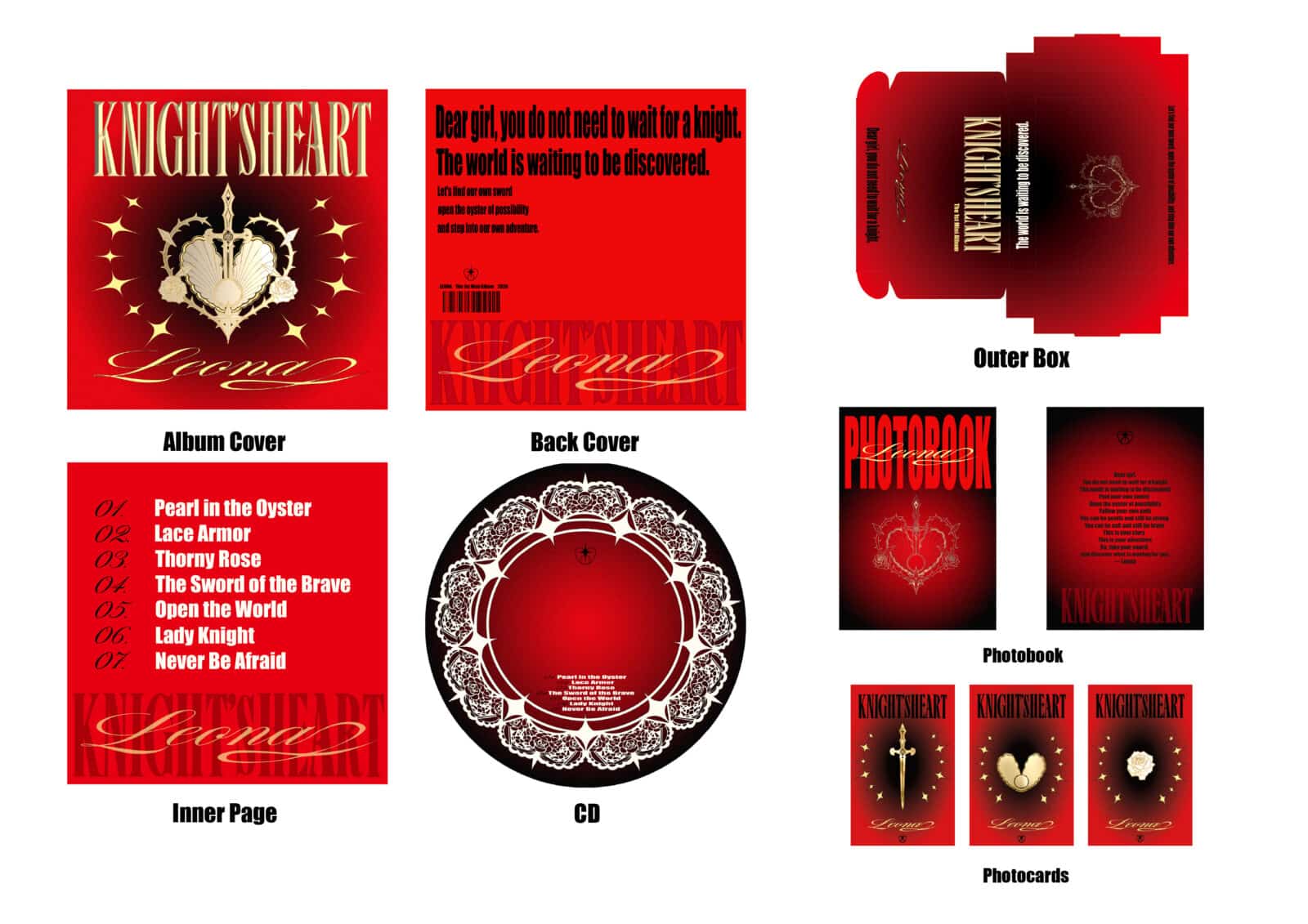
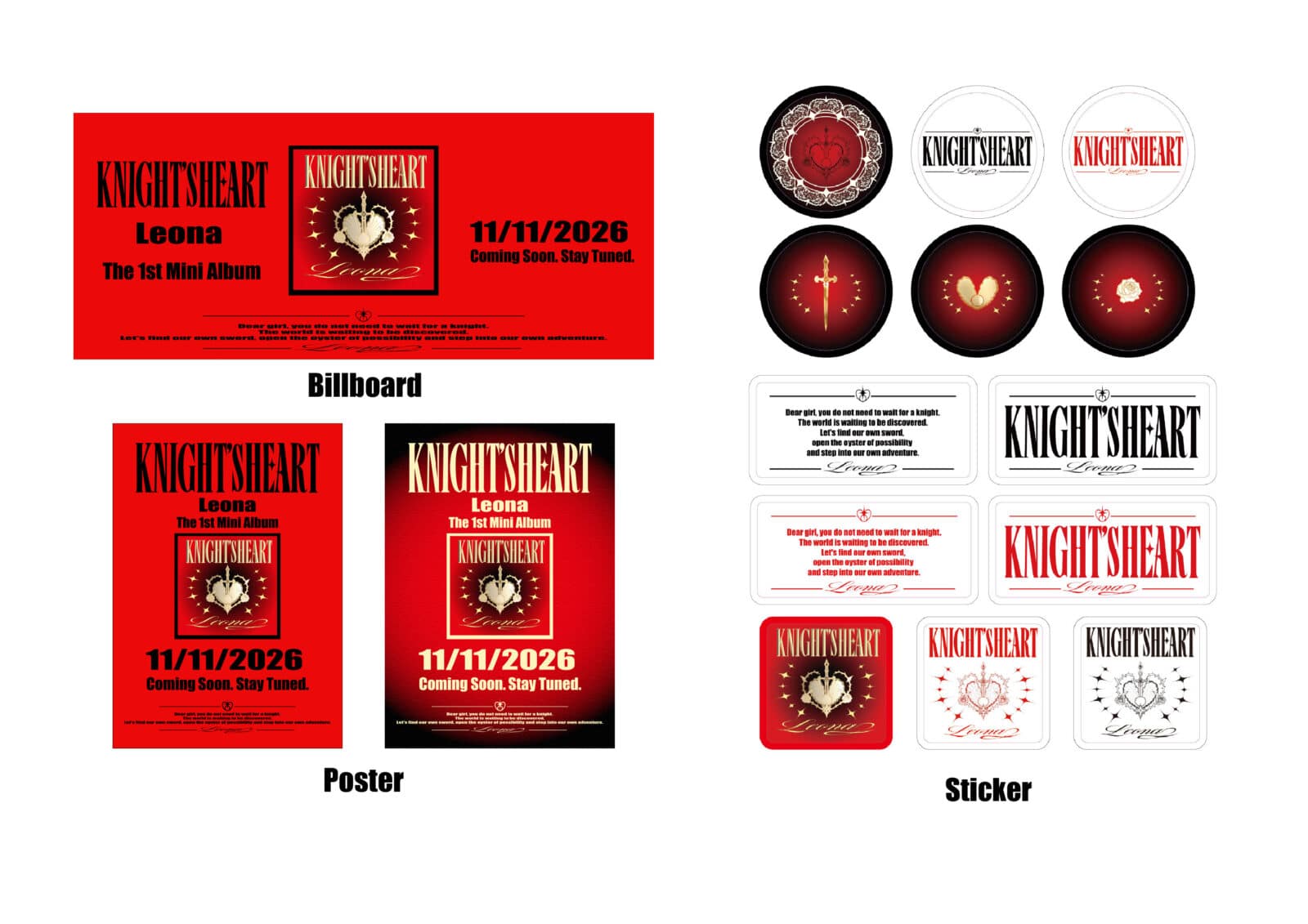
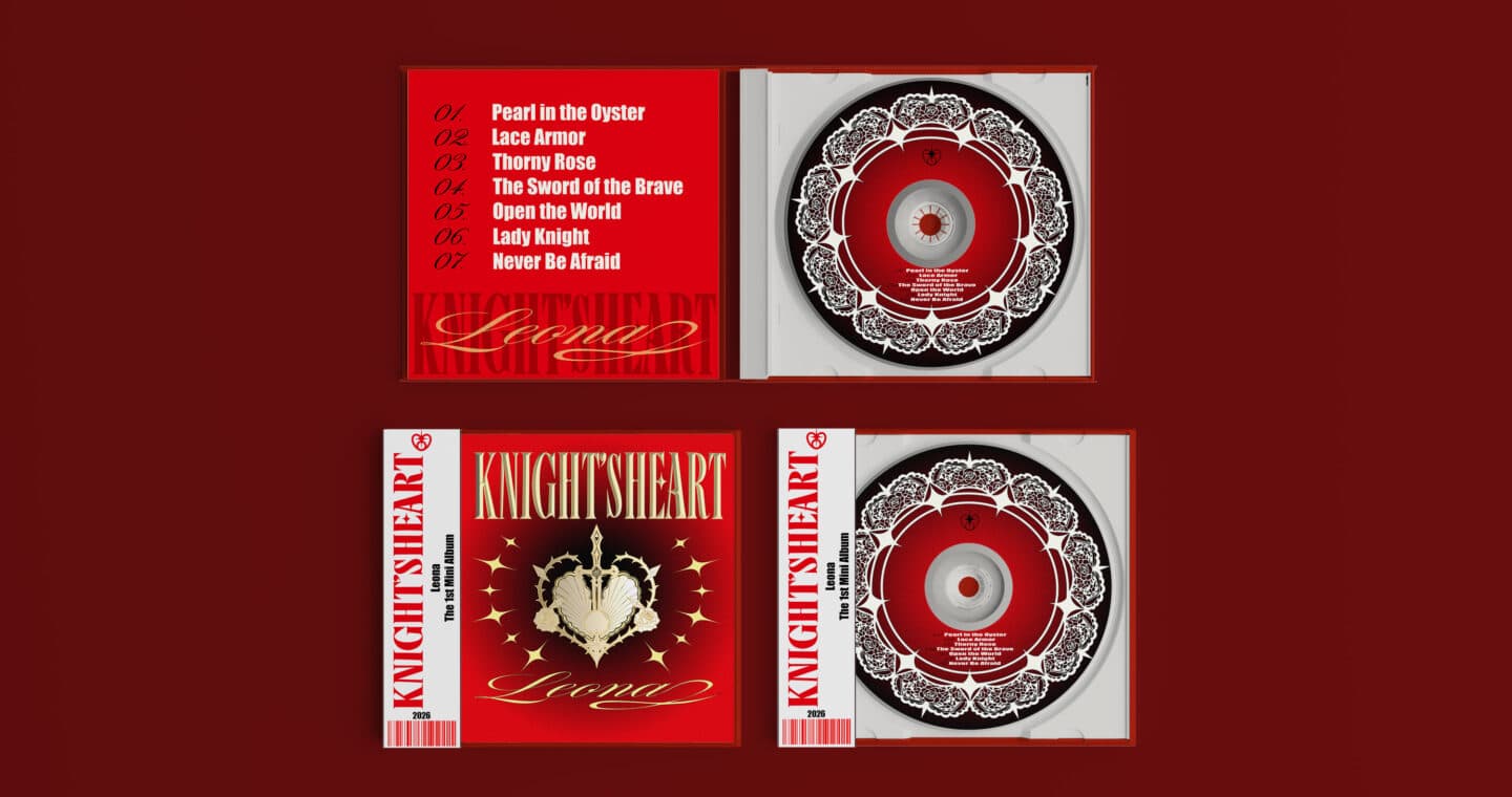
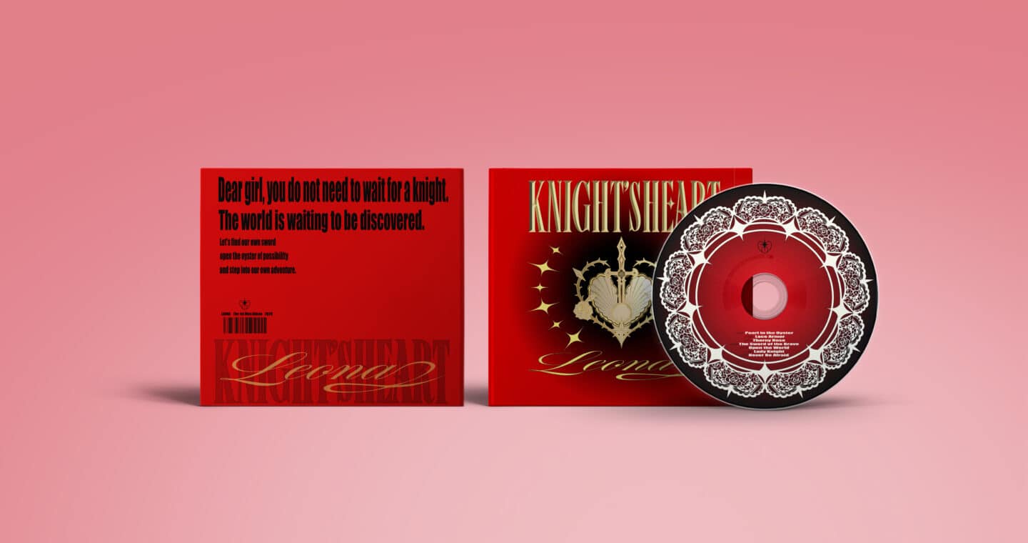
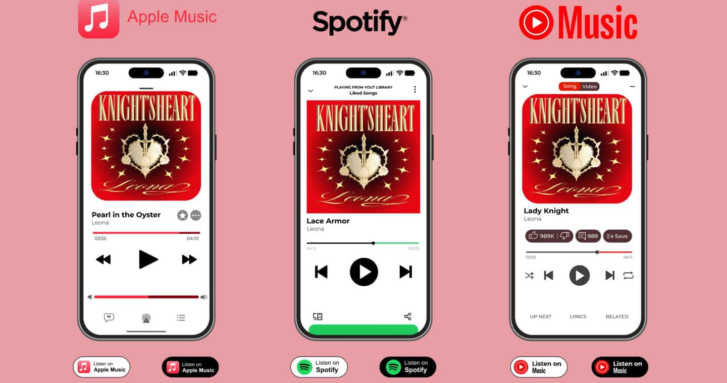
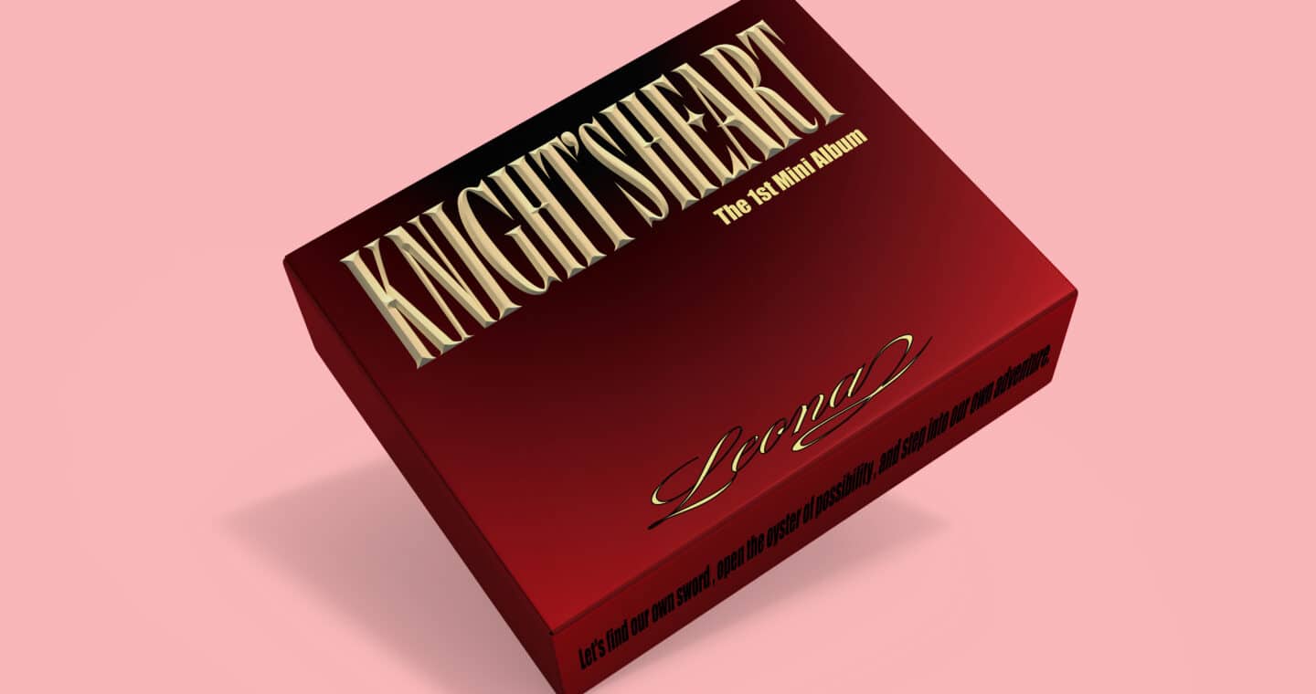
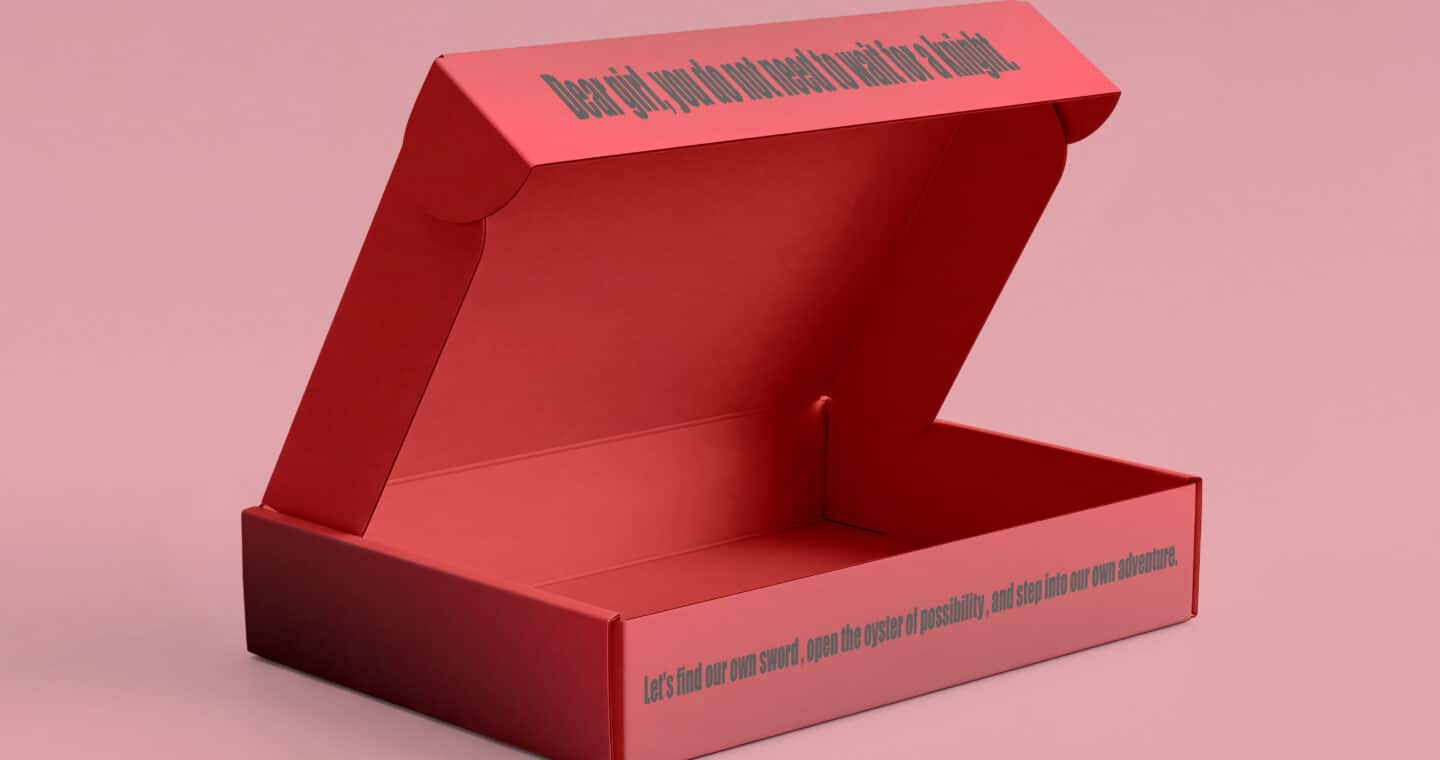
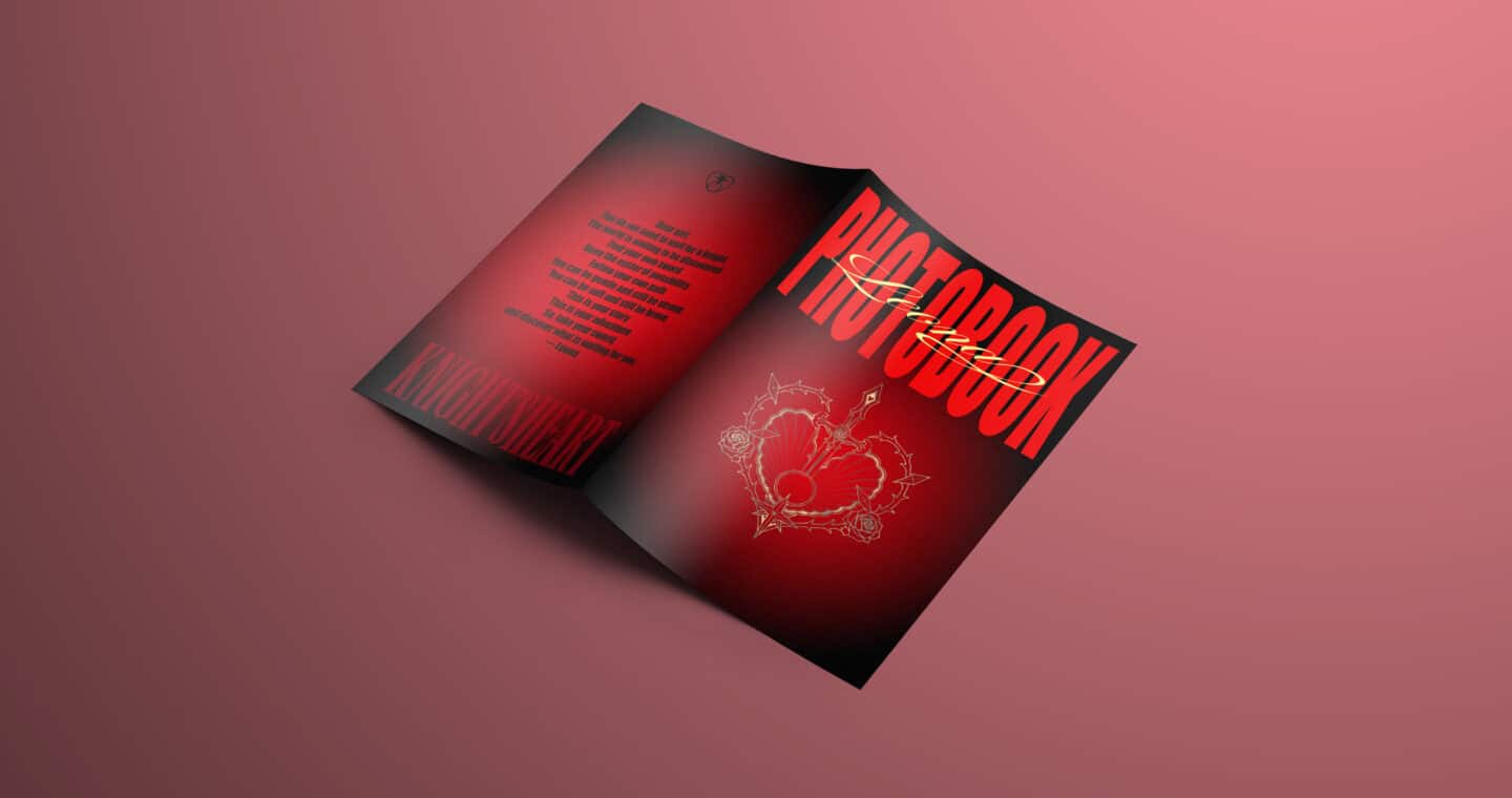
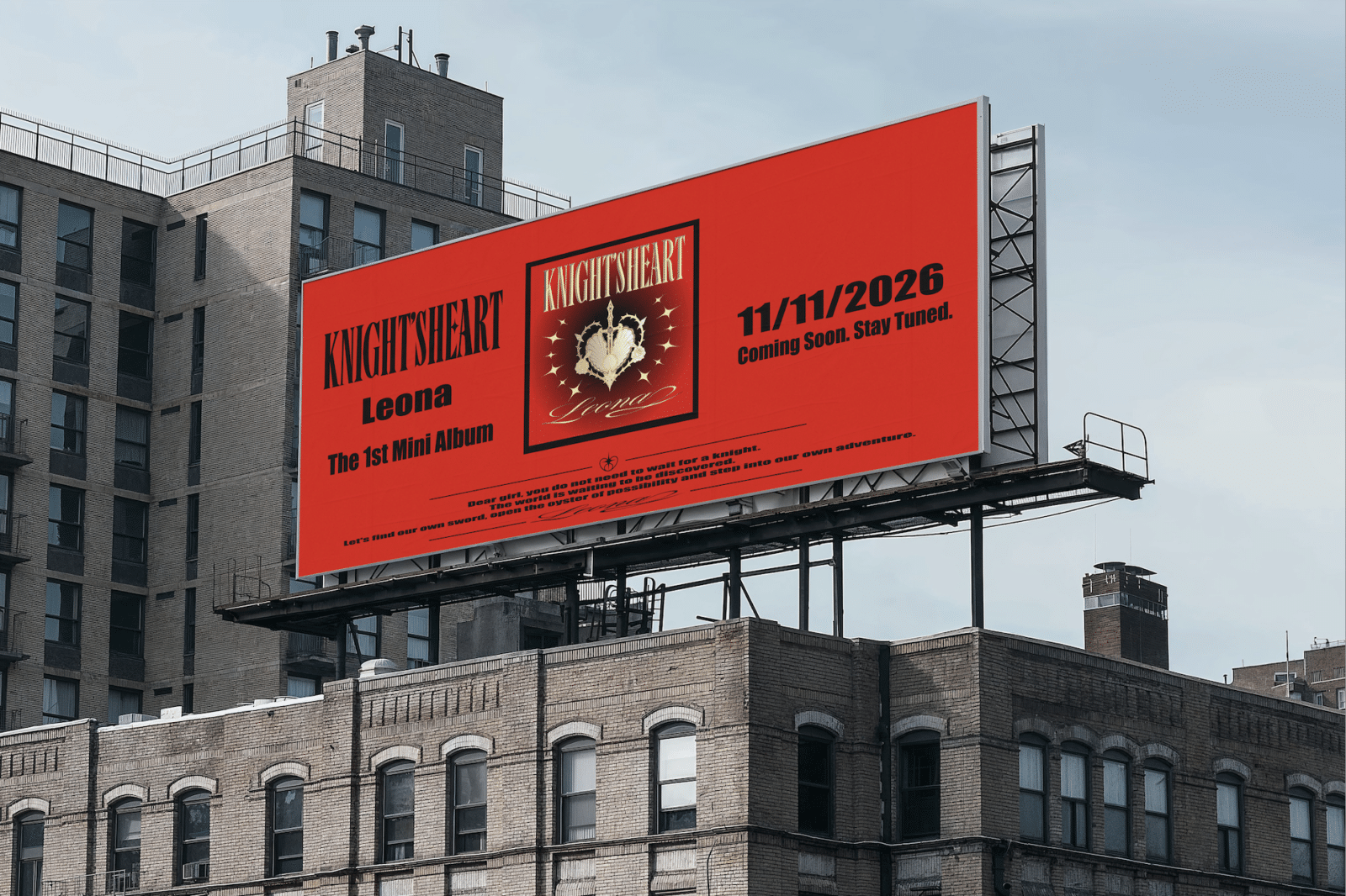
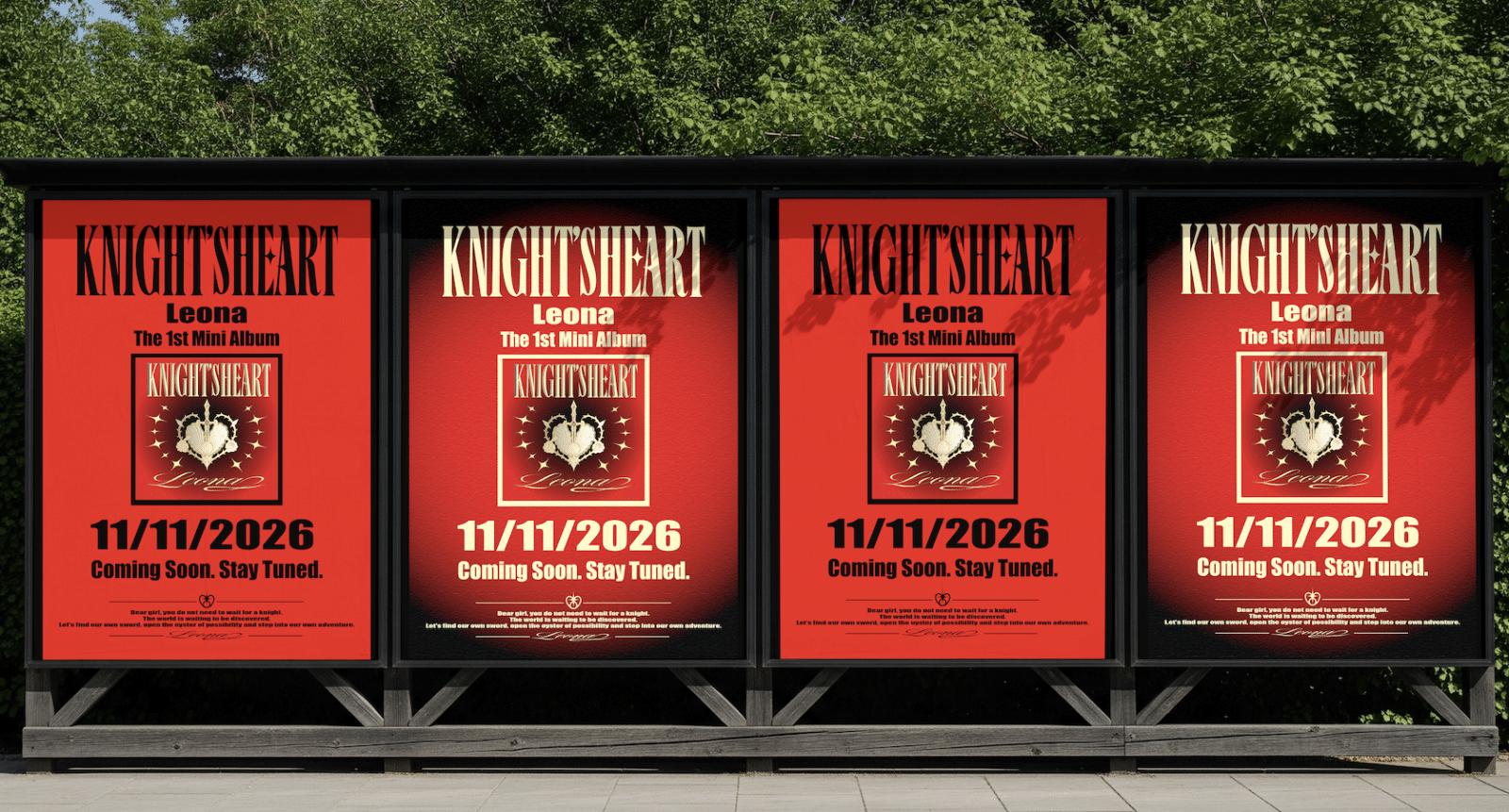
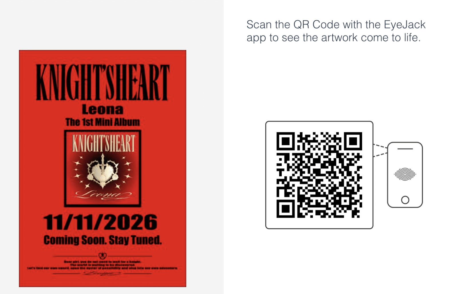
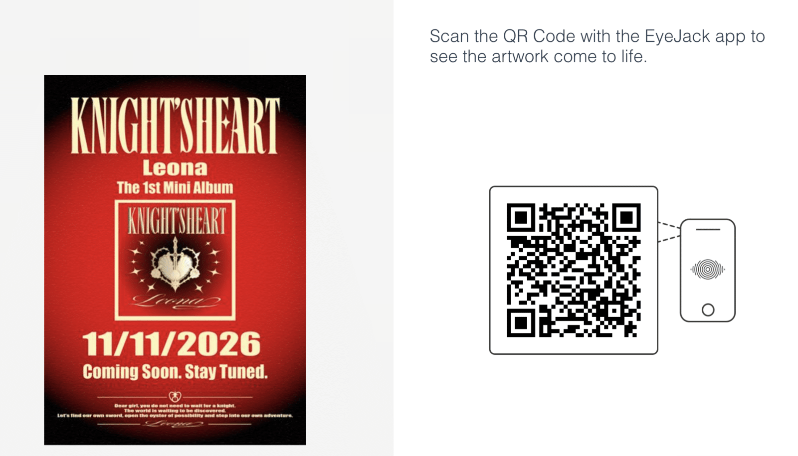
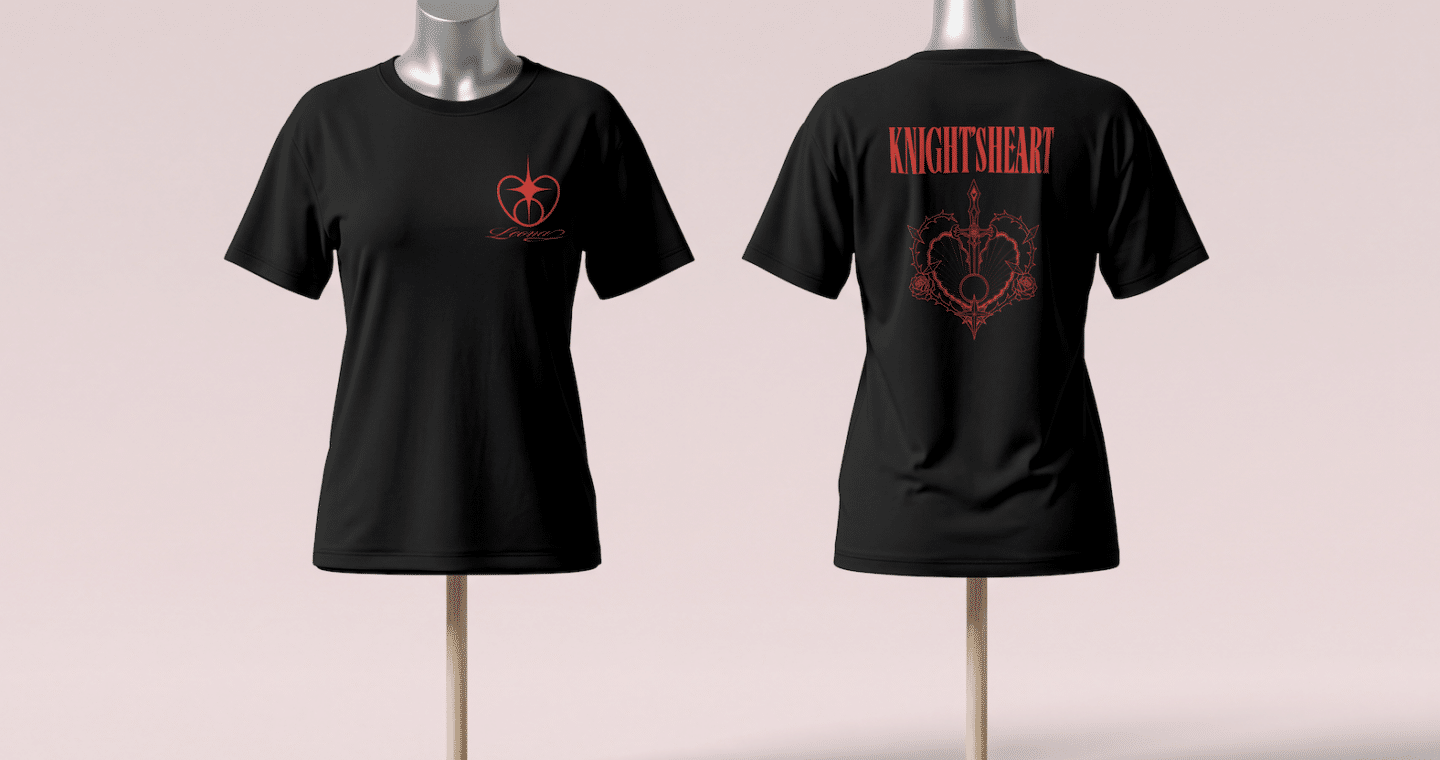
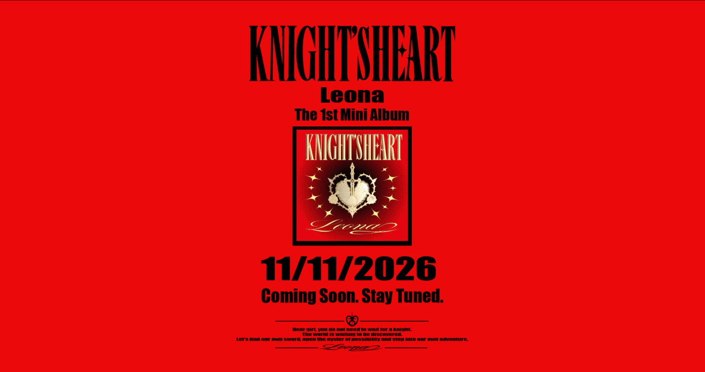
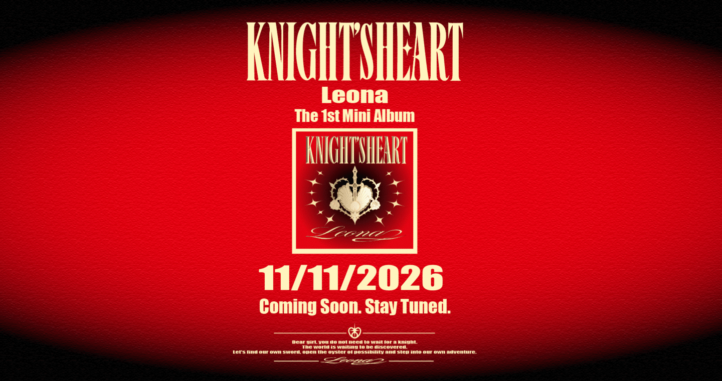
KNIGHT’s HEART is an album branding and packaging project for Leona, a fictional contemporary pop artist. Inspired by the female knight, it explores the coexistence of softness and strength. Through symbols such as pearls, lace, roses, and swords, the project celebrates women as active creators of their own destinies.
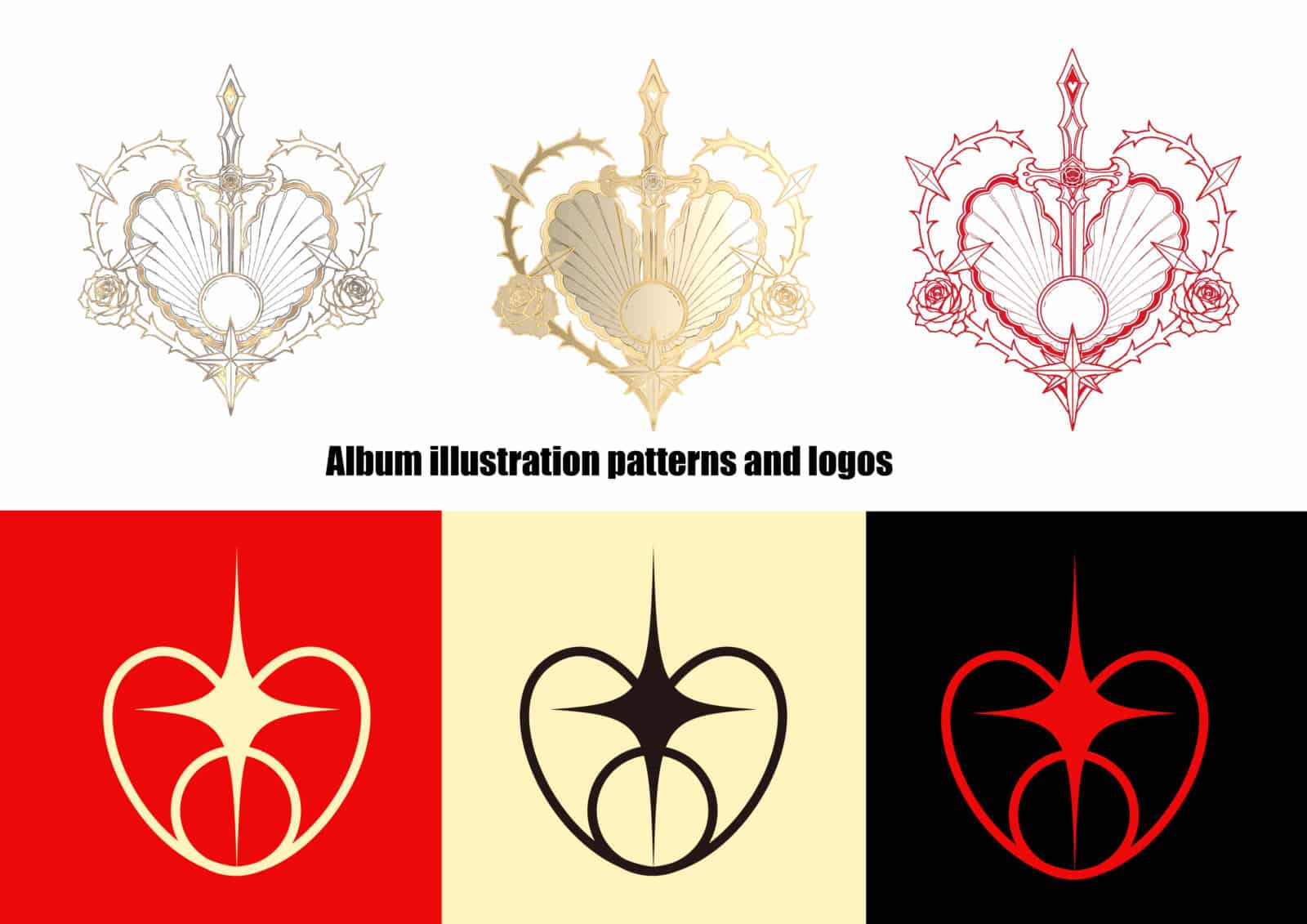
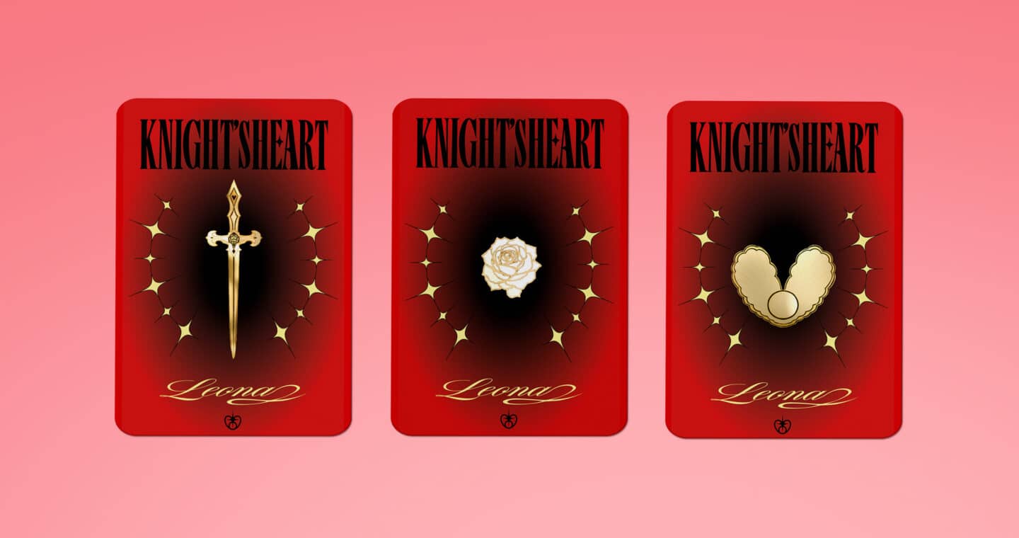
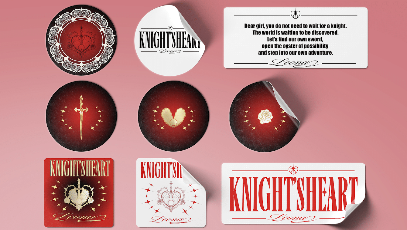
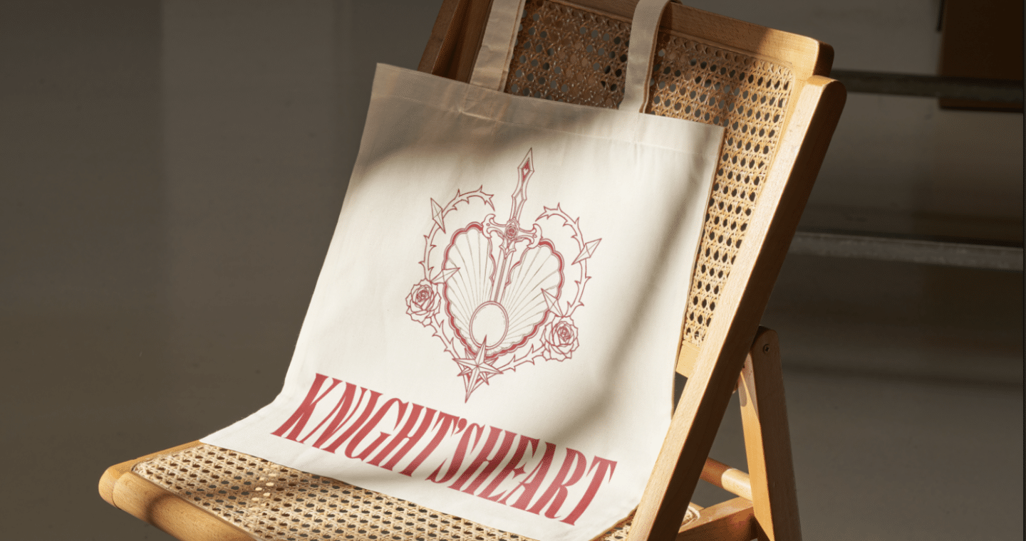
The illustration patterns in the album combine a sword, an open oyster, a pearl, roses, and thorned branches to convey the album’s central concept. The sword pierces open the oyster to reveal the pearl, symbolizing the courage to uncover hidden potential and embrace new possibilities. Representing courage, strength, and self-determination, the sword embodies the power to shape one’s own destiny. The oyster symbolizes opportunity and untapped potential, while the pearl represents personal growth and transformation. Roses and lace introduce traditional feminine traits such as beauty, elegance and refinement, while the thorns of roses also represent resilience and protection. These elements together create a visual language that links femininity with strength.
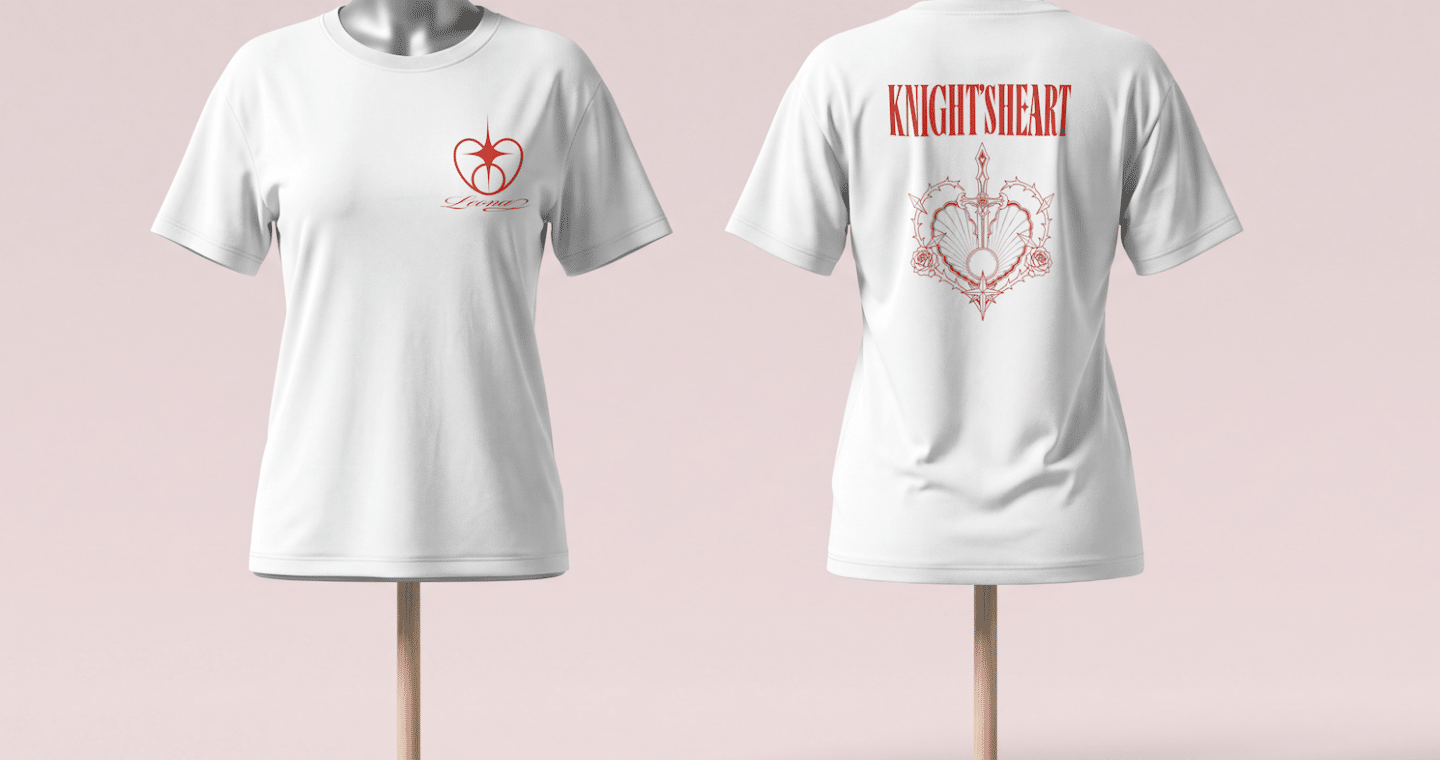
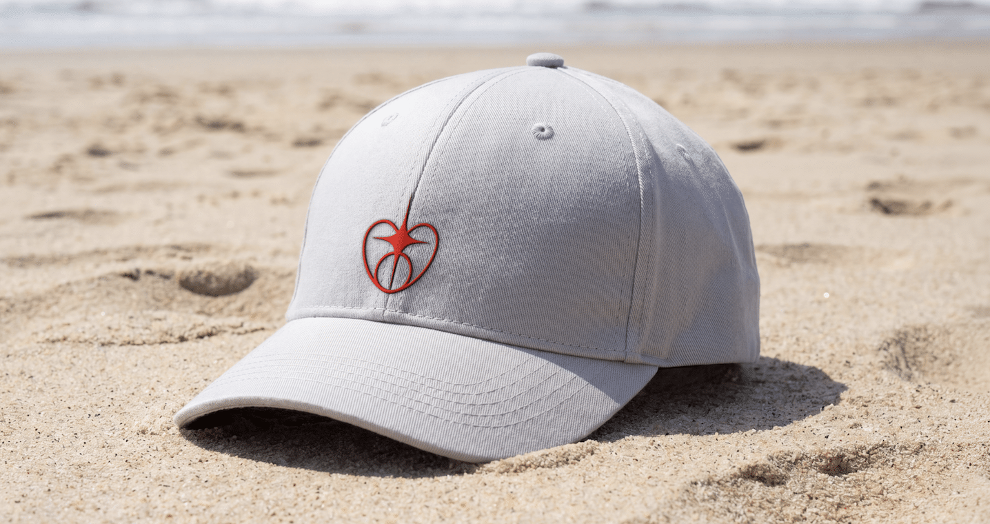
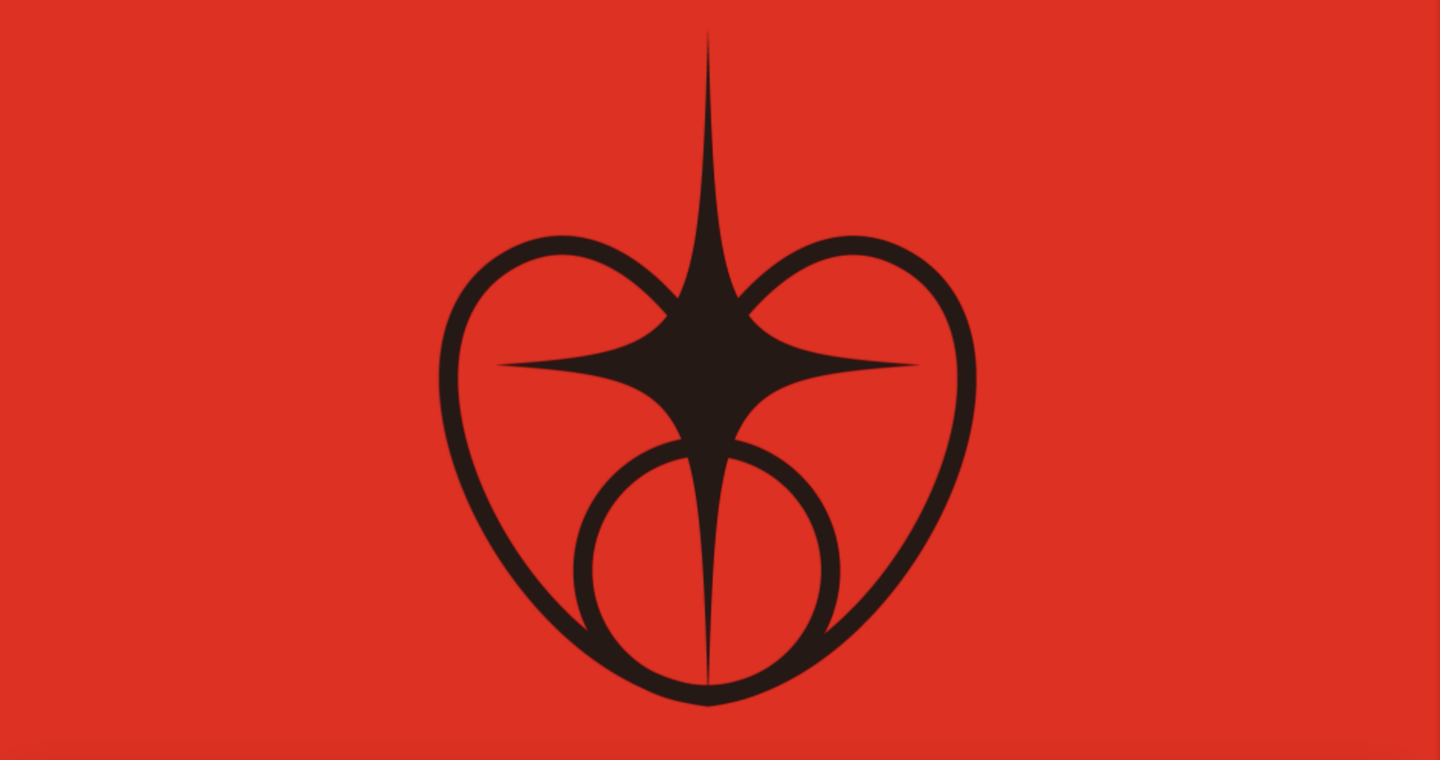
The album logo distils key visual elements from the complex illustrations, including the sword, oyster, and pearl. These elements are simplified and reinterpreted through geometric forms, creating a more refined and recognizable symbol that can be applied consistently across various design media.
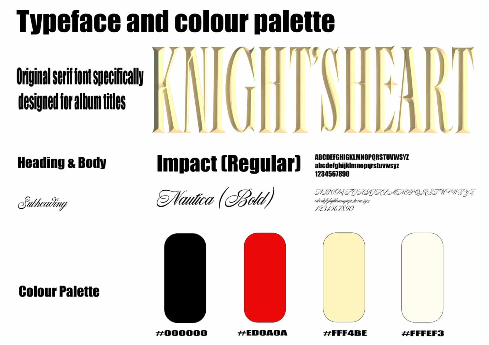
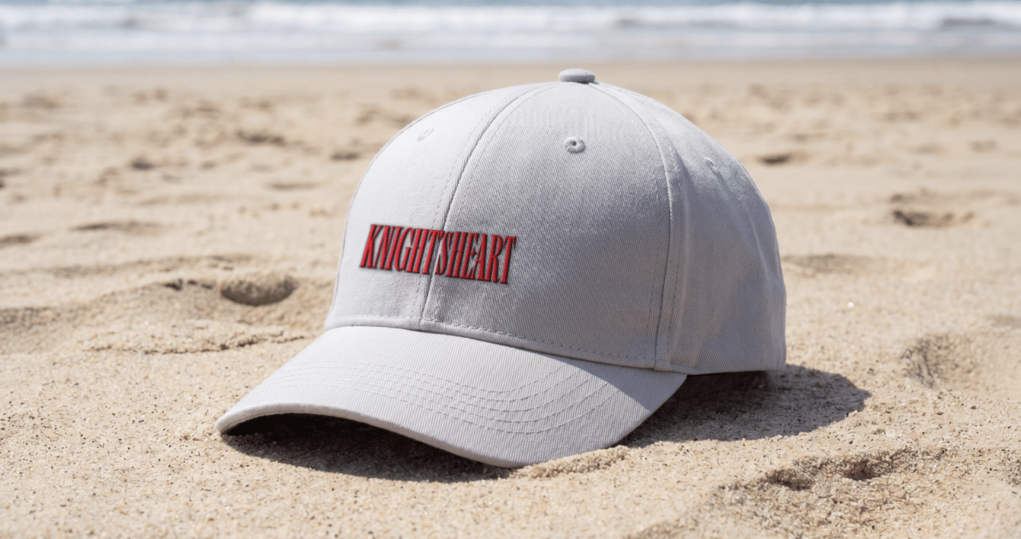
The custom typography for KNIGHT’s HEART combines the visual characteristics of serif and Gothic typefaces, creating a distinctive identity that balances elegance and strength. Sharp edges, high contrast, and ornamental details give the lettering a bold yet refined appearance, reinforcing the concept of the female knight. Inspired by the metallic surface of a sword, the gold finish adds depth and strength while connecting the typography to the album’s central symbolism.
The colour palette combines black, vivid red, soft gold, and warm ivory to express the contrast between strength and softness. Black establishes a strong visual foundation, while red conveys courage and passion. Soft gold introduces elegance and a metallic quality, reflecting the sword and ornamental details. Warm ivory balances the bolder tones with delicacy, drawing inspiration from pearls, oyster shells, and white lace, which evoke the album’s feminine and refined aesthetic.
The core message of the album:
Dear girl, you do not need to wait for a knight.
The world is waiting to be discovered.
Let’s find our own sword, open the oyster of possibility and step into our own adventure.
— Leona
Follow your own path.
You can be gentle and still be strong.
You can be soft and still be brave.
This is your story.
This is your adventure.
So, take your sword, and discover what is waiting for you.
Yuxing Wang is a visual communication designer who enjoys translating ideas and stories into visual experiences. Working across graphic design and motion graphics, she explores how visual elements communicate ideas and evoke emotions. She is passionate about creating work that is both visually engaging and meaningful.