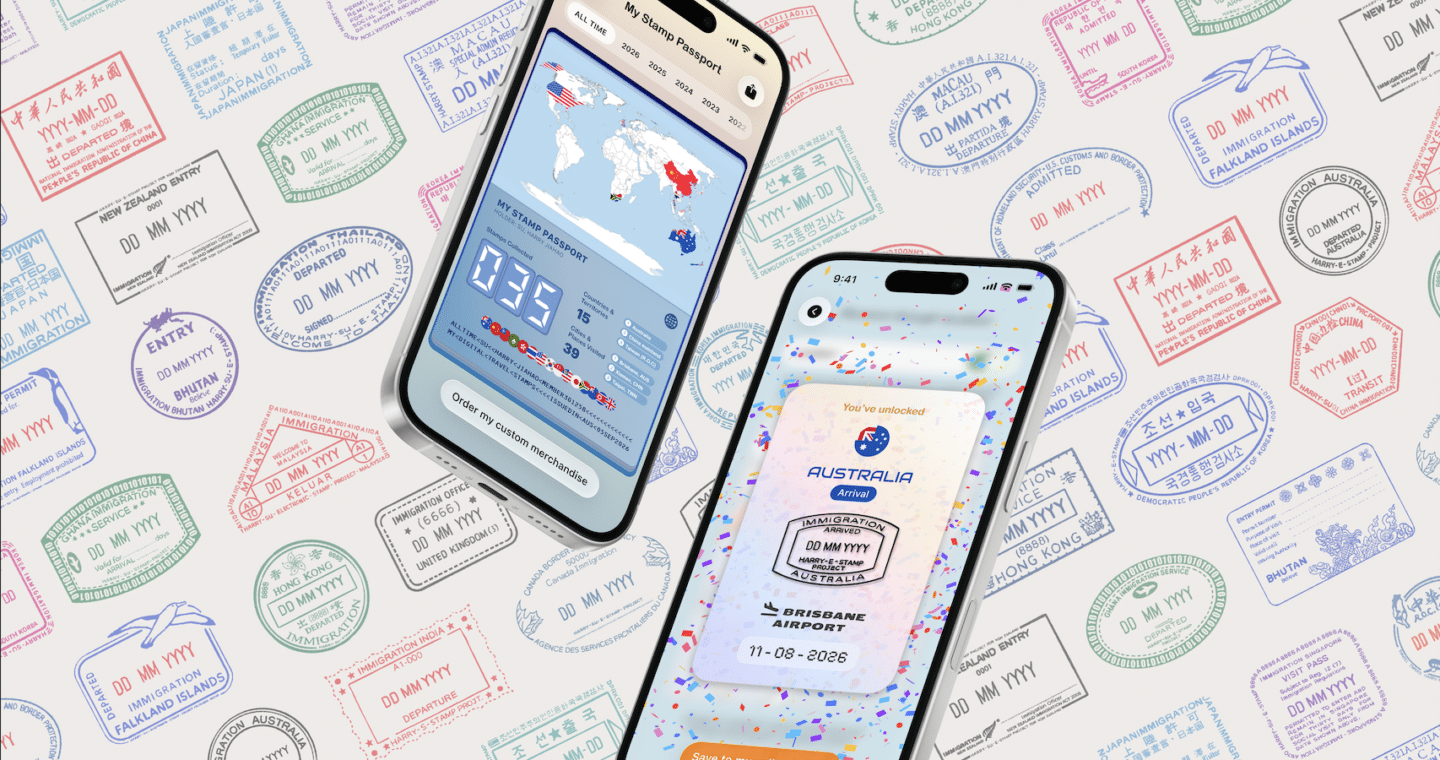
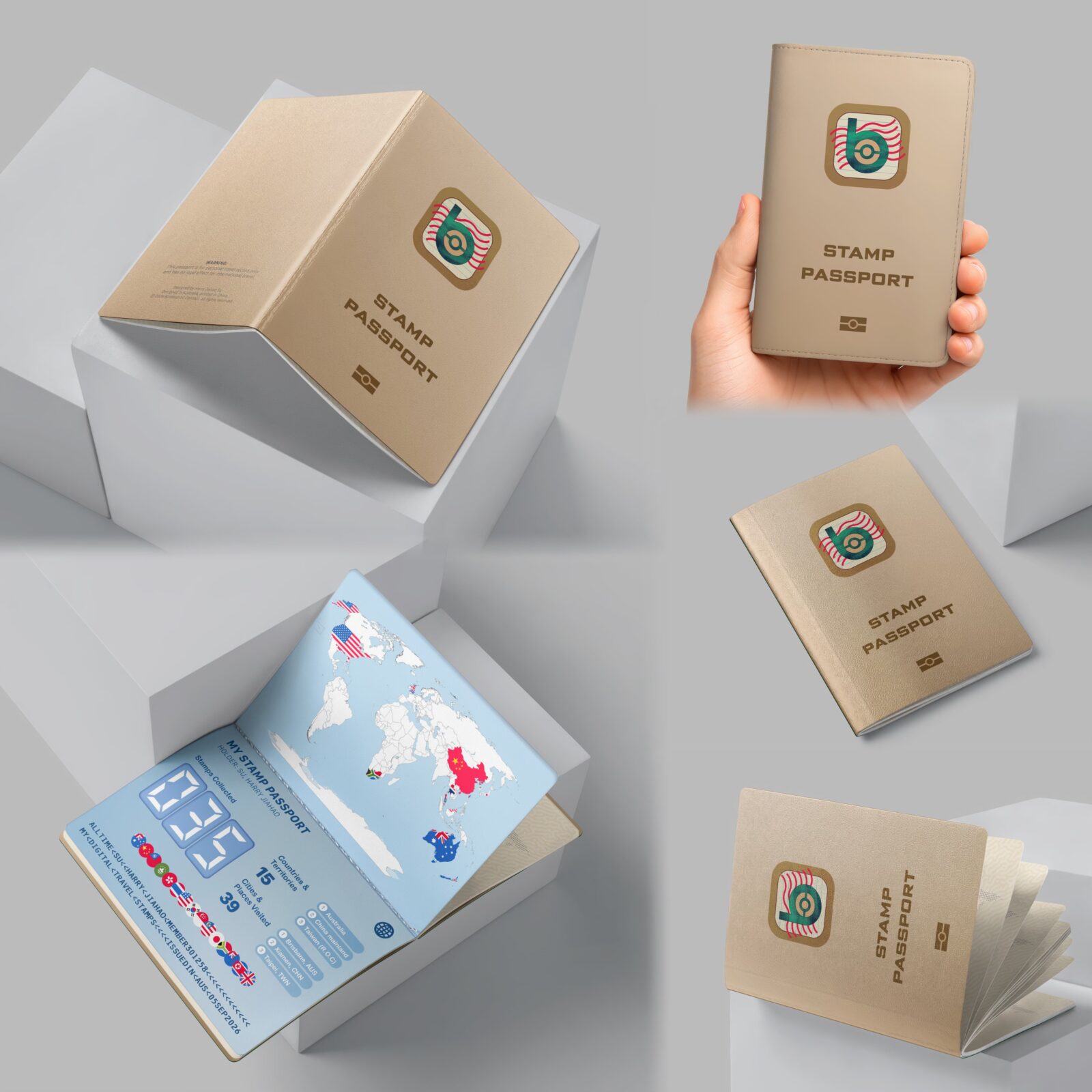
BORDERPRINT is a digital travel-stamp collection that reimagines how travellers preserve their journeys as traditional passport stamps become less common. Through an interactive mobile app, users can unlock, collect and organise digital stamps. A souvenir passport and collectible stickers extend these digital memories into tangible keepsakes, preserving memories beyond borders.
BORDERPRINT is a digital travel-stamp collection designed to help travellers preserve and revisit their travel experiences in an increasingly digital world.
Traditionally, immigration stamps have served as physical records of international travel, becoming personal souvenirs that document where people have been.
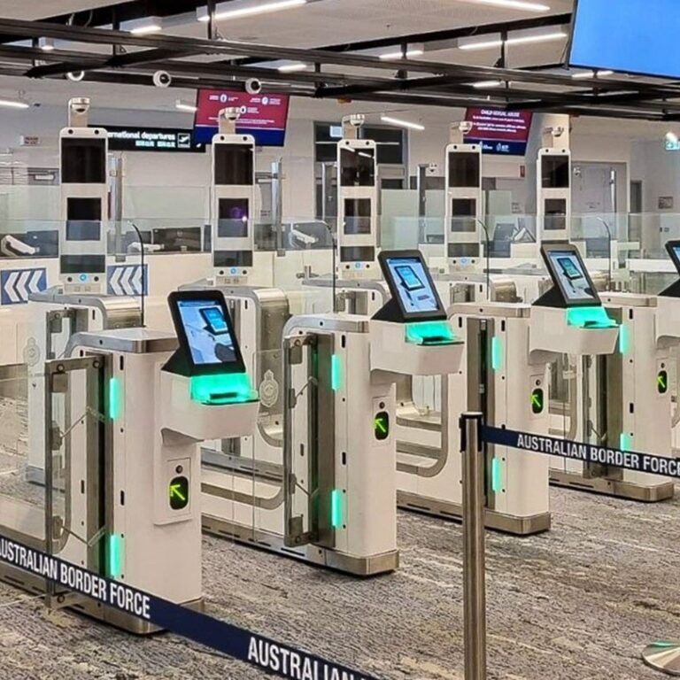
However, as more border authorities adopt electronic immigration systems, physical passport stamps are becoming less common, reducing opportunities for travellers to collect these tangible mementos.
BORDERPRINT explores how this experience can be reimagined through an interactive mobile app that allows users to unlock, collect and organise digital travel stamps. Through features including travel mapping, stamp collections, location-based interactions and boarding-pass scanning, the application connects travel information with a personalised visual record of each journey.
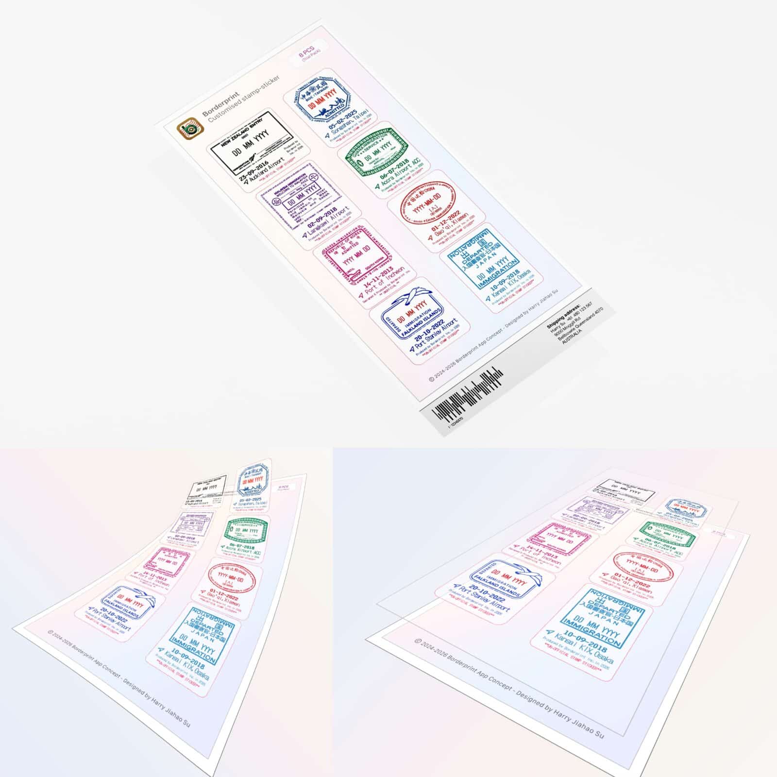
The experience also extends beyond the screen through a souvenir passport and collectible stamp stickers, allowing users to turn their digital collection into physical keepsakes. By combining digital convenience with the emotional value of physical memorabilia, BORDERPRINT offers an alternative way to document and celebrate the places people visit.
Design Inspiration and Rationale
BORDERPRINT began with an interest in the visual and emotional significance of immigration stamps. Beyond their administrative purpose, these marks can become personal souvenirs that represent a particular journey, destination or moment in time.
The project explores the relationship between traditional travel documentation and contemporary digital experiences. Passport stamps, travel documents, maps and collection-based interfaces informed the visual direction, while the gradual transition towards electronic border processing provided the central design opportunity. The design aims to retain the recognisable characteristics of traditional immigration stamps while adapting them into a more flexible digital collection. Typography, stamp shapes, country identifiers, dates and location information help establish a visual connection with physical travel documents.
The project also draws on digital travel-tracking experiences, including Flighty’s digital passport feature. This provided a relevant reference for presenting travel history and destination information digitally. BORDERPRINT develops this idea around collecting and interacting with travel stamps rather than focusing primarily on flights. These influences informed the development of a connected experience in which users can discover, collect, organise and eventually print their digital travel memories.
DEVELOPING THE BORDERPRINT VISUAL IDENTITY
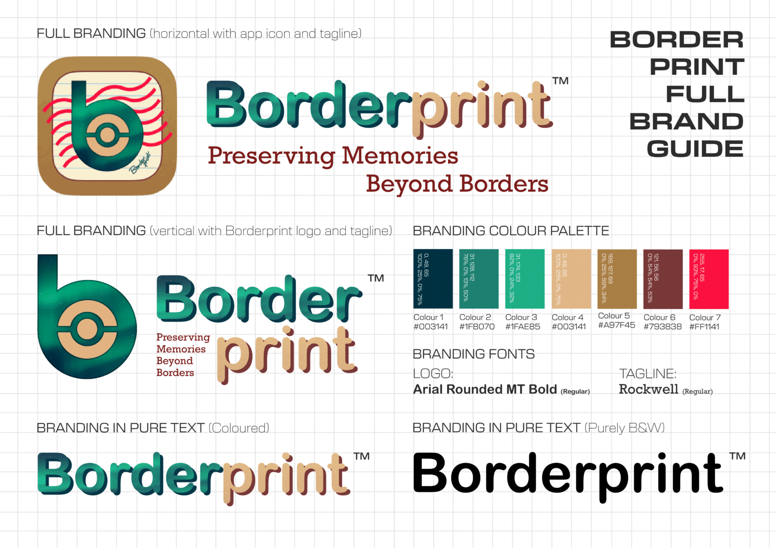
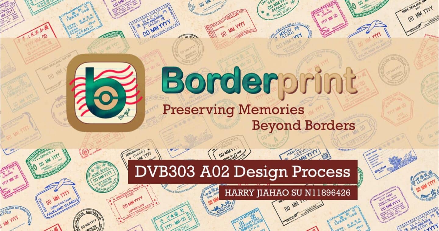
The visual identity of BORDERPRINT combines elements of traditional travel documentation with a contemporary digital aesthetic. The letter B forms the central brand symbol, incorporating a passport-inspired electronic chip to represent the transition from physical travel records to digital collecting. An aurora-inspired teal and green gradient introduces a sense of movement, discovery and the excitement of travelling, while the red wavy lines reference the visual language of passport stamps and travel documentation. Warm cream and tan tones balance the brighter colours, connecting the identity with the familiar materials of physical passports and travel memorabilia. The rounded typography creates a friendly and approachable appearance, allowing the identity to translate across the mobile application, digital passport and physical merchandise. Together, these elements support the tagline, Preserving Memories Beyond Borders, expressing the project’s intention to help travellers continue collecting and preserving meaningful travel memories as border documentation becomes increasingly digital.
DEVELOPING THE BORDERPRINT STAMP SYSTEM
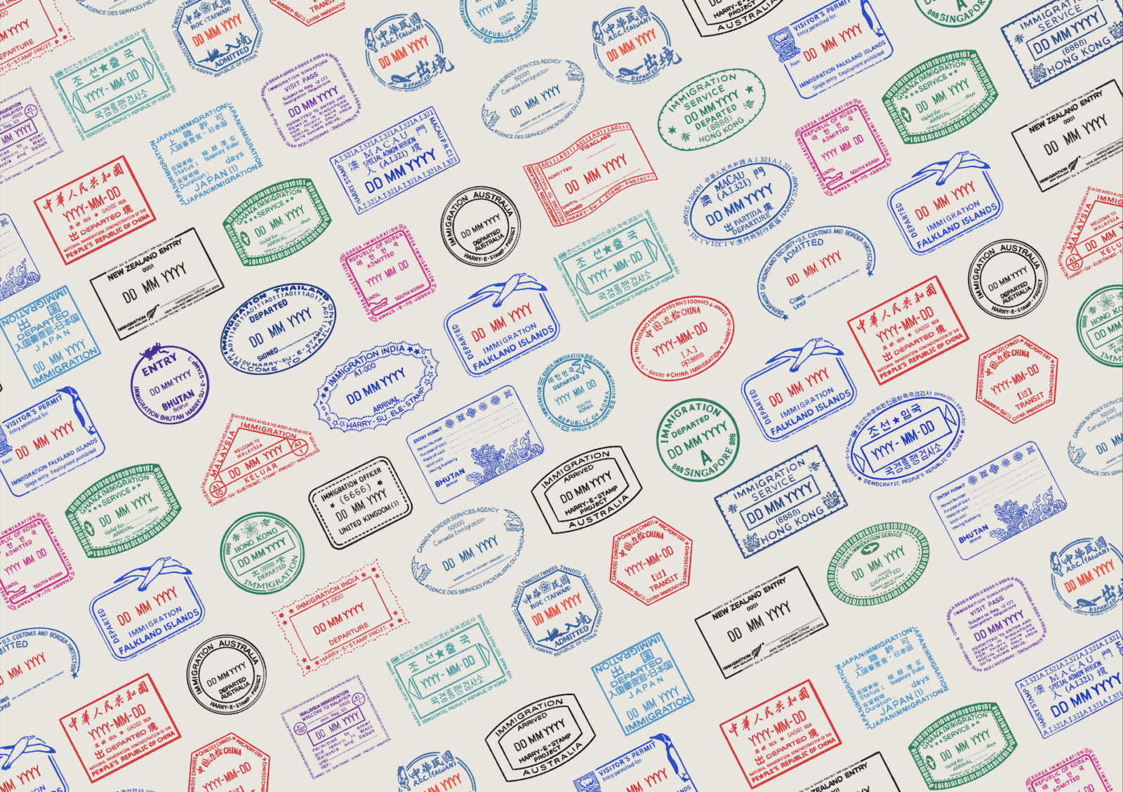
The stamp collection is the central visual element of BORDERPRINT. I illustrated the stamps in Procreate, using traditional immigration stamps and travel documents as references for their graphic language.
The designs explore familiar characteristics of physical stamps, including circular and rectangular formats, border treatments, destination identifiers, dates and administrative-style typography. These elements help establish a recognisable connection with traditional travel documentation.
I developed variations across different destinations while maintaining a consistent overall visual language. Selected colours, text and other details were adapted to suit the individual designs, allowing the collection to feel varied without losing its identity. The resulting stamp system was applied across the mobile interface, digital passport, sticker designs and physical merchandise mockups.
This helped establish continuity between the digital collection and its physical extensions. The development process involved balancing visual authenticity with legibility at different sizes, particularly when stamps were displayed as small cards within the mobile interface.
01 — PASSPORT HOME PAGE
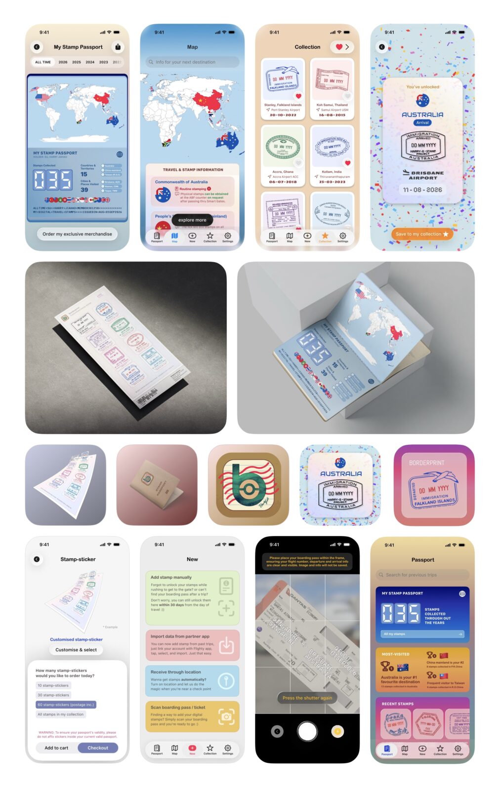
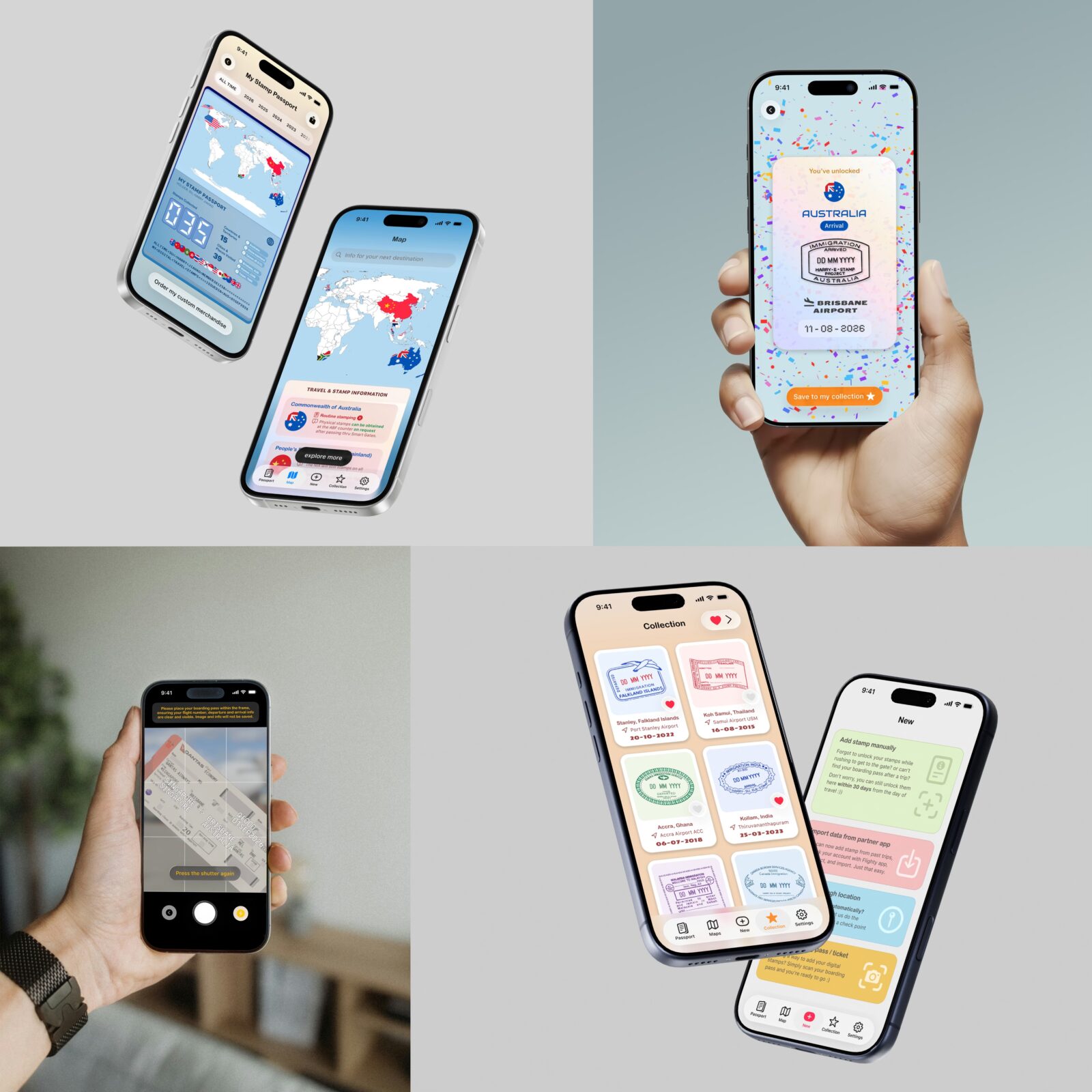
The central dashboard and entry point to the user’s travel history as well as order their unique personalised merch.
THE DIGITAL PASSPORT
Inspired by Flighty the app, the homepage is designed around the idea of a personal digital passport.
The interface prioritises:
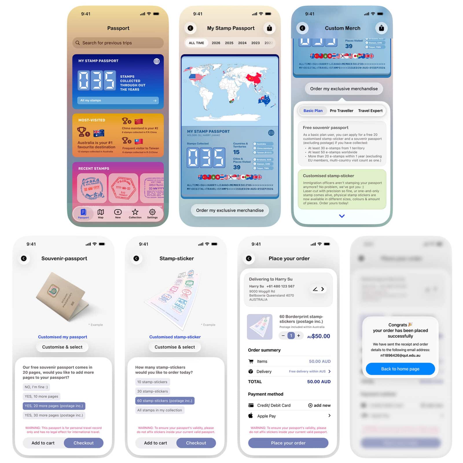
1) MY STAMP PASSPORT
A summary of total stamps, countries visited, recent journey and collection progress, it provides an overview of the user’s collection and offers access to the wider travel experience.
2) DIGITAL TURNING INTO PHYSICAL
Selecting the digital passport opens a more detailed record of accumulated stamps and visited countries. From there, users can access the merchandise-ordering experience.
The souvenir passport and stamp sticker collection extend the mobile experience into tangible objects. The passport provides a dedicated place to preserve collected stamps, while the stickers allow users to bring selected designs into a physical format.
The merchandise visual language follows the same stamp system used throughout the application, maintaining consistency in typography, colour, destination information and graphic style. I also developed an interactive merchandise-ordering flow within the prototype. Users can explore the available products, select options, review an order and progress through a simulated checkout experience. This creates a clearer connection between collecting digital stamps and preserving travel memories physically.
02 — MAP PAGE
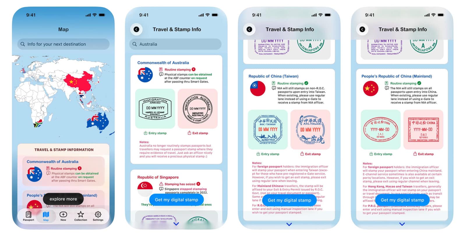
The Map page presents a world map that highlights visited countries using national flags and colour. Supporting information introduces users to the physical stamp practices of different destinations.
Underneath the map, there are also a few services provided, including travel and stamp information. The scrollable information allows users to explore whether stamps are generally available and understand the circumstances in which they may still be obtained. For destinations where routine passport stamping has ceased, the app explains that physical stamps may no longer be available and offers digital collection as an alternative.
To ensure the app’s sustainability, travel information and advertisements for these destinations can also be placed in this second to help app creators.
03 — NEW UNLOCK PAGE
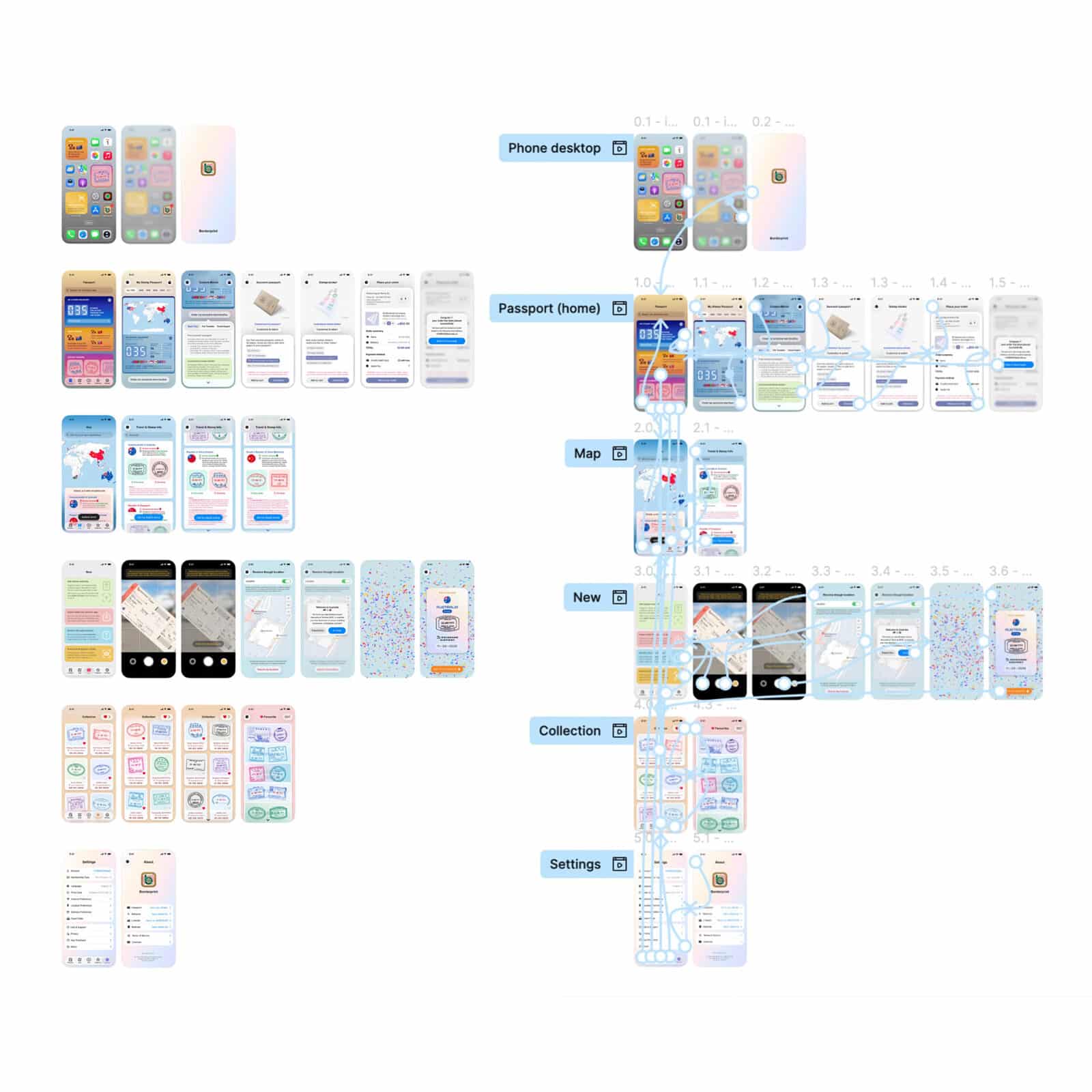
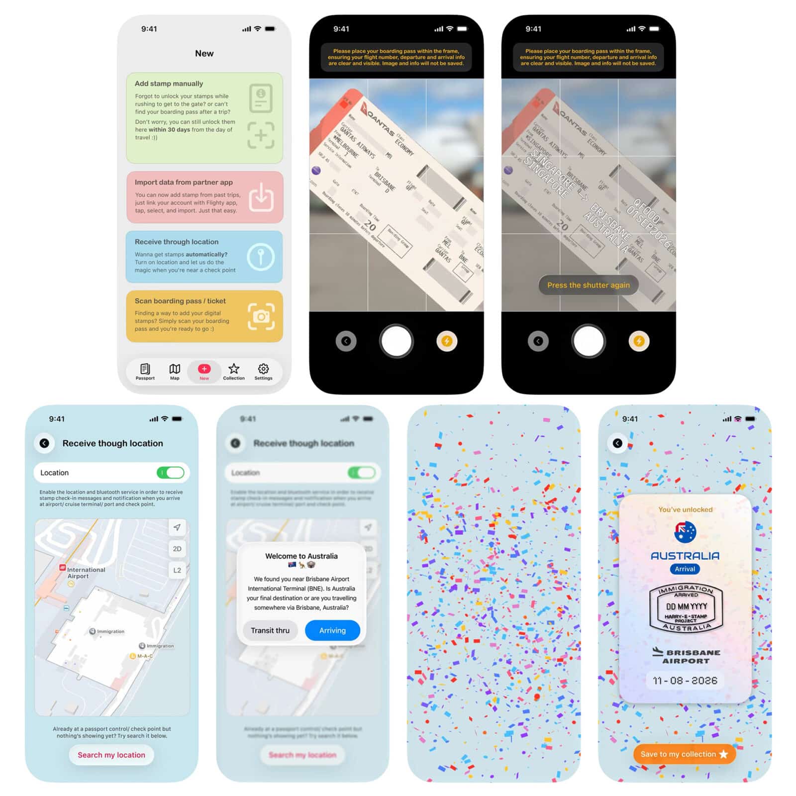
Stamp unlocking is a central interaction within BORDERPRINT. I designed four methods to accommodate different ways users might record their travel experiences.
Manual entry
allows users to add a stamp when they have forgotten to unlock it during their journey. The prototype communicates a 30-day window for adding missed stamps.
Partner app import
provides a proposed way to bring existing travel information into the collection, reducing the need to enter every journey manually.
Location-based unlocking
explores how location permissions could support a more automatic experience. When the prototype detects a user near an airport, it presents a contextual prompt asking whether the user is arriving at that destination or travelling onwards.
Boarding-pass scanning
uses the camera interface to represent a workflow in which travel details, such as departure and destination, can be identified from a boarding pass. Depending on the journey, this could support unlocking stamps for more than one destination. The unlocking sequence concludes with a celebratory confirmation screen, using confetti and a newly unlocked stamp card to make the action feel rewarding.
These options accommodate different travel circumstances, including users who forgot to unlock a stamp or want to add information from a previous journey.
04 — MY COLLECTION PAGE
Store and organise previously collected stamps.
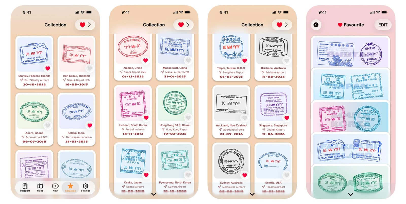
The collection page is designed to recreate the feeling of opening a passport or travel book filled with stamps, the stamps are displayed as individual visual card. To make it even more special, you could select and “like” your favourite ones, those extra special ones will be treasured on your favourites page and prominently displayed as a widget on your homepage or even phone’s home screen.
IN THIS TAB, USERS CAN:
– browse stamps
– filter by country/ region
– view favourites
– revisit travel information
– see repeat visits
05 — SETTINGS & HOME SCREEN WIDGETS
Provide access to account preferences and supporting information.
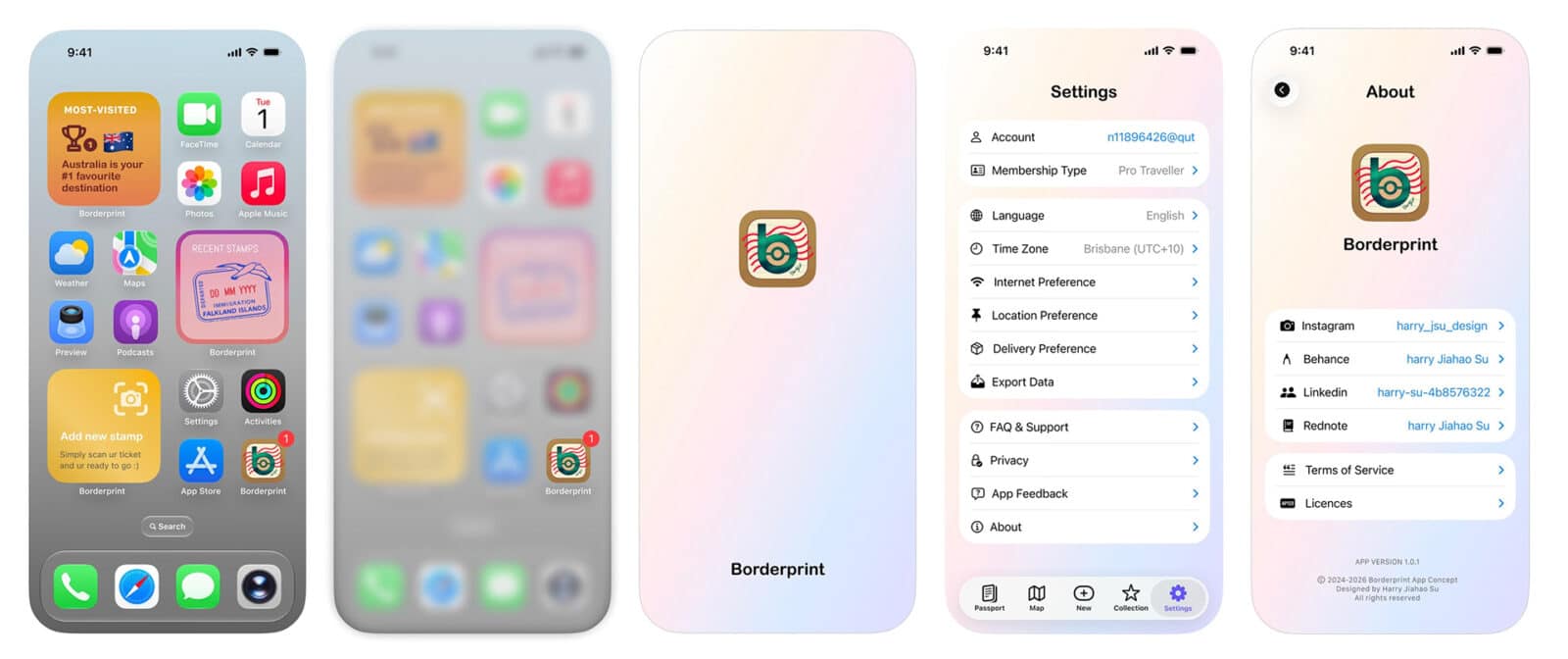
To make the app accessible to a wider audience, common settings such as managing membership plans, language and time zone, as well as network, location, and delivery preferences, are listed on this page.
A FAQ and some profile information for the app developer (relevant professional and social profiles) are also provided in the secondary menu. There is also a range of designed homescreen widgets available for iOS users.
Harry is a third-year Visual Communication Design student at Queensland University of Technology (QUT), Brisbane. With a passion for design and a strong attention to detail, he has developed skills in branding, typography, illustration, digital design and UI/UX design. He enjoys exploring the intersection of creativity, technology and visual communication, transforming ideas into thoughtful and engaging design outcomes. He is particularly interested in branding, interactive design and the application of emerging technologies in visual communication.