Visual Communication - Bachelor

DANGER SLUSH

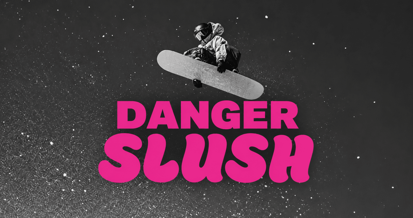
DANGER SLUSH is a snowboard lifestyle brand inspired by freestyle snowboarding, terrain park culture and ski resort warning signage. The project combines hazard graphics, bold typography and bright colours across snowboards, apparel, accessories, posters and social media to create a playful, energetic and recognisable visual identity.

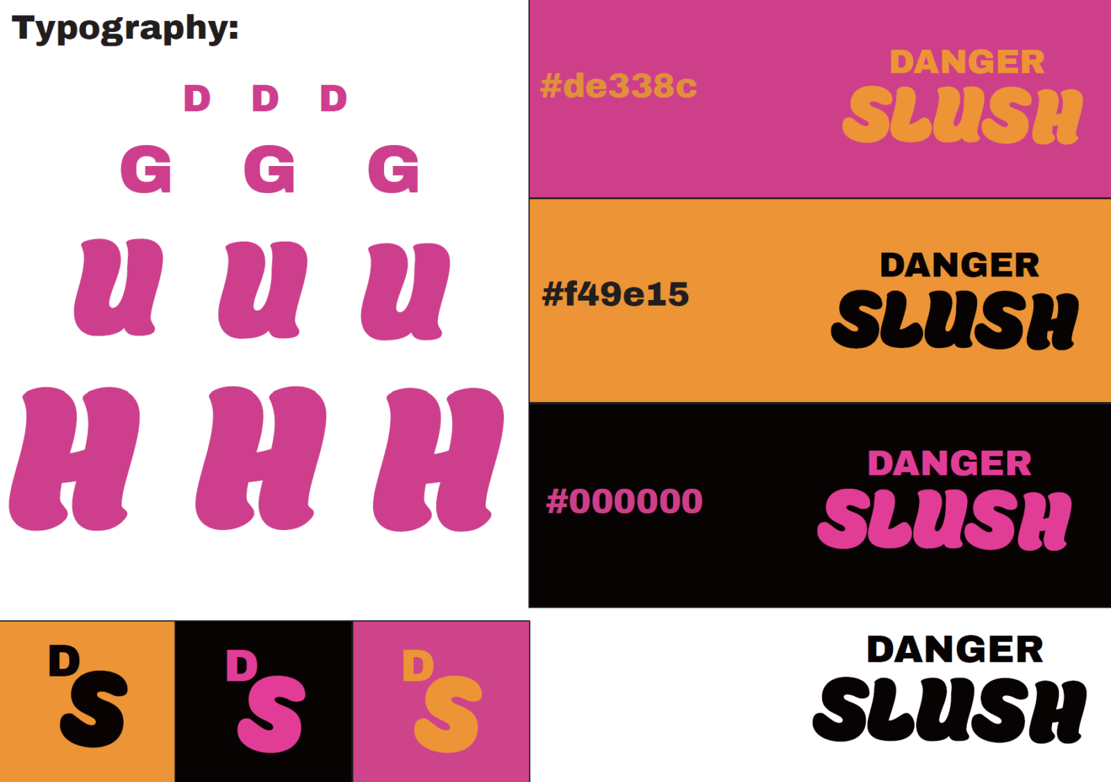
colour identity &TYPOGRAPHY

DANGER SLUSH colour palette and typography system showing pink, orange and black brand colours with bold and rounded letterforms.

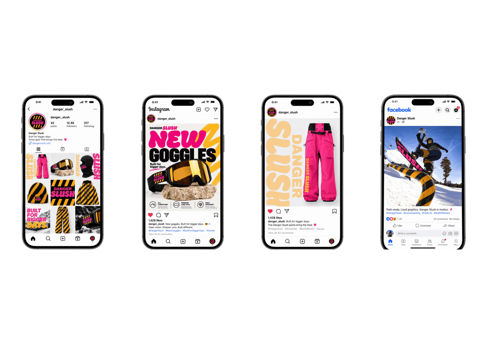
Social media campaign

Four smartphone mockups showing DANGER SLUSH Instagram and Facebook content, including product posts, a profile grid and a goggles advertisement.

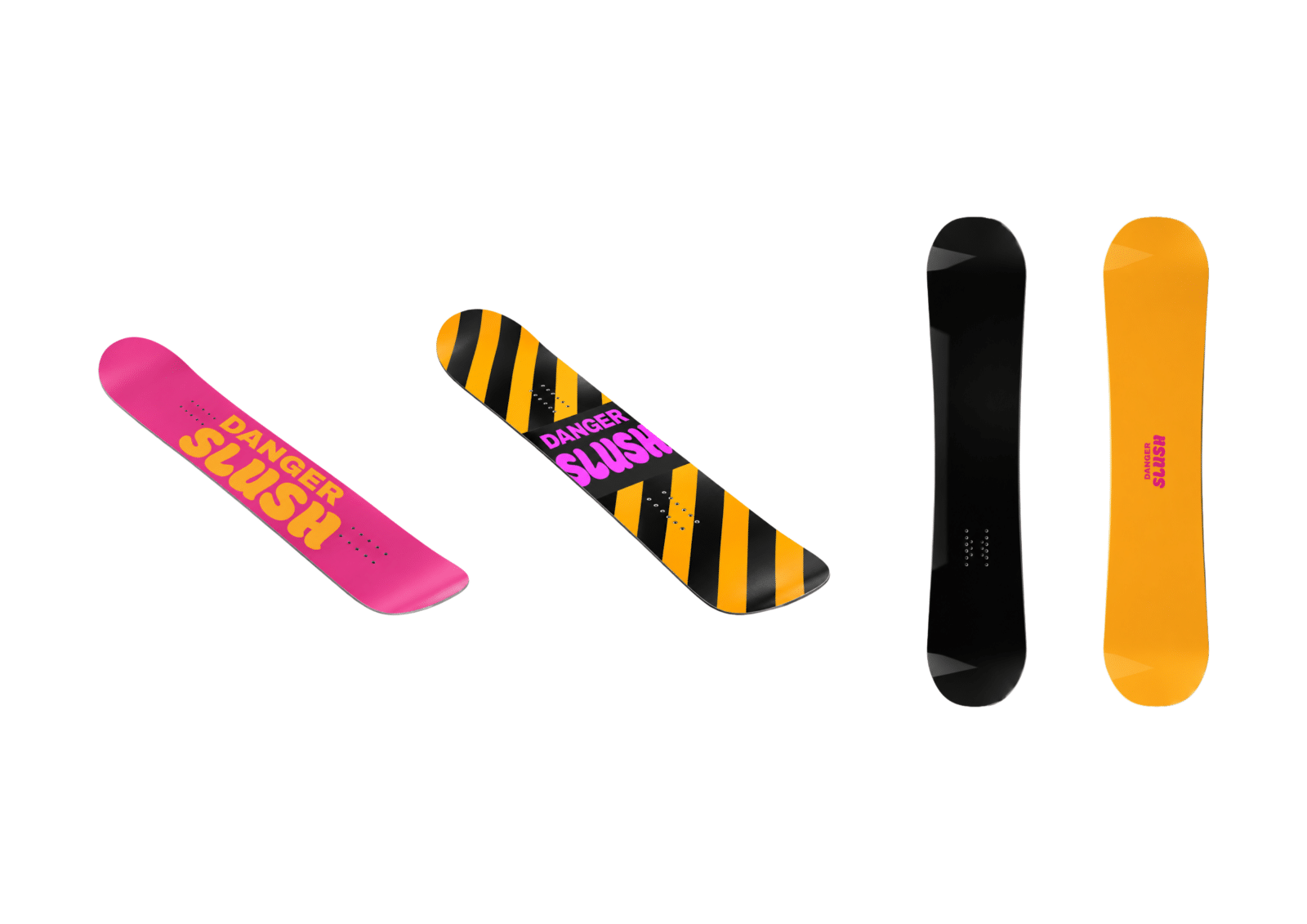
DANGER SLSUH PRODUCTS

Four DANGER SLUSH snowboard designs in pink, black, orange and black-orange hazard stripe colourways.
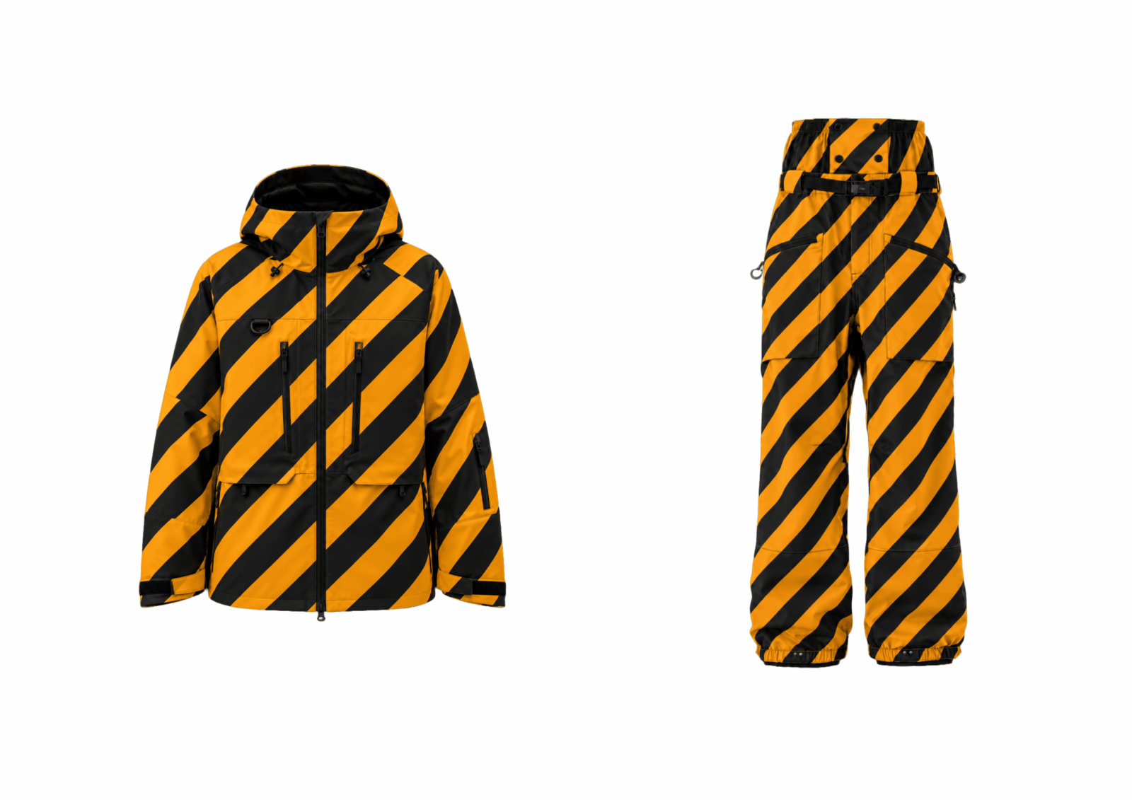
DANGER SLUSH snowboard jacket and pants featuring bold black and orange diagonal hazard stripes.
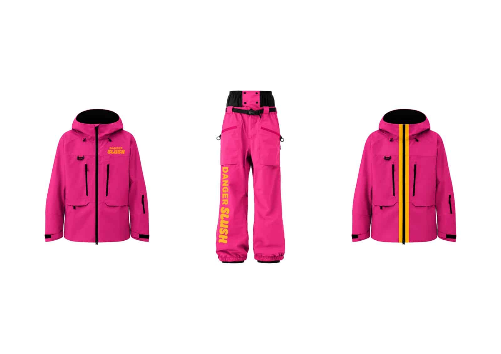
Three DANGER SLUSH pink snowwear designs, including two jackets and matching snow pants with yellow and black details.
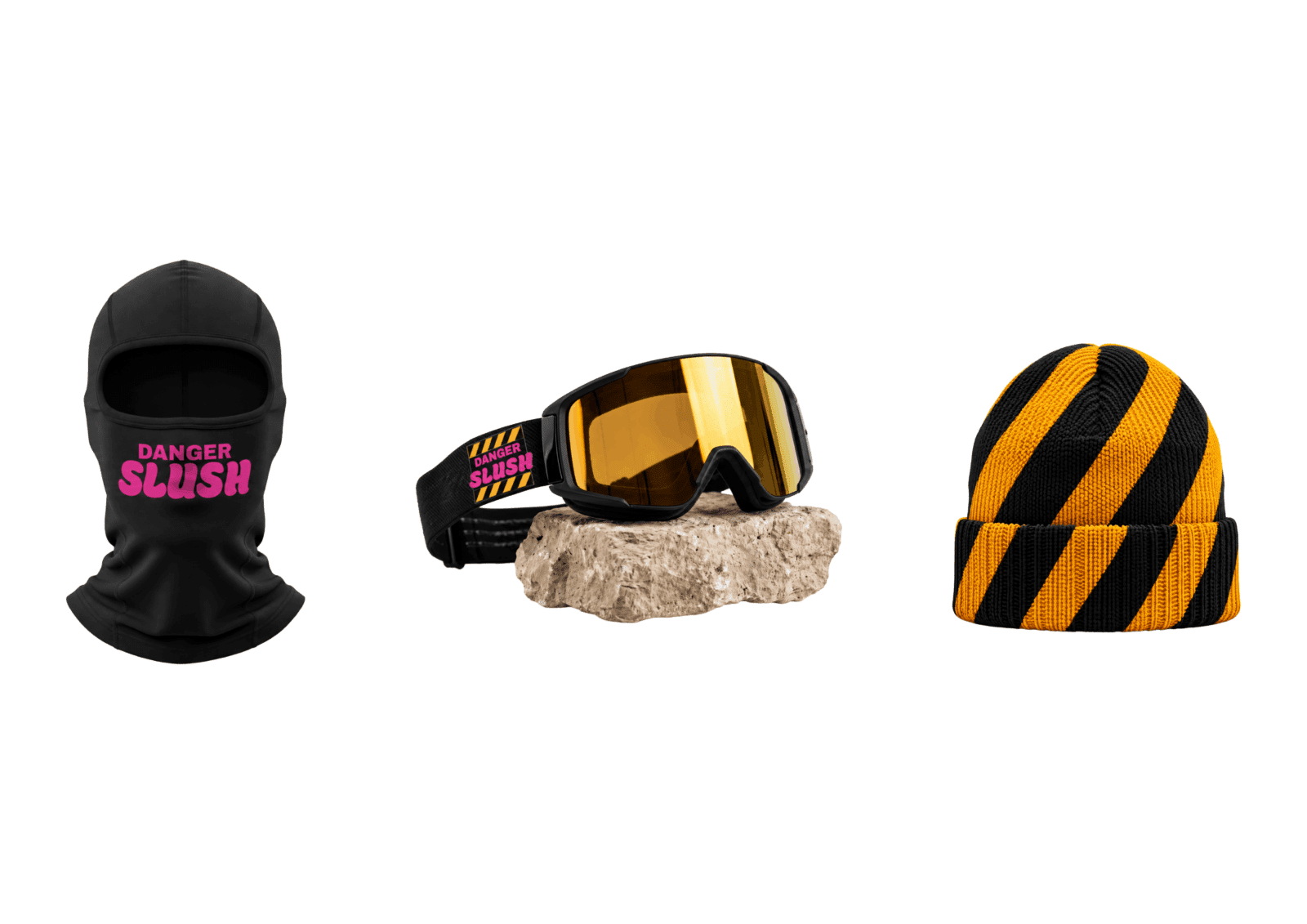
DANGER SLUSH accessories including a black balaclava, branded snow goggles and a black-orange striped beanie.

CAMPAIGN POSTER

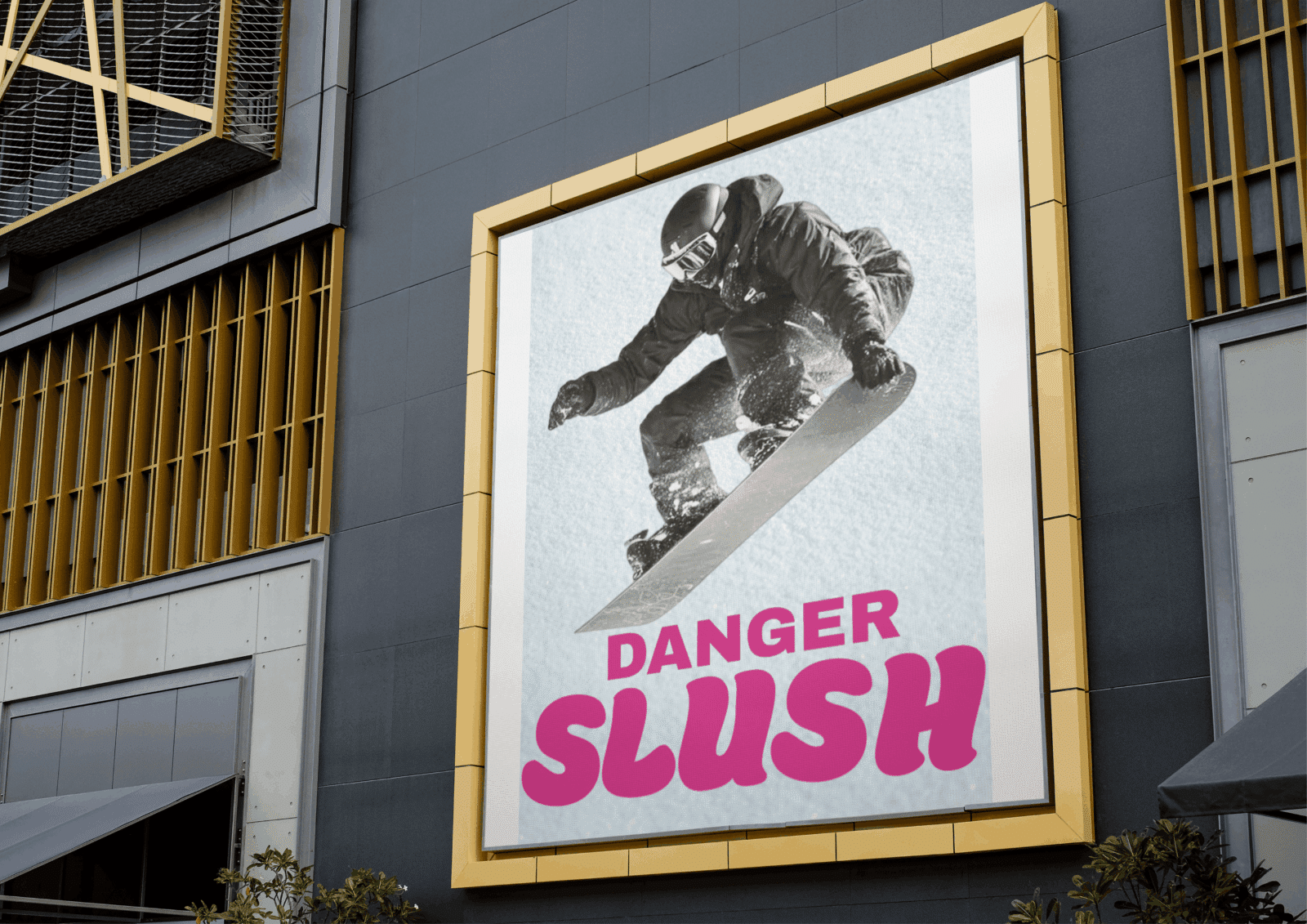
DANGER SLUSH snowboard poster displayed on a large outdoor wall-mounted advertising panel.
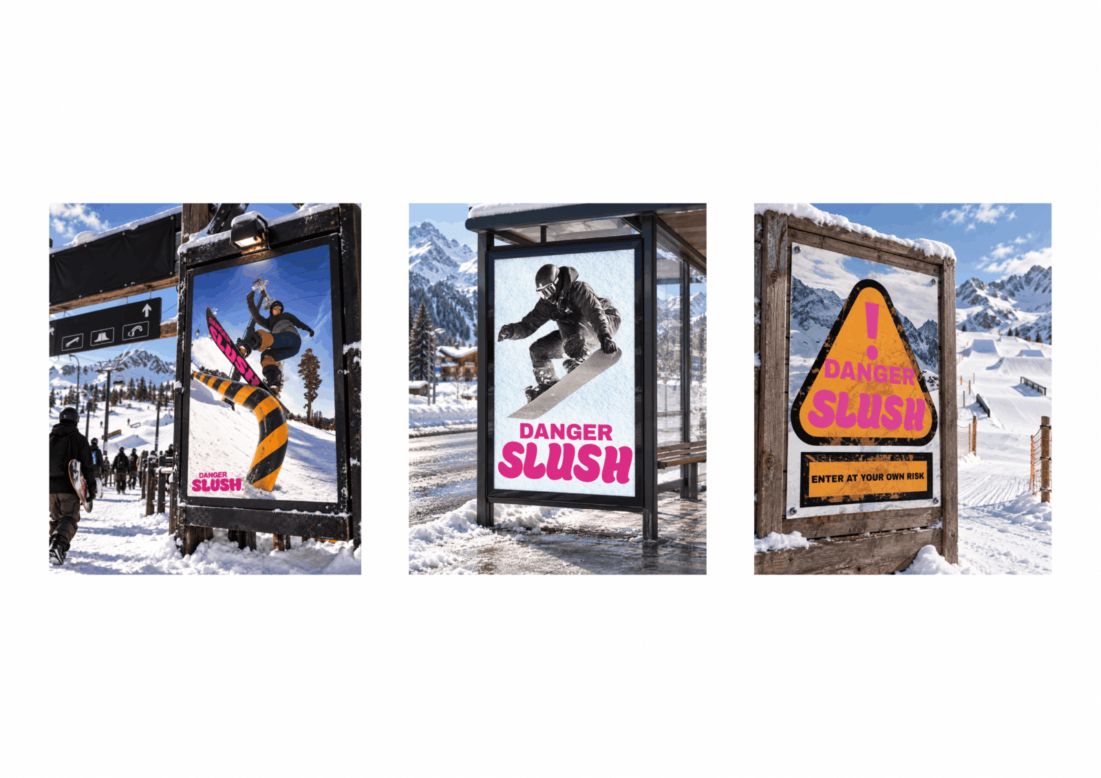
Three DANGER SLUSH poster mockups displayed in ski resort environments, including a terrain park entrance and bus stop.

Chenzhe (Vinnie) Ma

Chenzhe is a Visual Communication student at QUT with an interest in branding, poster design and social media. His work is often inspired by sport, youth culture and lifestyle, using bold colour and typography to create clear and energetic visual identities.

Vote For This Project

"*" indicates required fields

This field is for validation purposes and should be left unchanged.
This field is hidden when viewing the form
Project