Visual Communication - Bachelor

Kiki

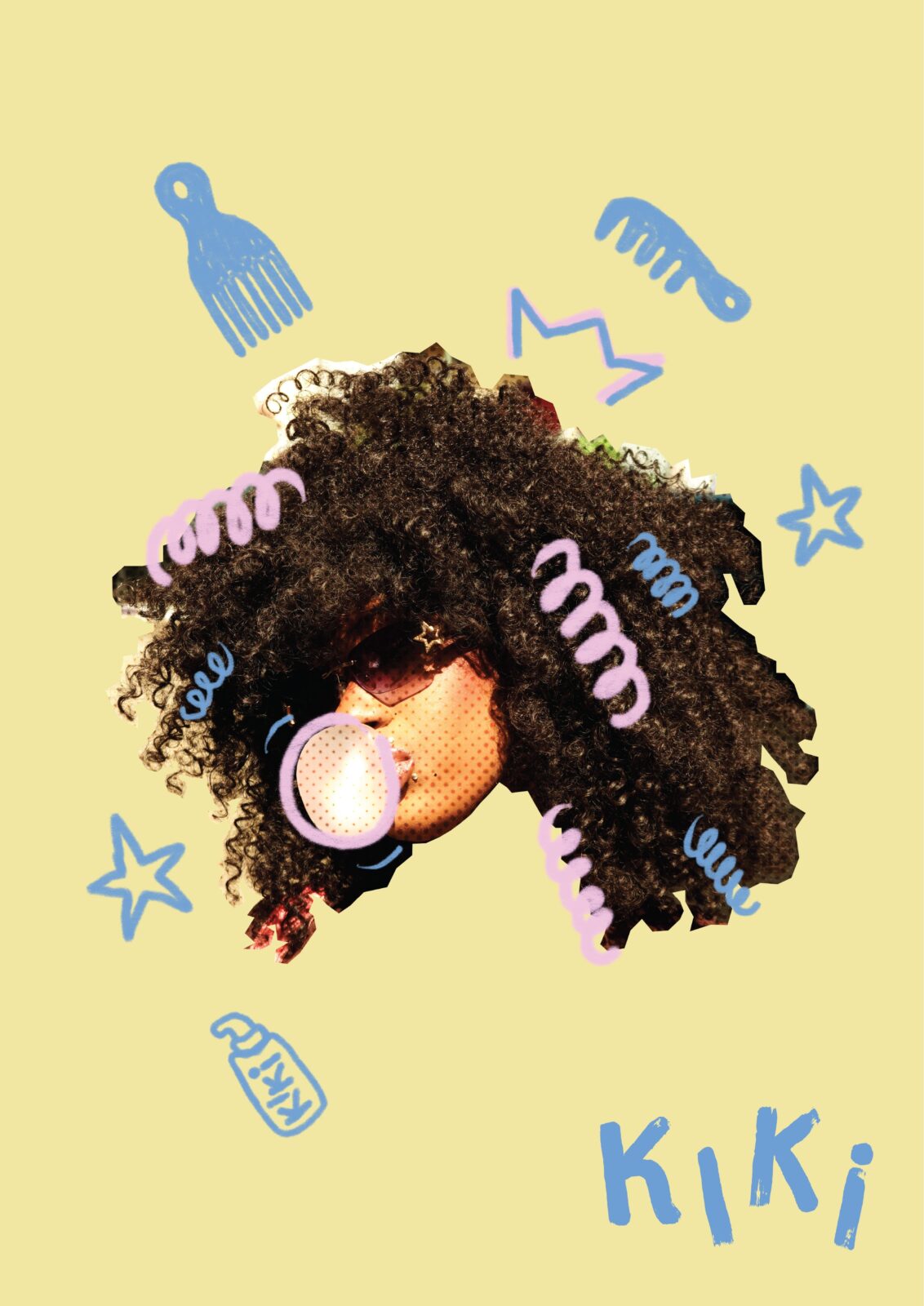
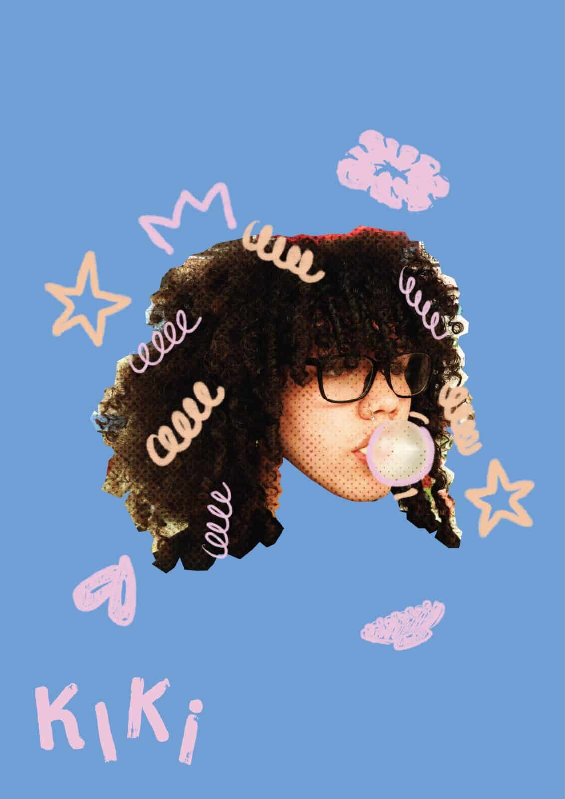
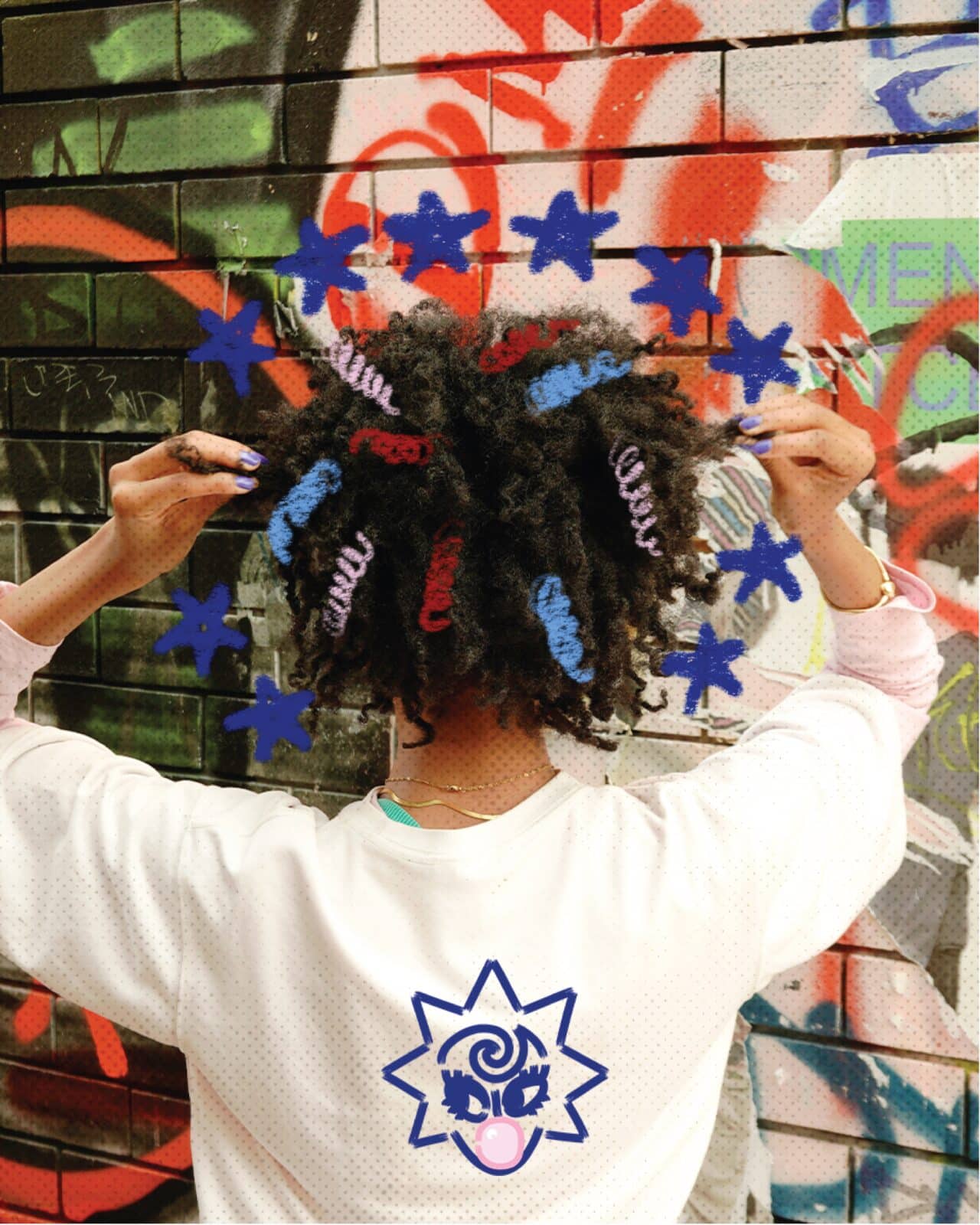
Kiki is a curly hair care brand designed to make curls pop! Created to fill a gap in the Australian market, it has a visual identity that is bold, playful and made to connect with audiences. Kiki’s goal is to transform the curly hair routine to uplift curls and remind the audience confidence is fun.

Kiki – curly hair care

Curly haired Australians deserve more than scraps to take care of their hair. They need brands that are entirely dedicated to help them take care of their curls and feel their best because of it. Kiki is a curly haired brand being designed for young adults in Australia to help them embrace their curls. 65% Of Australian women have curly or wavy hair and the salons and markets dedicated to them don’t match that statistic. Kiki is made to help young adults get the tools they need to thrive with their hair and feel powerful in it. Our target audience is Gen Z with curly to coily hair that value their appearance, feeling their best and supporting authentic brands. Kiki strives to achieve this by creating a brand identity that is bold, powerful and confident by embodying the shared experience of these feelings through design. This brand will produce a logo, visual campaign, product packaging and social media posts. These deliverables will be designed using software’s such as Adobe Illustrator, Adobe Photoshop and Procreate. The visual direction Kiki will take is through bold mixed media designs that are heavily illustrated. This is inspired by Adobe’s design trends of 2026 which highlight organic imperfect design as well as collage and layered visual elements. All these elements will help create and establish Kiki, Curls that pop!

VISUAL IDENTITY

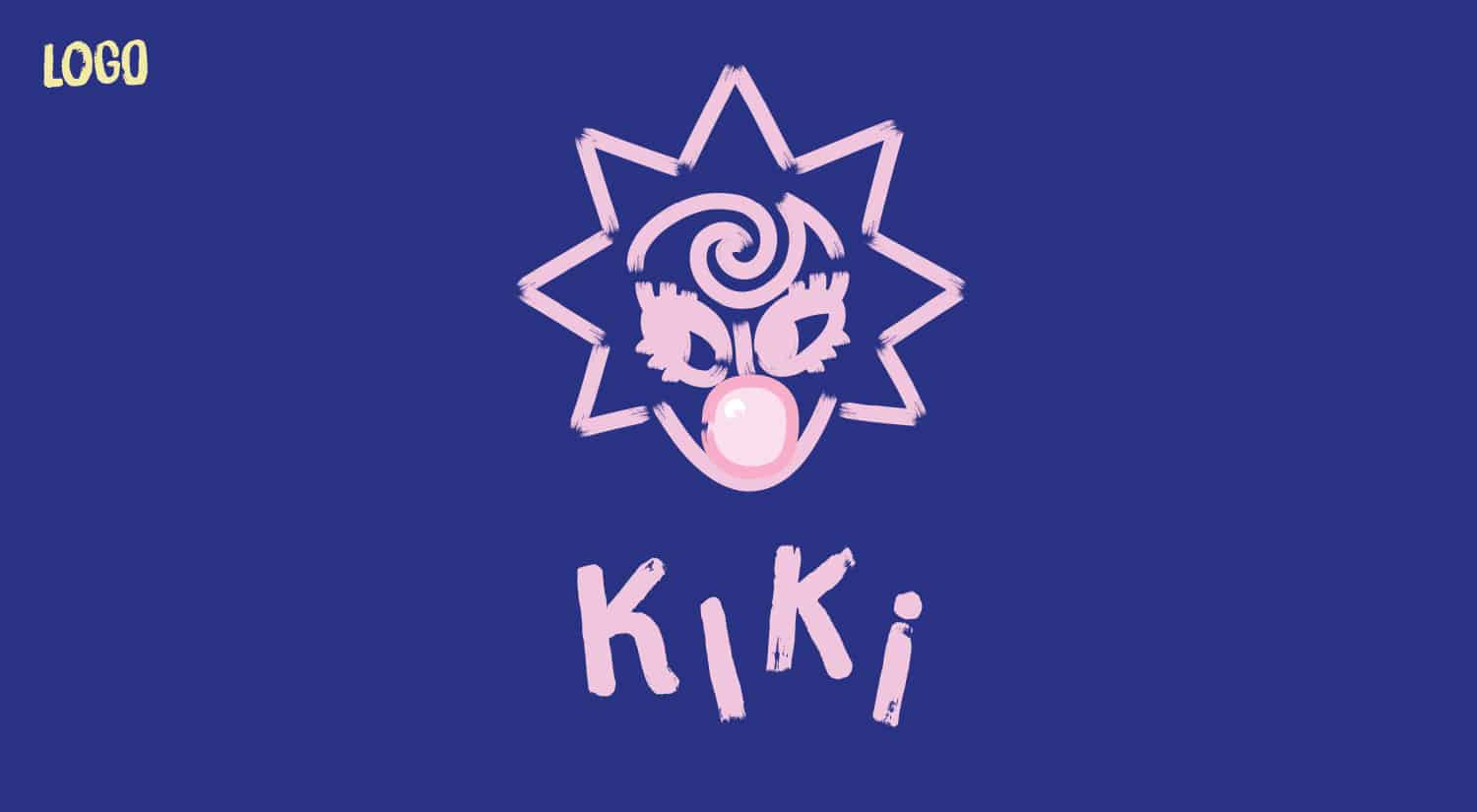
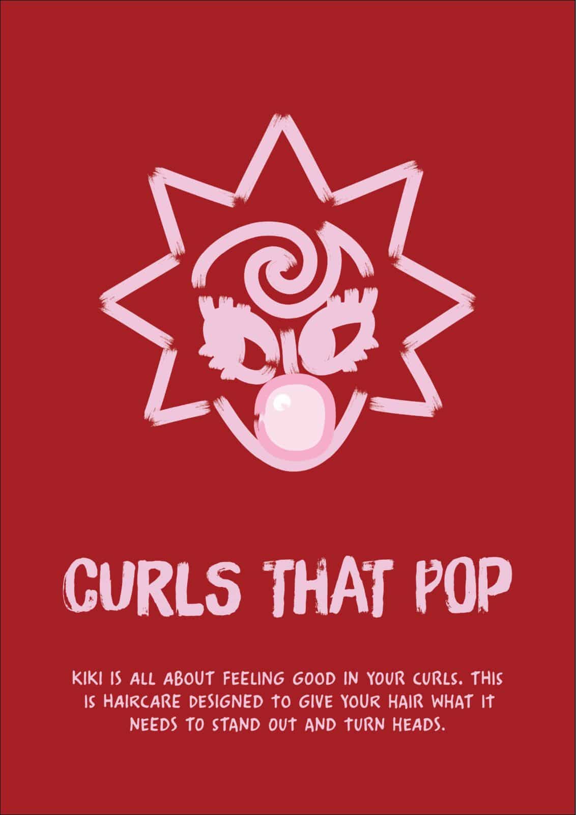
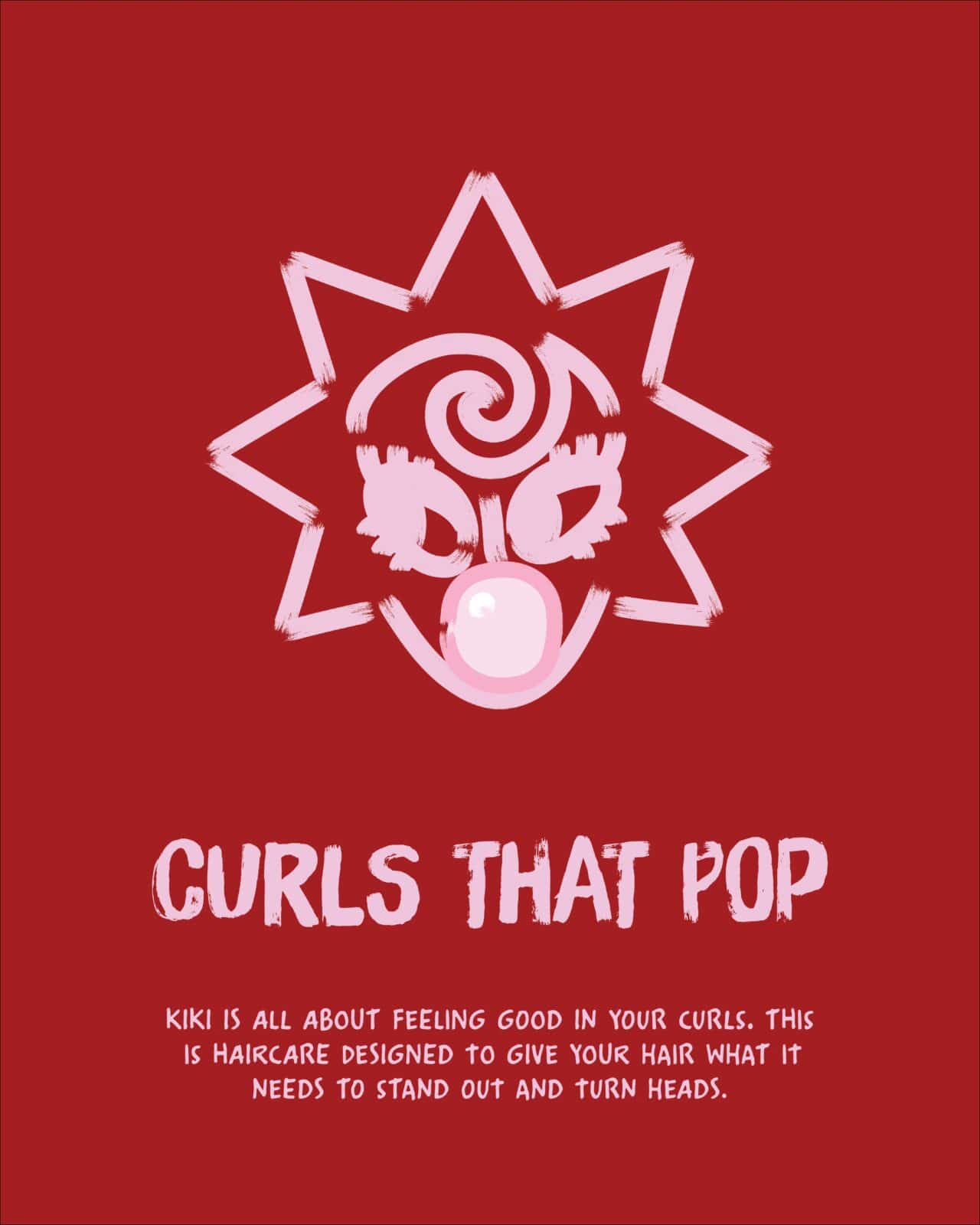
Logo. Spiked hair girl line illustration blowing a pink bubble gum ball. Under the illustration it reads Kiki in a brush stroke typeface and all the letters are individually slanted.
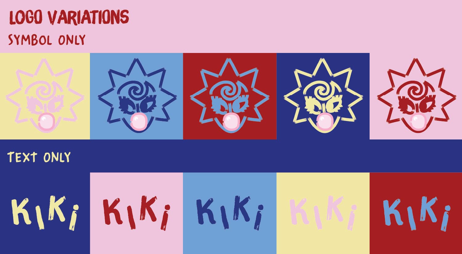
Logo variations, symbol only and text only in all colours from colour palette.
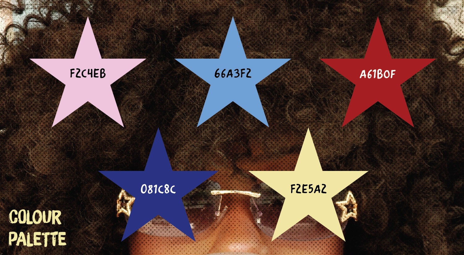
Project colour palette, #F2C4EB light pink, #66A3F2 blue, #A61B0F deep red, #081C8C dark blue and #F2E5A2 yellowish light beige.
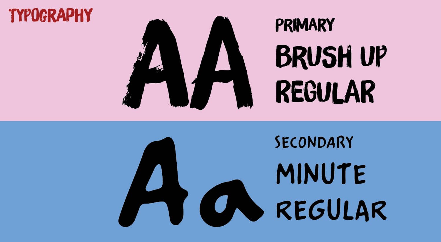
Project Typography. Primary font is Brush Up regular, looks like brush strokes. Secondary font is Minute regular, looks like hand written text.

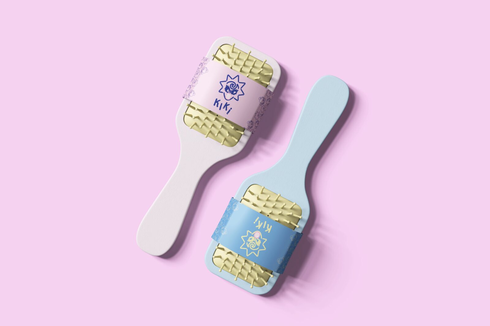
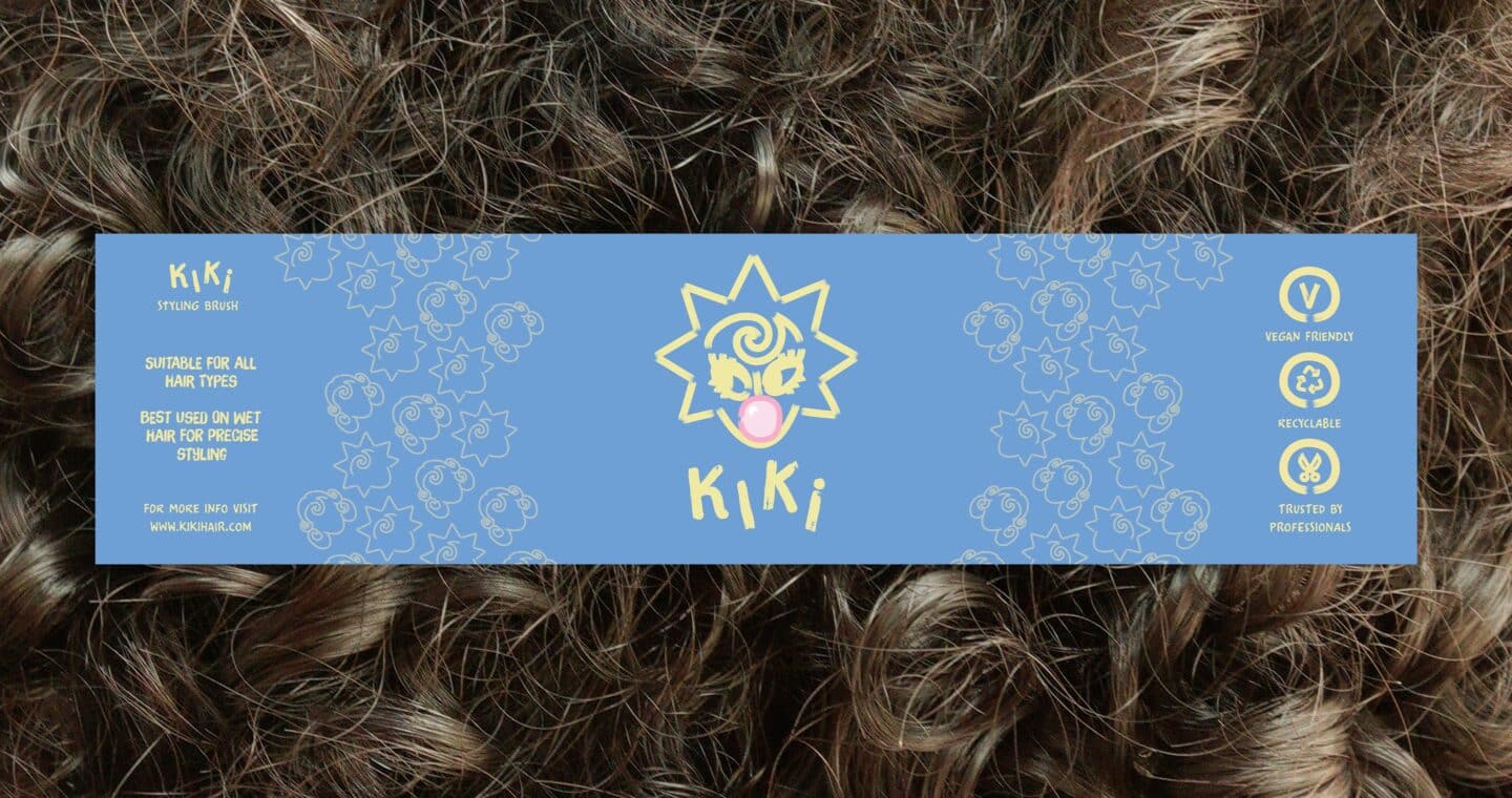
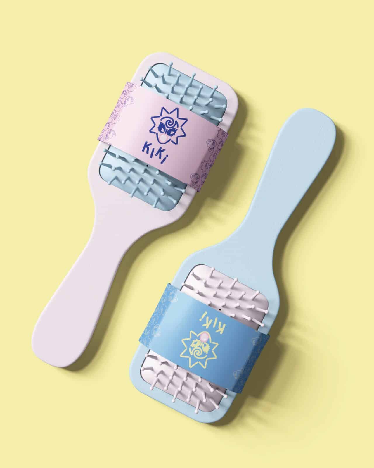
Hair brush sleeve packaging

Two hair brushes with Kiki packaging

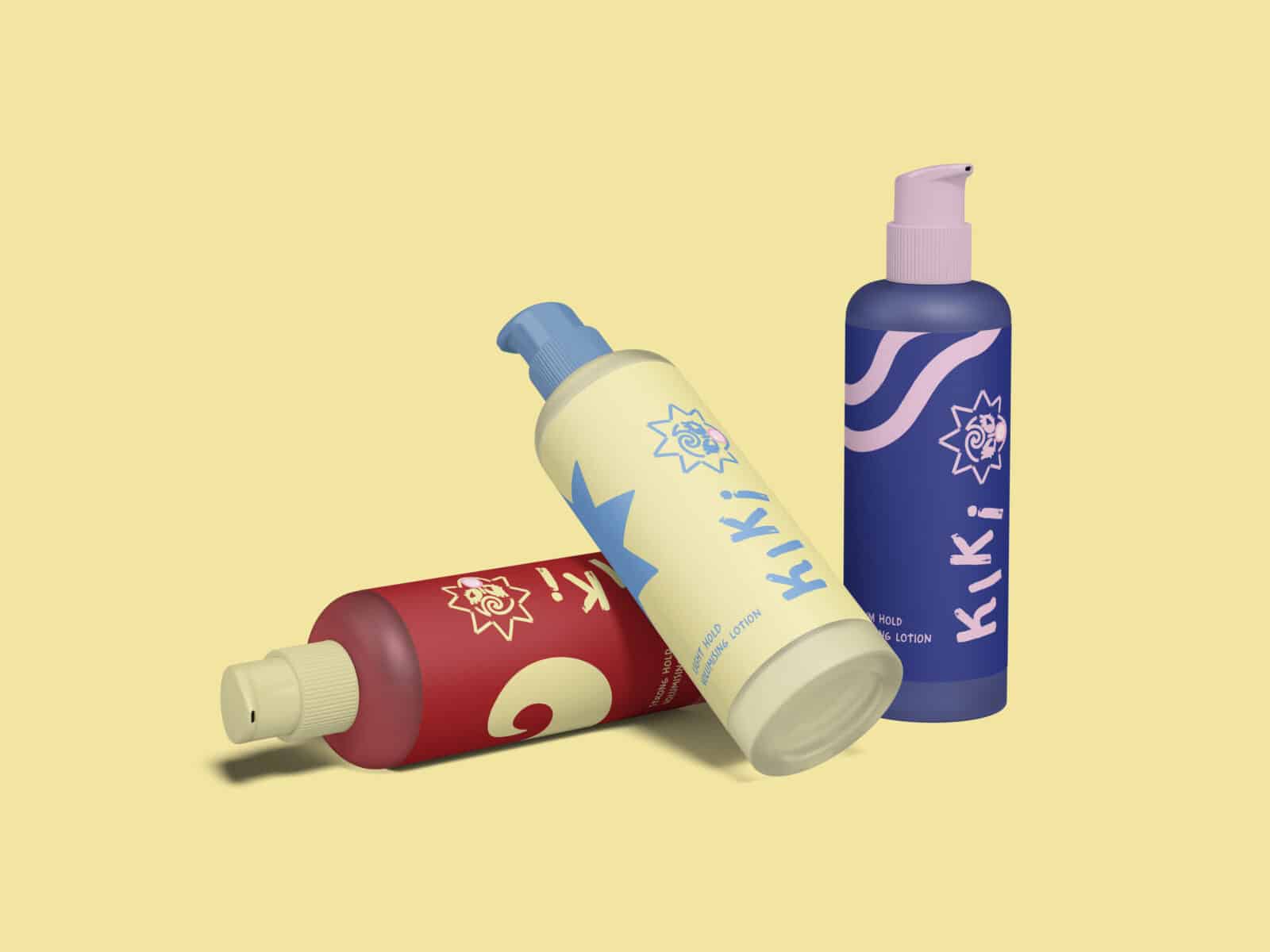
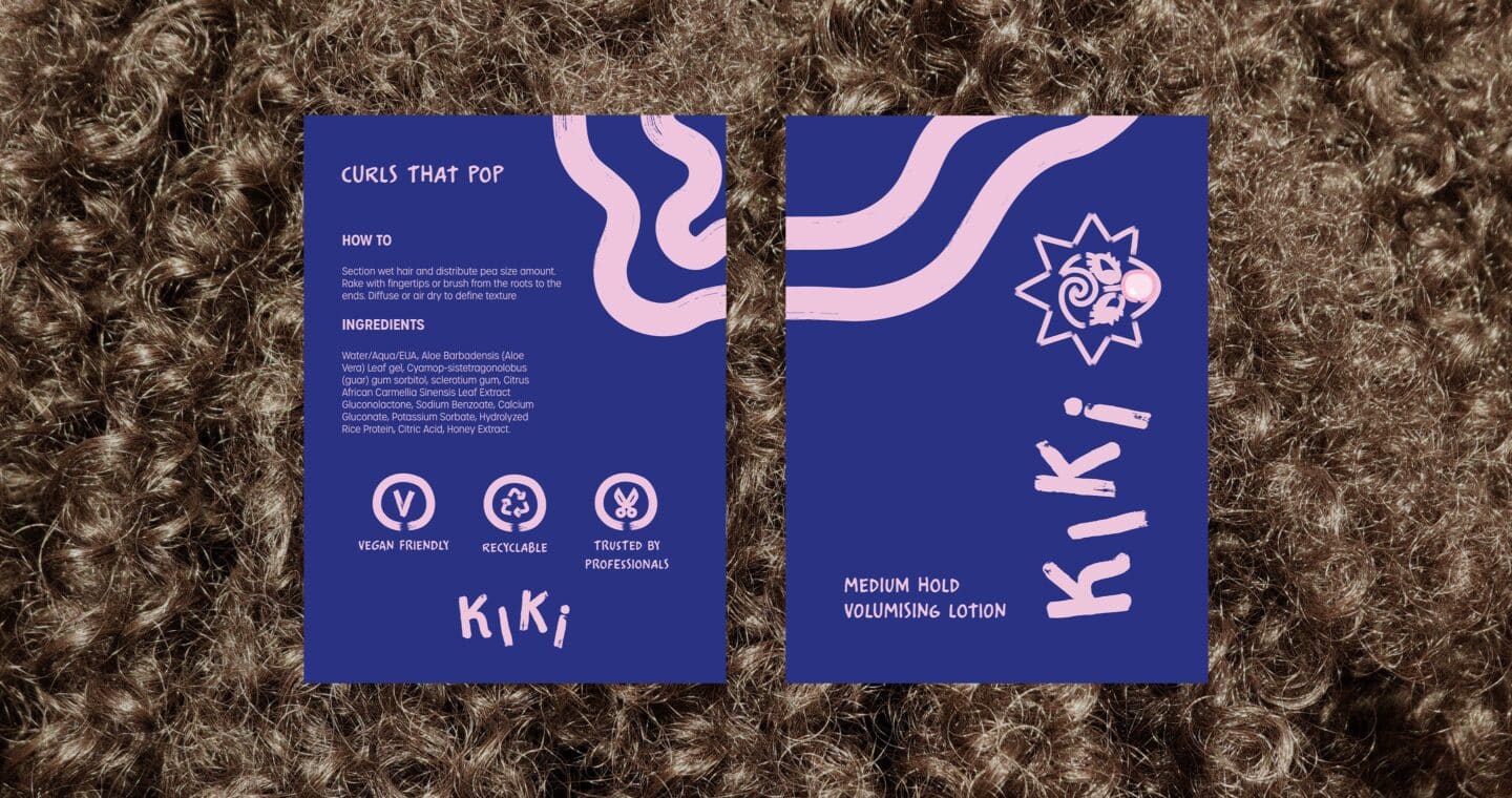
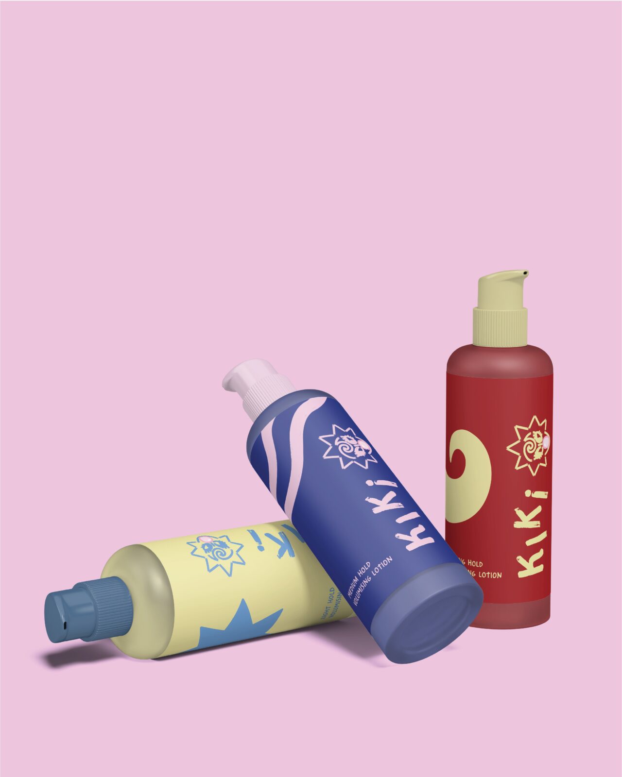
CUrl cream label packaging

3 curl cream pumps that are light beige, dark blue and deep red. Each have their uniquely designed Kiki packaging

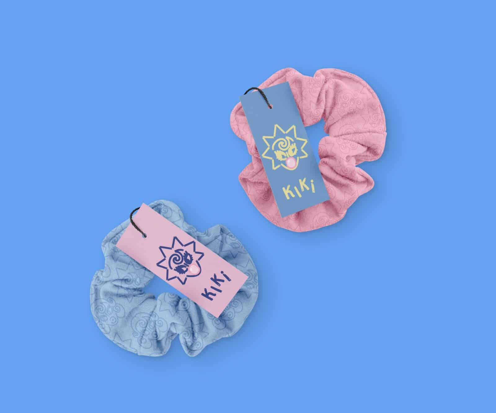
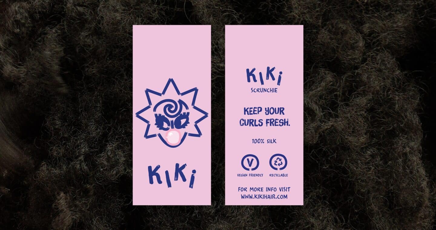
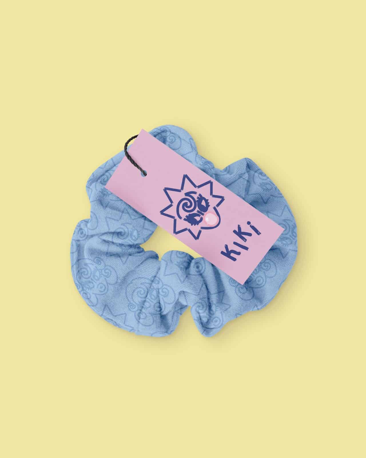
Scrunchie tag packaging

Two scrunchies, one blue one pink. Both and Kiki designed product tags

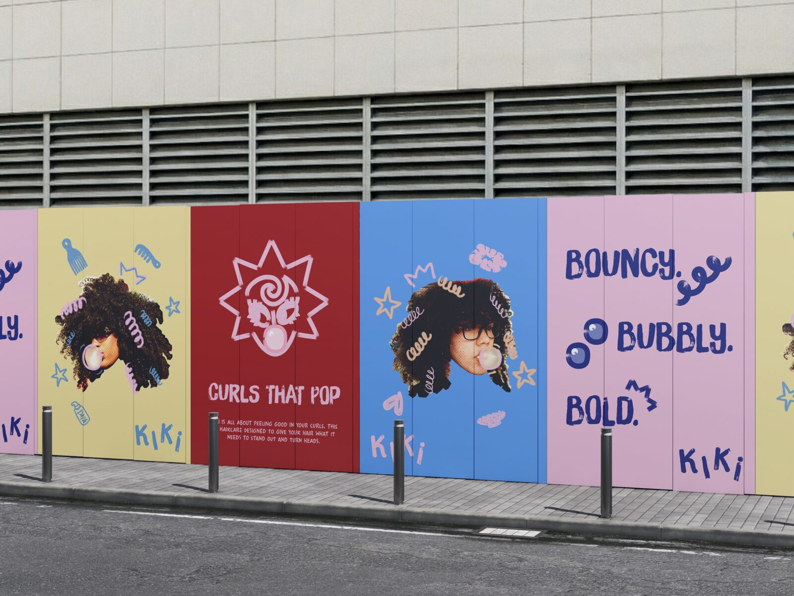
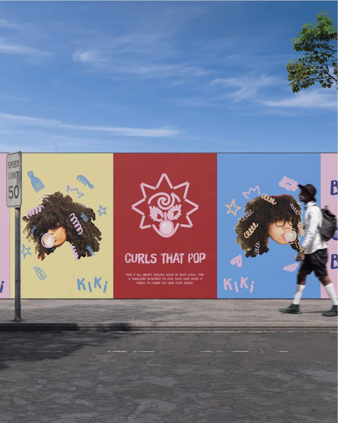
POSTER Advertisement campaign

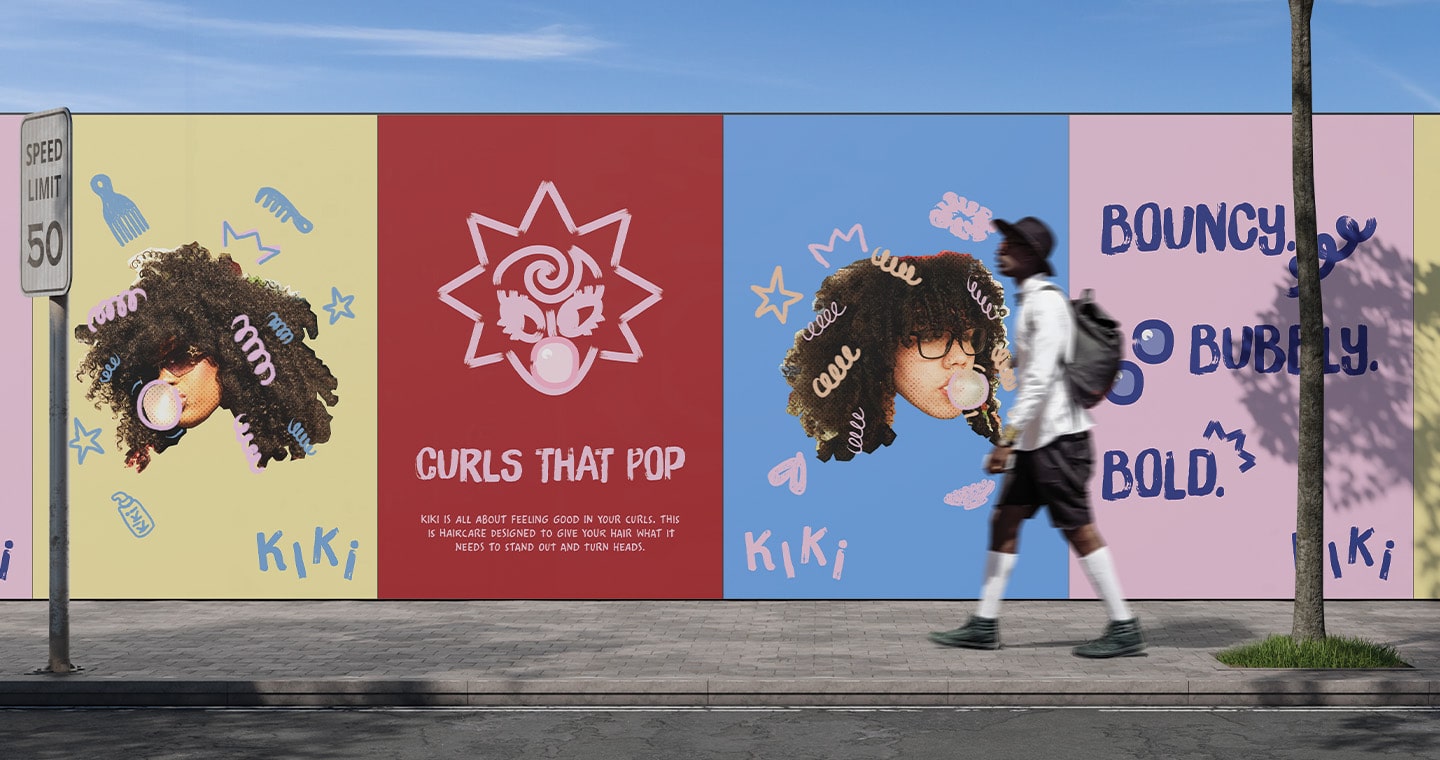
Street with 4 posters on the wall displaying Kiki's advertisement campaign.

Social media content

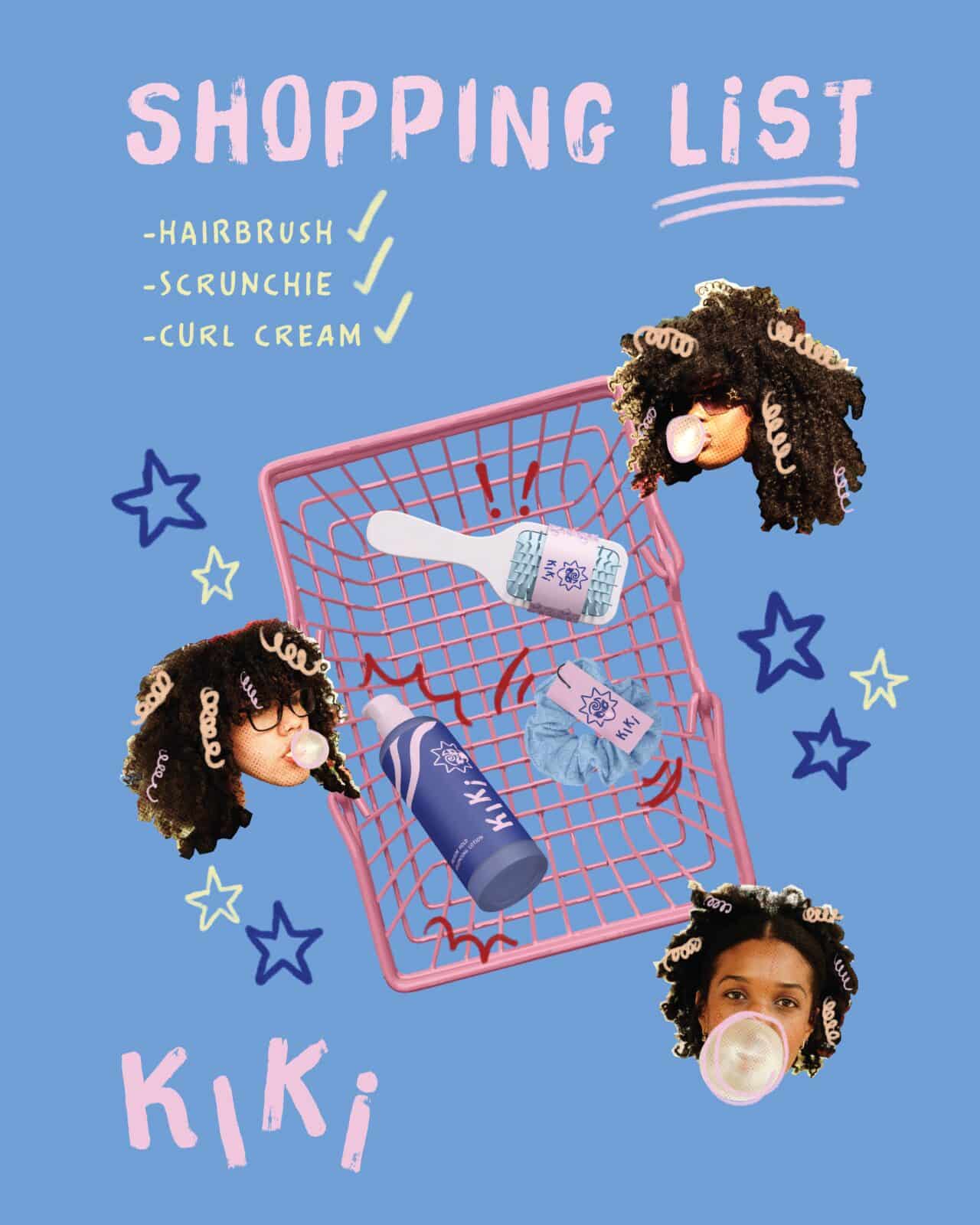
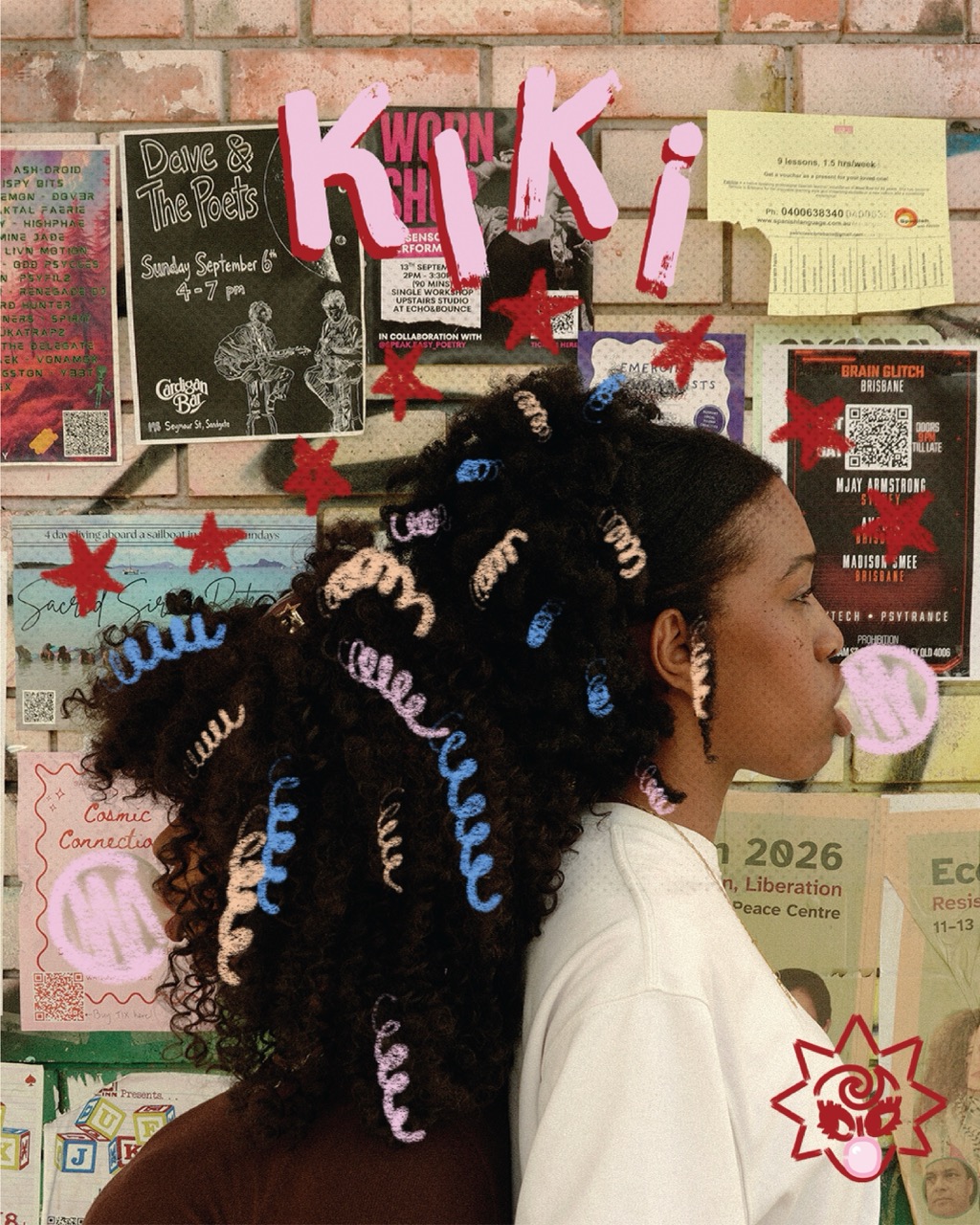
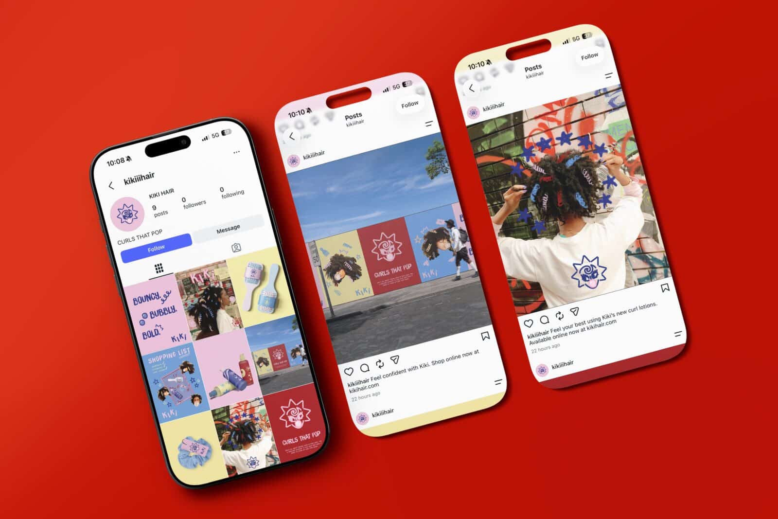
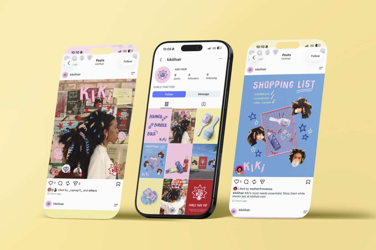
Kiki Social media grid and two posts on the sides. Illustrating a shopping list of products and an imaged with illustrations overlayed
Social media Mockup for Kiki

Project Behance

Alan Fericelli Domingo
Alan Fericelli Domingo is a Brisbane based designer whose passions for photography, illustration and collage influence his playful and colourful designs. He is dedicated to creating work that connects with audiences and brings joy. Looking ahead, Alan aspires to keep experimenting, learning and creating work that is meaningful and memorable.
Vote For This Project

"*" indicates required fields

This field is for validation purposes and should be left unchanged.
This field is hidden when viewing the form
Project