Visual Communication - Bachelor

[outsiders*: a brand identity]

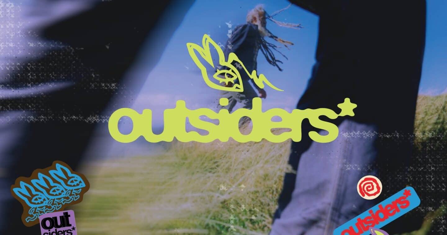
Outsiders* is a women’s outdoor adventure club and lifestyle brand that centres around the tensions between being polished and showing grit. Outsiders' identity leans into bold, experimental editorial imagery of bright, saturated colour, hand-treated illustration and confident imagery that does the talking. Rather than explaining the brand, each piece is built to be instantly recognisable from imagery alone: a single striking colour block, a bold illustrated motif, letting the visual carry the message rather than text.
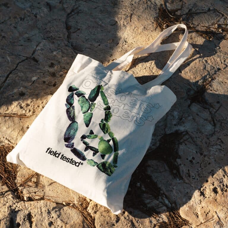
A tote bag mockup laying on a rock face with an Outsiders* brand design.

[tote bag]

The Outsiders* logo was replicated graphically with rocks and earthy textures. Each rock was strategically placed to maintain the brandmark’s playful nature. A gradient was applied, as well as a stripey half tone effect. This created a texture on the graphic that resembles vintage TV screen quality.

[sticker pack]

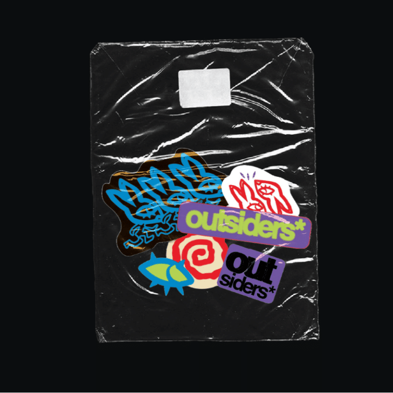
The distressed packaging contrasts with the playful graphics, bold typography and saturated colours, deliberately creating tension disorder and expression. The repeated Outsiders* branding pushes its identity, belonging and individuality, while the layered stickers evoke personal collections and subcultural aesthetics.

[event passport]

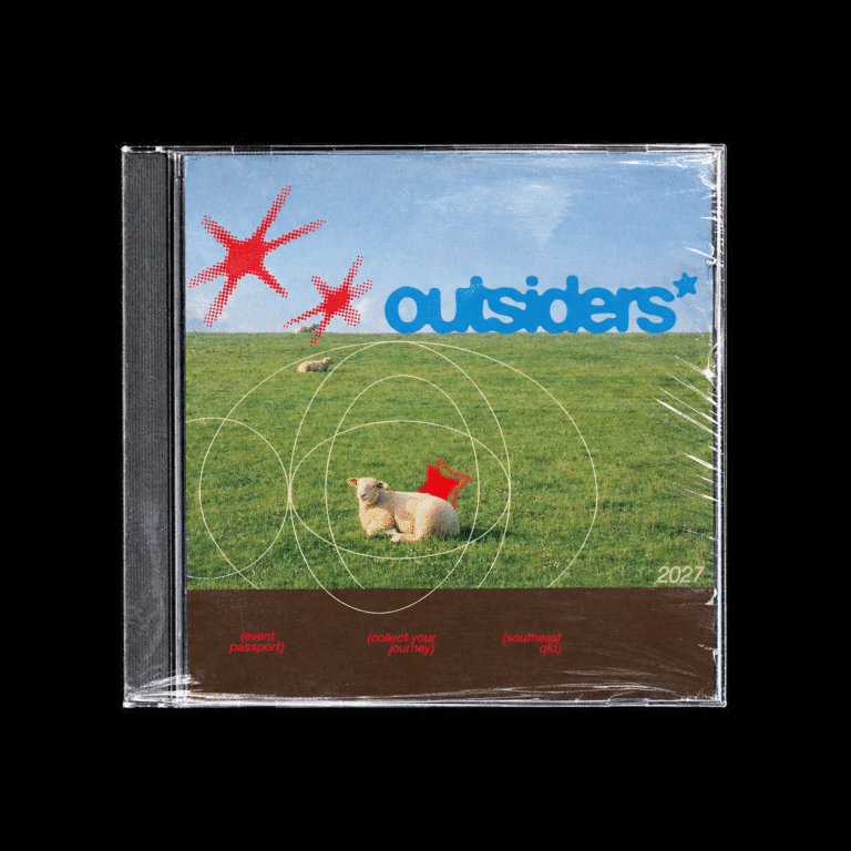
An empty CD case was chosen as the format for the Outsiders event passport because it connects the brand’s Y2K and internet inspired identity with a familiar, nostalgic object. The CD case feels playful and unexpected, while also creating a physical keepsake that members can collect and hold onto. As well as being a protective casing, this format also supports the idea of collecting experiences, with each event adding to a personal record of adventures. The event passport would open out into a booklet inside the cover. In the real world context, this would be executed with secondhand faulty CDs.

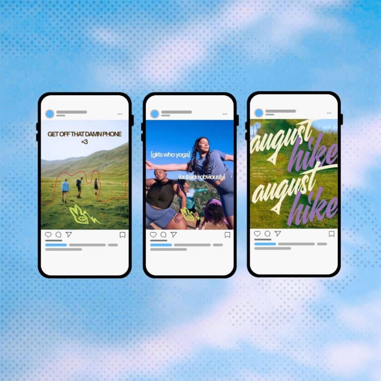
[social media tiles]

I chose bold writing and direct messaging to capture attention quickly in a social media environment where audiences scroll rapidly through content. Phrases such as “GET OFF THAT DAMN PHONE” challenge everyday habits, encouraging people to disconnect from technology and reconnect with nature. The oversized, overlapping typography in the hiking promotion adds movement and personality, making the content feel expressive rather than overly polished.

Talisa Carlton

Talisa is a 4th Year Visual Communications and Marketing student with a love for the outdoors, community, creatures and Japanese design magazines. She feels passionately about the Brisbane design scene and strives to be involved wherever and whenever she can. As a marketing major and a Junior Paid Ads Specialist, Talisa feels that she us lucky to express herself creatively on a daily basis.

Vote For This Project

"*" indicates required fields

This field is for validation purposes and should be left unchanged.
This field is hidden when viewing the form
Project