Visual Communication - Bachelor

Pandu

Pandu is an educational toy brand that combines both play and hands-on learning resources to support Mandarin Chinese-English speaking immigrant families in fostering the Chinese literacy skills of young Chinese-Australian kids.

The context behind the brand

Raising second-generation immigrant children in an English-dominant society while passing on full literate proficiency of one’s native language is a particular challenge faced by Chinese immigrant parents in Australia. While these children may grow up speaking Chinese at home, learning English as they enter kindergarten and formal schooling tends to take priority in these immigrant families due to societal pressures of assimilation, so Chinese-Australian children tend to demonstrate varying proficiencies in their bilingual language development—often with a greater proficiency in listening comprehension and limited reading and writing literacy skills.

Parents play an essential role in shaping the bilingual language development of their children, as familial learning and supportive parent engagement are factors shown to have a direct impact on their child’s initiative to continue native language learning in later years. Many Chinese immigrants and Chinese-Australian children have also expressed frustrations with their traditional classroom learning experiences, hoping for more engaging and fun study methods in learning Chinese. Pandu aims to bridge this gap with its playful, activity-based resources.

This project also draws upon my experiences as both a second-generation immigrant Chinese-Australian who studied Chinese later in life and a visual communication designer, where I was inspired to leverage play-based learning methods with visual and tactile forms of communication.

about the brand

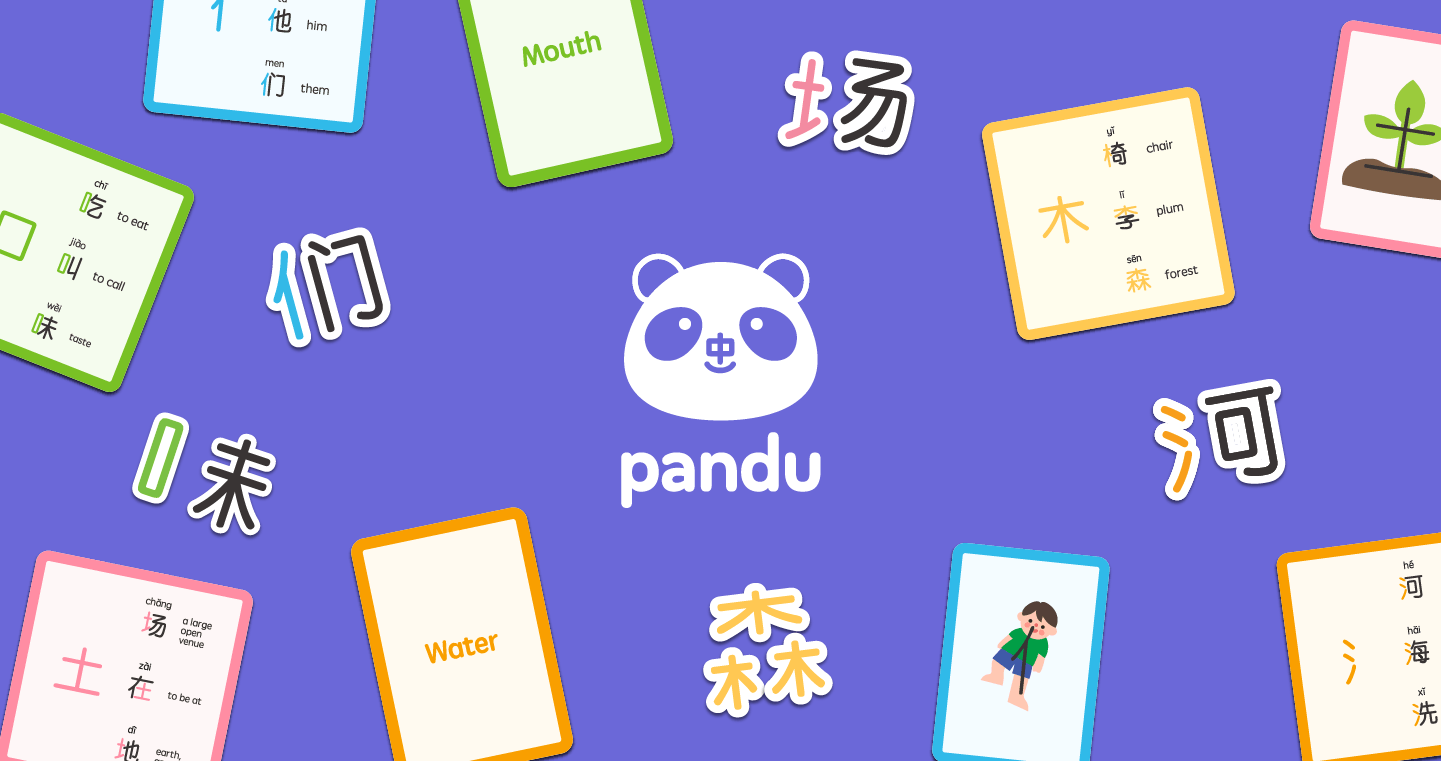
Pandu is derived from panda (China’s national animal) + dú (to read in Chinese).

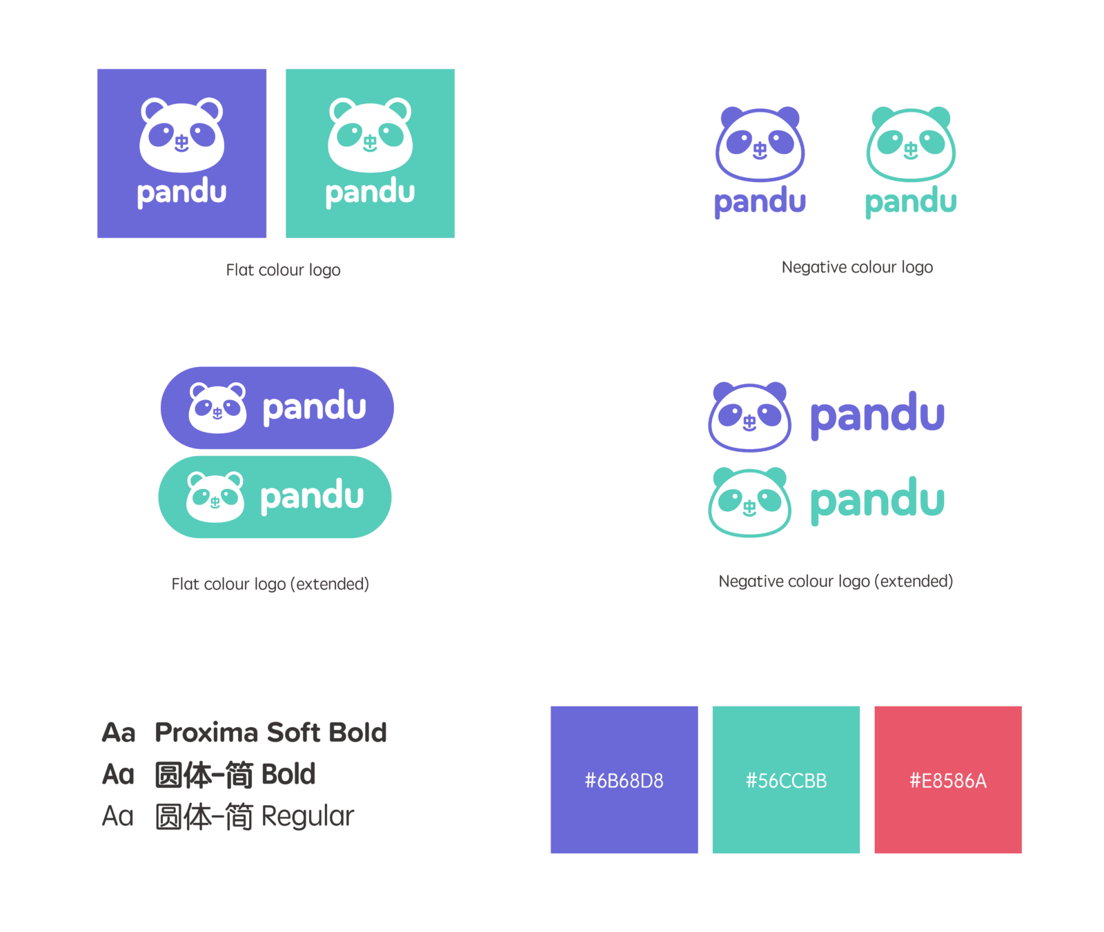
The logo’s main colours of purple and turquoise lend itself to bold hues that excite its young target audience while cultivating a calm and inspiring mood for learning, with an accent red for a small burst of energy. This inquisitive tone is supported by rounded sans-serif type and a flat vector illustration style.

The logo’s mascot features the Chinese character 中 for its nose, which refers to China as a country or culture in various contexts.

The image shows different logo variations, including: flat colour logo, negative colour, extended flat colour and extended negative colour.

The image lists the type used for the brand, including Proxima Soft Bold, 圆体-简 Bold and 圆体-简 Regular.

The brand's three main colours are purple (#6b68d8), turquoise (#56ccbb) and red (#e8586a).
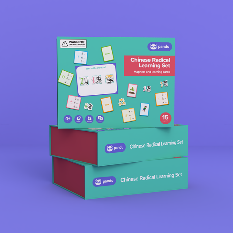
The image shows three boxes of the Chinese Radical Learning Set, where one is propped up in clear landscape orientation atop two boxes that show its spine.

Pandu: Chinese Radical Learning Set

Pandu’s Chinese Radical Learning Set is a box set that contains a bundle of physical learning materials, intended for use with parents and children to learn about five core semantic radicals.

Radicals, known as the building blocks of the Chinese language, are individual units comprised of strokes which are used to form whole characters that in turn form words. The main purpose of semantic radicals are to signal the meaning of a character.

Understanding both the function of semantic radicals and developing a morpohlogical awareness of how Chinese characters are structured is fundamental for literacy development, as Chinese readers focus on semantic representations of characters to capture different meanings.

The box set contains:
– 5 magnet sets for 5 key radicals
– 1 collapsible magnet board
– 1 set of 5 learning cards
– 2 sets of 5 memory cards

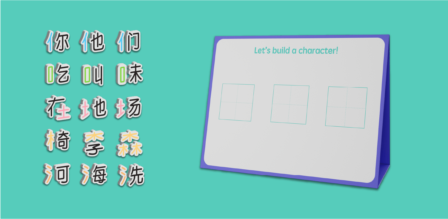
radical magnets and magnet board

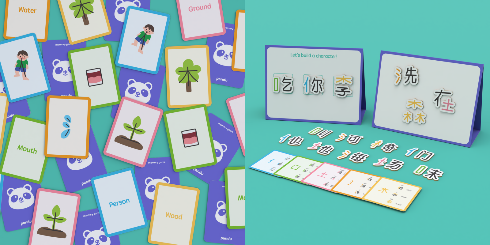
The collapsible magnet board and magnets can be used together to explore how each semantic radical is structured in example characters to give a word meaning.

image shows three rows and five columns of radical magnets on the left, and on the right shows the magnet board

learning cards and memory cards

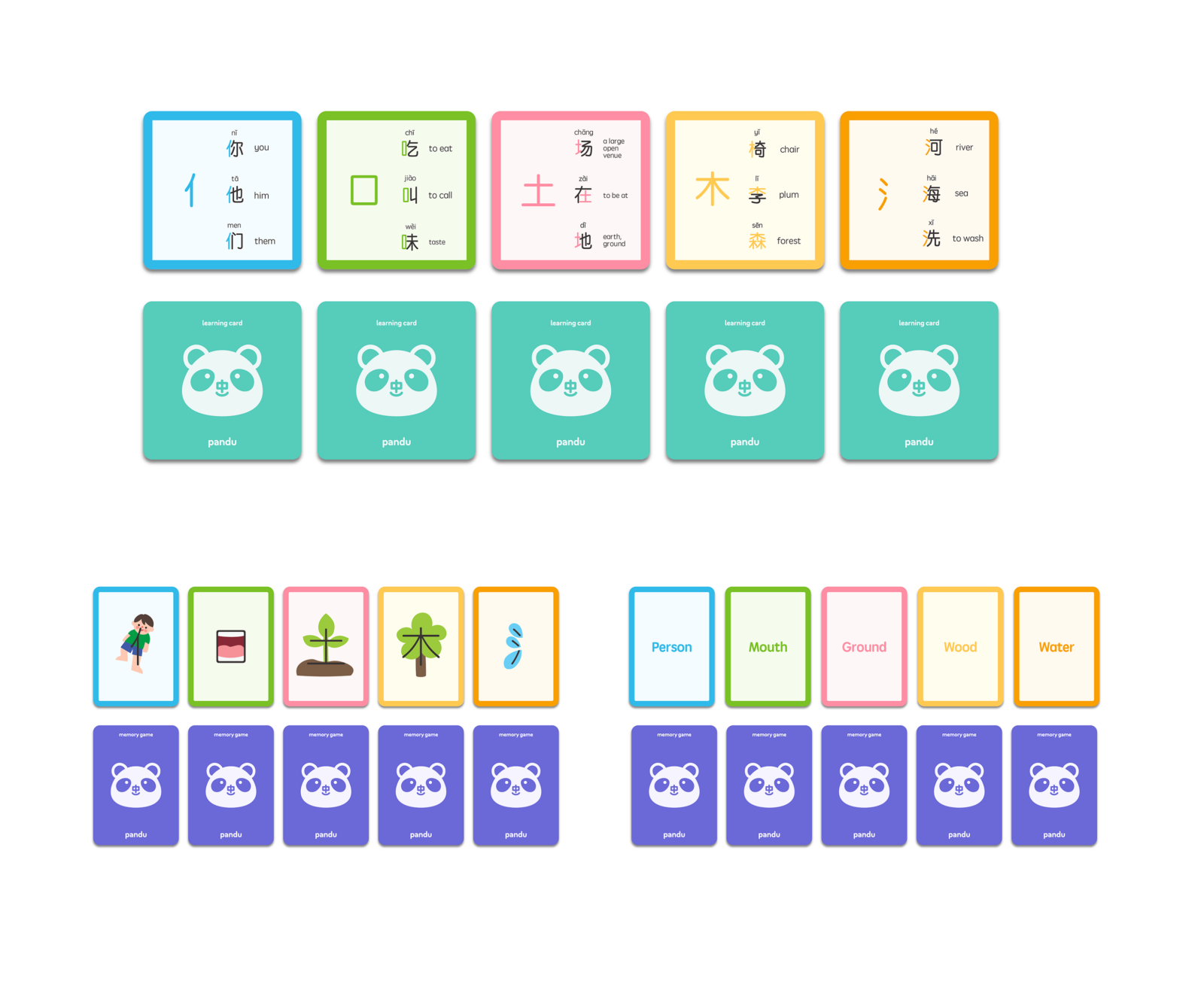
This learning is supplemented by five learning cards which demonstrate all possible magnet combinations. The box set also comes with two sets of memory cards intended for a flashcard game: one set with mnemonic illustrations, and one set with its respective radical names to help reinforce a visual distinction and understanding between different radicals.

the image shows one set of the learning cards on top, and the two sets of flash cards beneath it
the image combines two pictures: on the left is a shot of the radical flashcards scattered on the floor, and the right is a shot of the magnets in use on two magnet boards displaying the front and back, as well as the other remaining magnets and learning cards splayed out in front

Merchandise

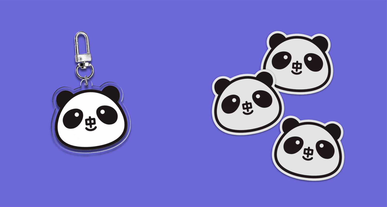
the image features the merchandise of the negative colour logo, as a keychain and as stickers

Biannca Chua

Biannca is a designer who is passionate about creative problem-solving and visual storytelling as a means of communication. Inspired by a minimalist lens and her background as a hobbyist artist, she enjoys creating thoughtful designs that balance practicality with emotional impact.

Vote For This Project

"*" indicates required fields

This field is for validation purposes and should be left unchanged.
This field is hidden when viewing the form
Project