Visual Communication - Bachelor

SILIENCE

SILIENCE is a late-night creative networking event connecting emerging creatives aged 18–30 through live music, creative conversations and immersive visuals. Centred on undiscovered talent, individuality and community, the project develops a cohesive visual identity and supporting deliverables that transform traditional networking into an authentic, relaxed and engaging shared experience.
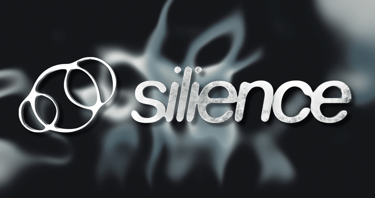
SILIENCE logo featuring a soft, abstract interconnected symbol alongside a lowercase wordmark in pale grey against a black background. The fluid shapes represent connection, creative expression and the space between individual voices.
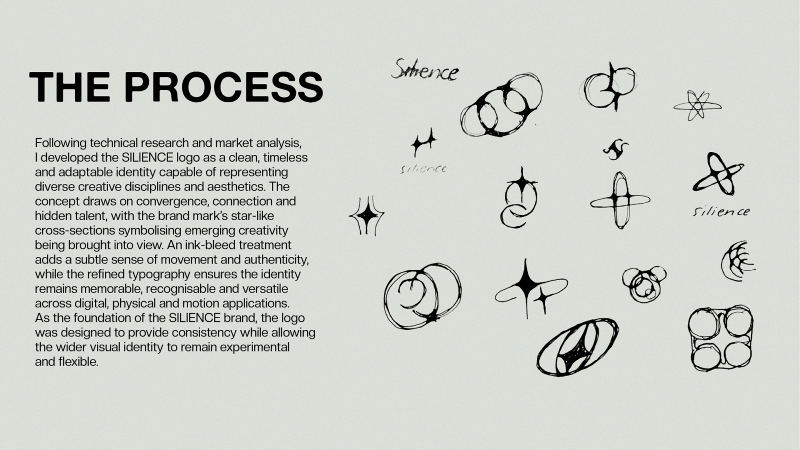
A visual documentation of the SILIENCE design process, showing research, experimentation and refinement across typography, and graphic elements.

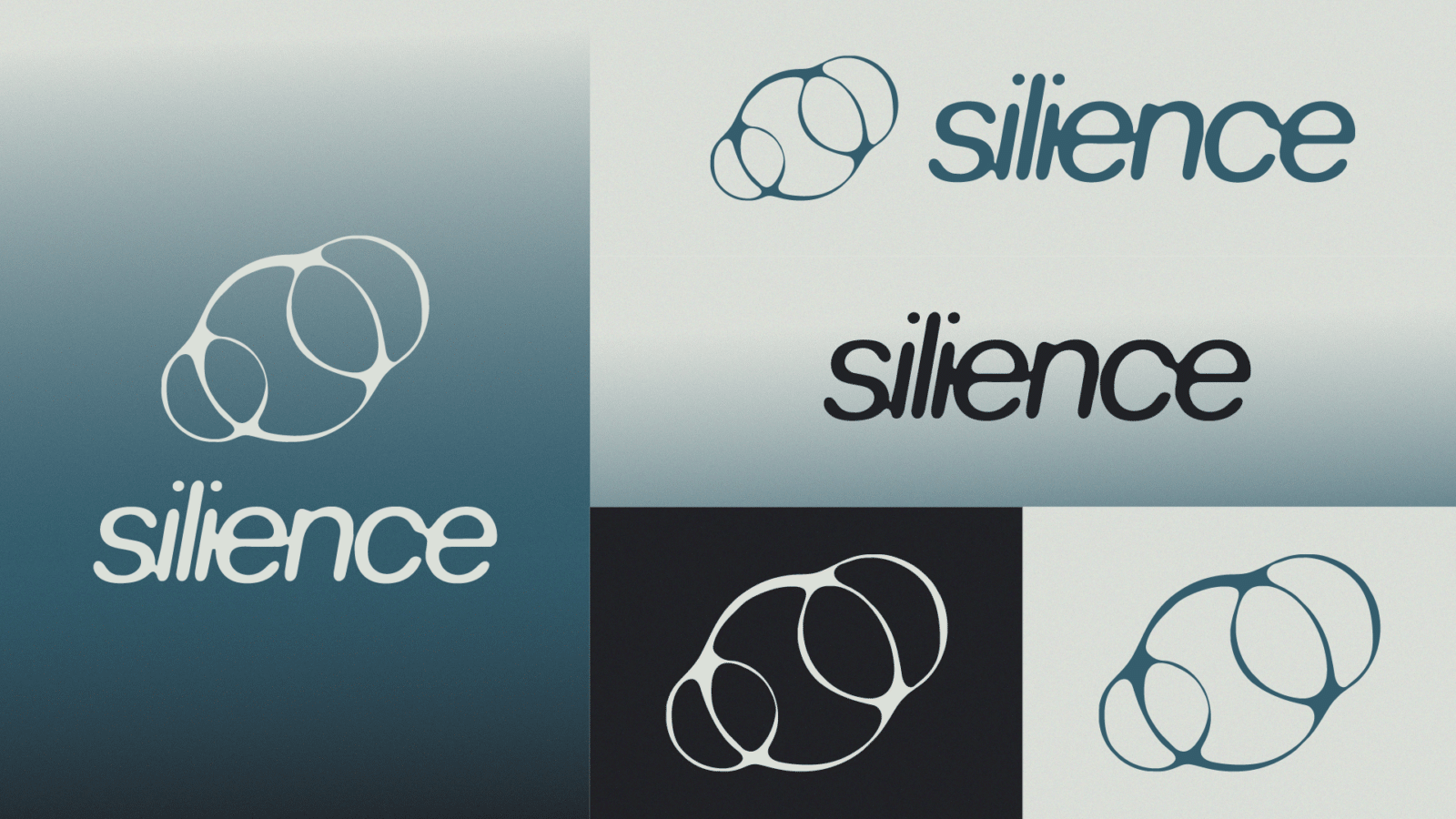
The SILIENCE logo represents the idea of connection through silence, using an abstract, interconnected symbol to represent individuals, ideas and creative disciplines coming together. Its overlapping forms reflect the moments where separate perspectives meet and create something new, while the fluid, rounded wordmark introduces a sense of movement and openness. Together, the symbol and typography balance simplicity with individuality, creating a recognisable identity that reflects the event’s focus on authentic connection and creative expression.

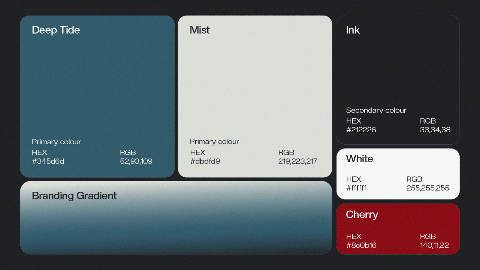
SILIENCE’s colour palette combines deep charcoal, muted blue, soft mist and pale aqua tones to create a refined, atmospheric identity. The restrained palette establishes consistency across applications, while gradients, transparency and light transitions introduce depth and allow for more expressive motion and projection visuals.

The SILIENCE colour palette combines deep charcoal, muted blue, soft mist and pale aqua to create a refined, atmospheric identity. Inspired by the immersive and experimental aesthetics of contemporary creative events, the palette establishes depth and sophistication. The restrained tones provide consistency across branding and collateral, while gradients, transparency and light transitions introduce movement and visual depth. This balance allows SILIENCE to feel contemporary and distinctive while supporting its concept of connection, stillness and creative expression.

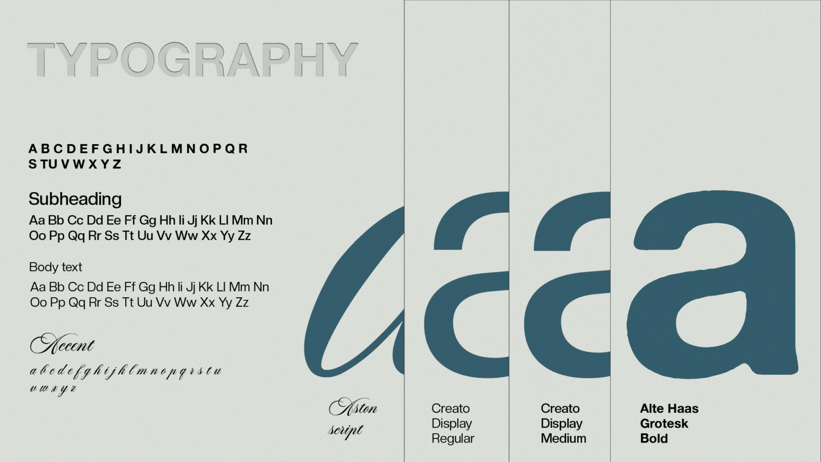
SILIENCE’s typography system combines bold, contemporary headings with clean, legible supporting text and expressive script accents. Alte Haas Display establishes a strong visual presence, while Creato Display maintains consistency and readability across applications. Aston Script introduces a more fluid, personal quality, balancing structure with creative expression across the brand identity.

The SILIENCE typography system balances contemporary sophistication with expressive individuality. Alte Haas Display Bold establishes a strong, confident hierarchy through all-caps headings, while Creato Display provides clean, legible supporting text across subheadings and body copy. Aston Script Bold introduces a fluid, expressive accent, adding personality and contrast without overwhelming the core identity. Together, the typefaces create a flexible visual system that maintains clarity across print, digital and environmental applications while reinforcing SILIENCE’s creative and experimental character.

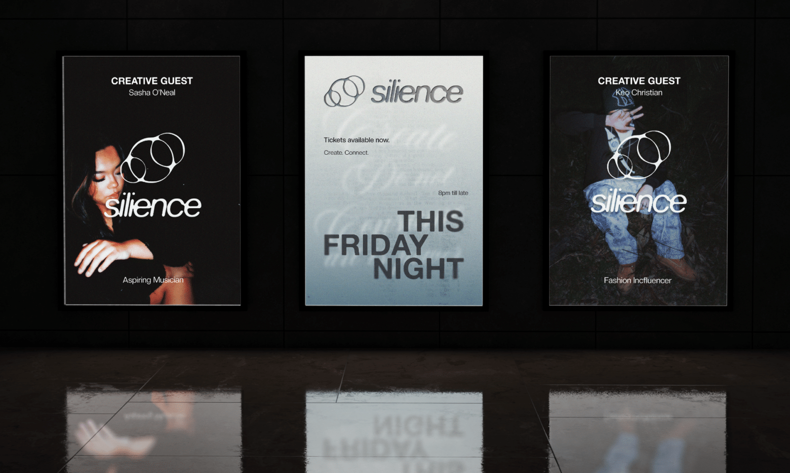
SILIENCE’s promotional posters establish a cohesive visual identity while communicating key event information and showcasing featured creative guests. The central poster highlights the event’s date, time, location and ticket availability, while the two photographic posters introduce the guests and their creative disciplines. Consistent typography, branding and atmospheric textures connect the designs while allowing each poster to serve a distinct purpose.
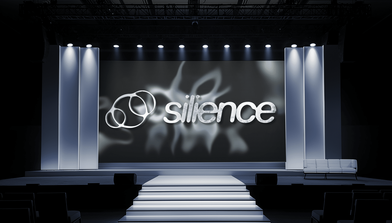
The SILIENCE stage mock-up explores how the brand identity can extend into an immersive event environment. A chrome 3D logo creates a reflective focal point against a dark, fluid gradient backdrop designed to move through subtle shifts in colour and texture. The combination of metallic forms, atmospheric lighting and motion reinforces the event’s contemporary aesthetic while transforming the visual identity into a dynamic spatial experience.

Jada Rosal

Jada is a multidisciplinary creative studying Business (Marketing) and Design (Visual Communication) at QUT. With a passion for music, visual storytelling and authentic self-expression, she explores the intersection of marketing and creativity to build meaningful brands, connect communities and create work that inspires curiosity and connection.

Vote For This Project

"*" indicates required fields

This field is for validation purposes and should be left unchanged.
This field is hidden when viewing the form
Project