Visual Communication - Bachelor

Tobikiri

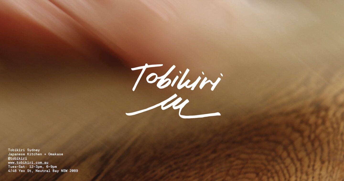
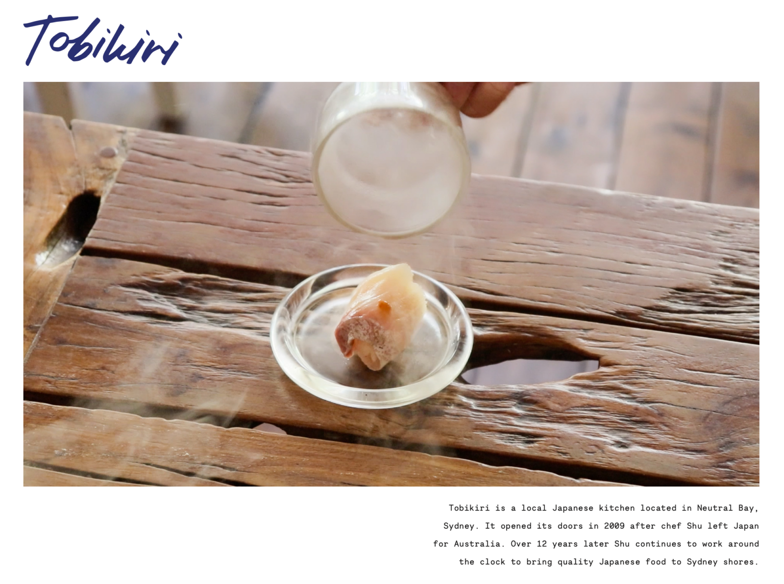
Tobikiri is your local Japanese - authentic, homely and handcrafted.
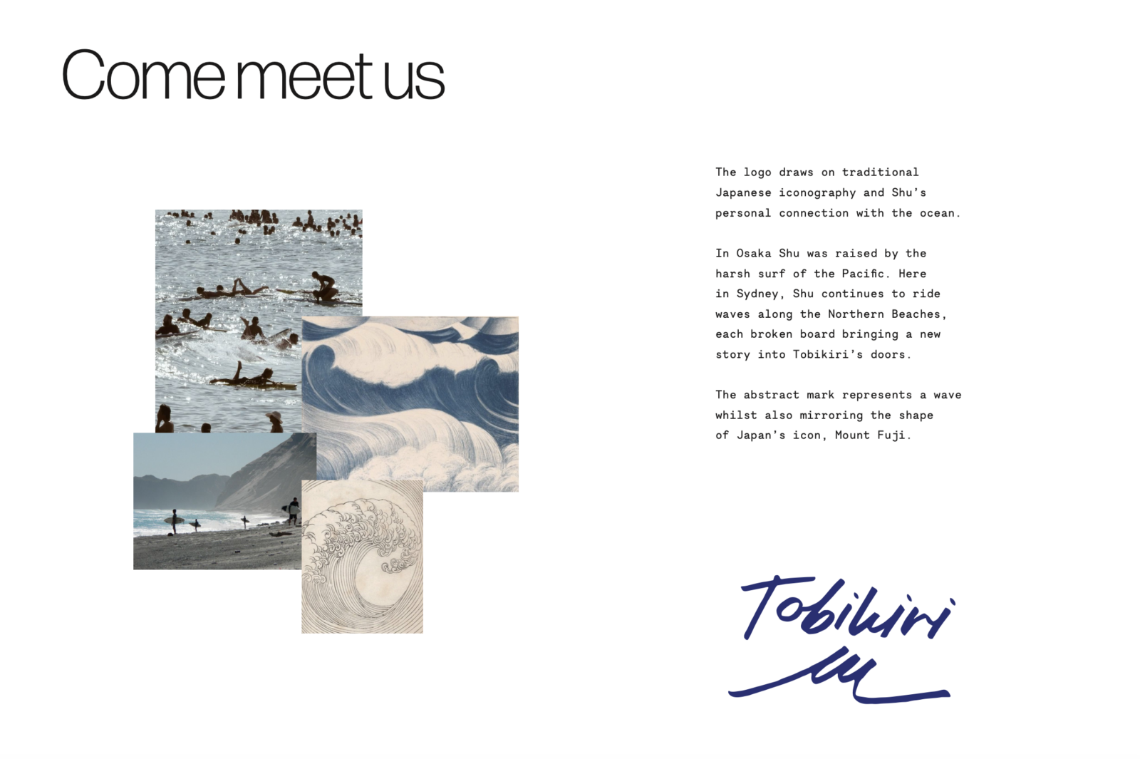
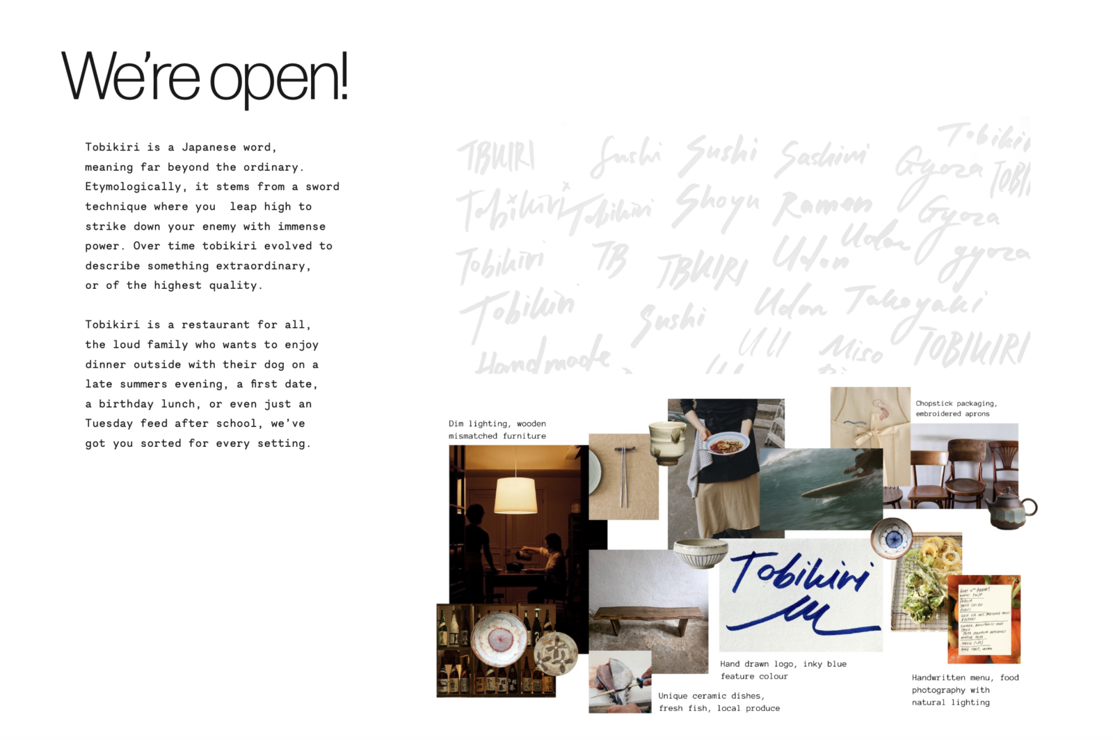
Each touchpoint is designed to elevate and compliment the food, rather than overshadow it. Inspired by Chef Shu’s bold personality and his love for the ocean, the designs make his story more accessible, allowing a wider audience to connect with his brand.
welcome

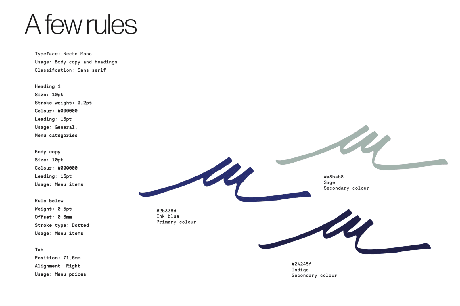
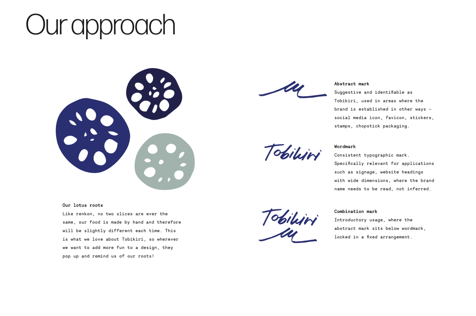
brand guidelines

menu design

Food Menu

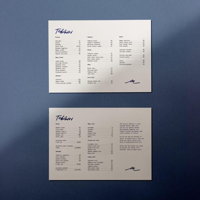
Tobikiri’s food menus have been meticulously constructed, with consideration of Japanese minimalism. Each item is communicated simply, letting Shu’s dishes speak for themselves. The food menu is familiar in its A4 size featuring no unnecessary foldouts to ensure accessibility for a wide range of hungry customers who want to navigate a menu with ease. Leader dots assist with fast scanning, communicating prices in a seamless way.

Drinks Menu

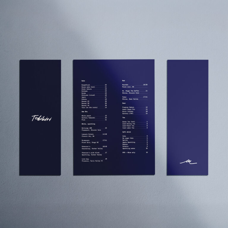
The drink menu is slightly elevated from the food menu, appealing to those interested in sake and wine to enjoy alongside their food. The dark blue hue and portrait bi-fold differentiates it from the food menu in both format and colour.

Omakase Menu

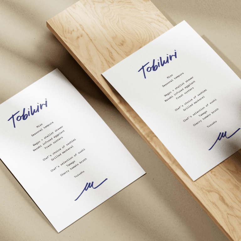
The omakase menu functions in a subtler way, as a soft indicator of Chef Shu’s menu for the day. The removal of prices and centre aligned menu items allows the design to feel more considered, reflecting the elevated and individualised experience of omakase dining practices.

business cards

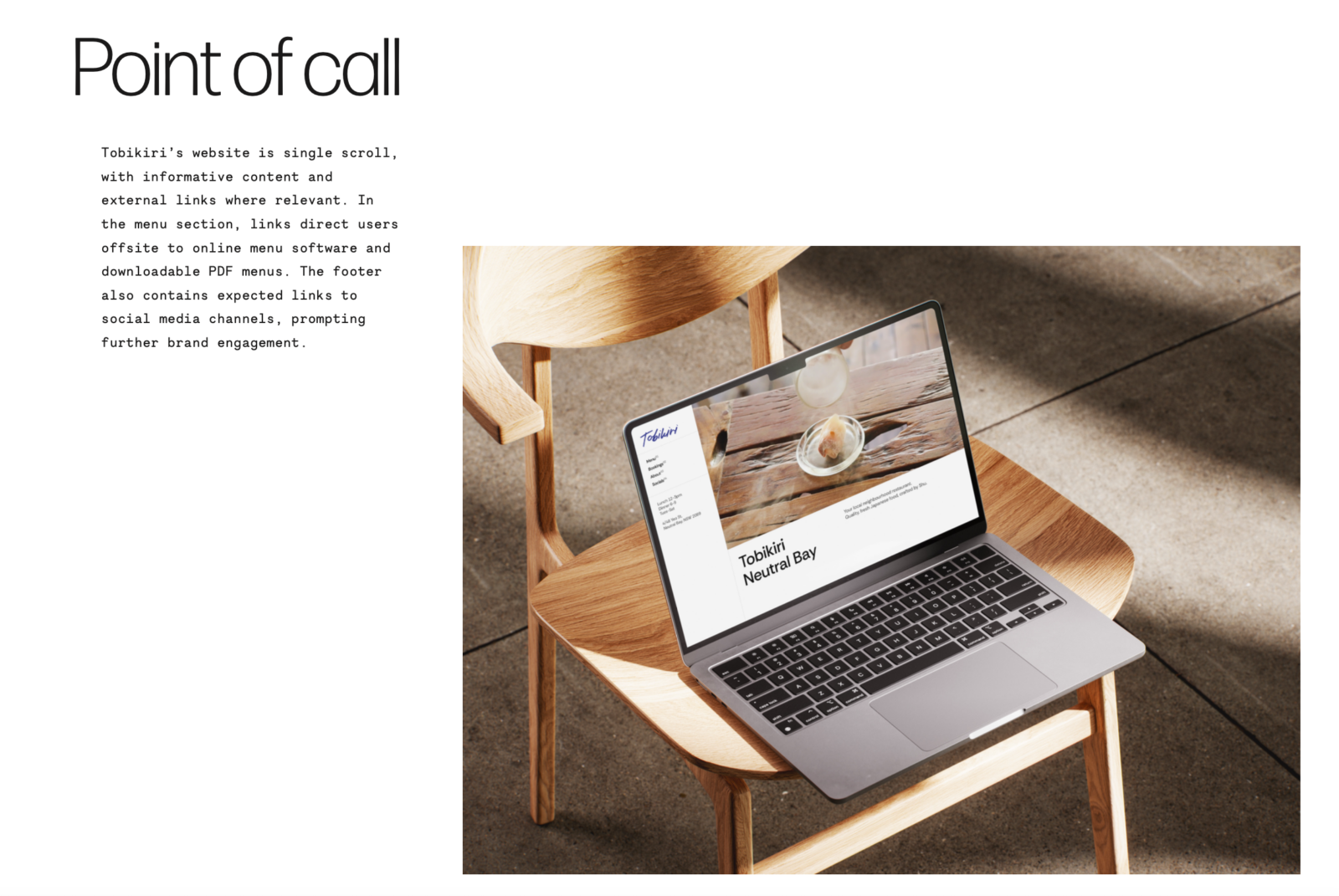
Website

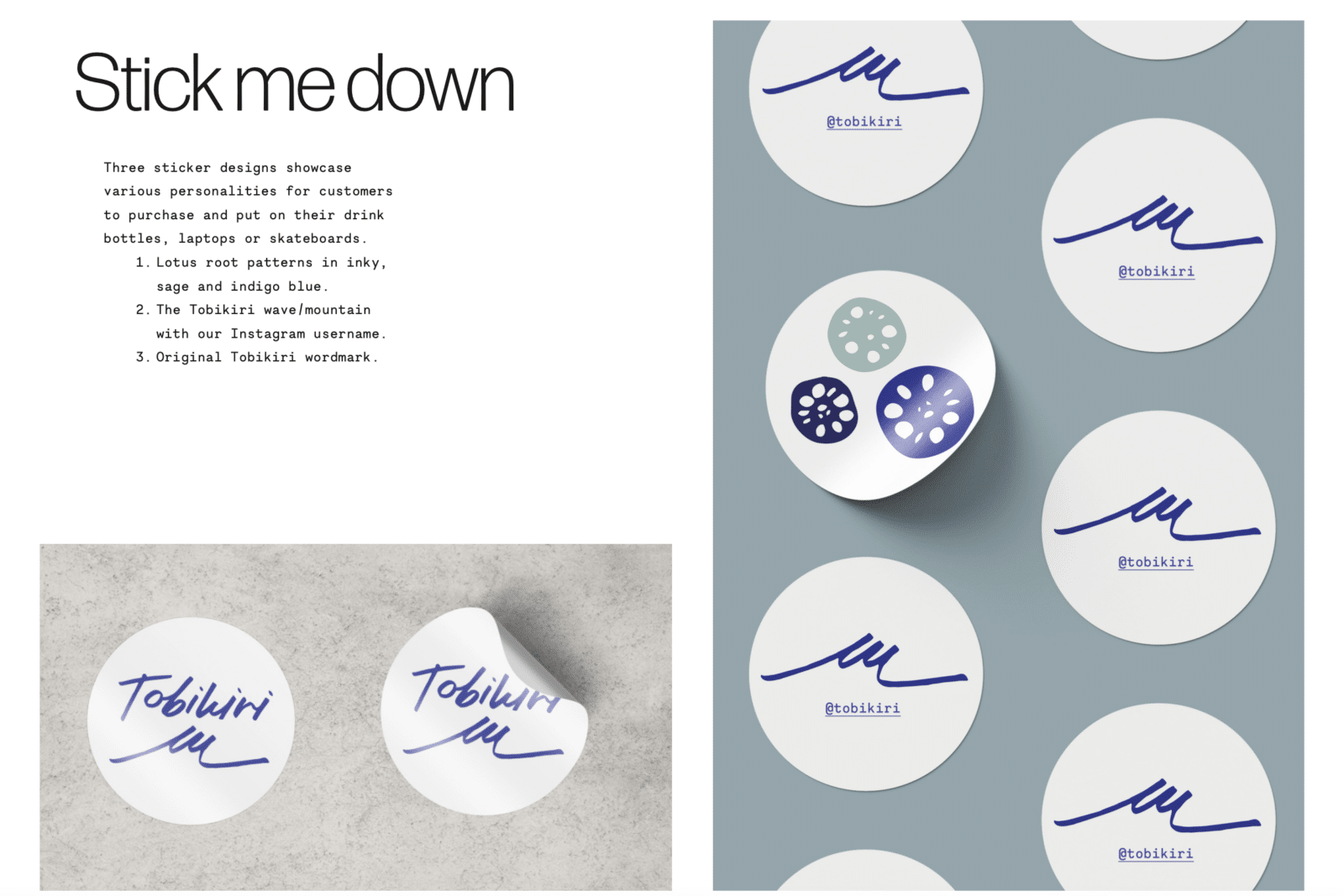
stickers

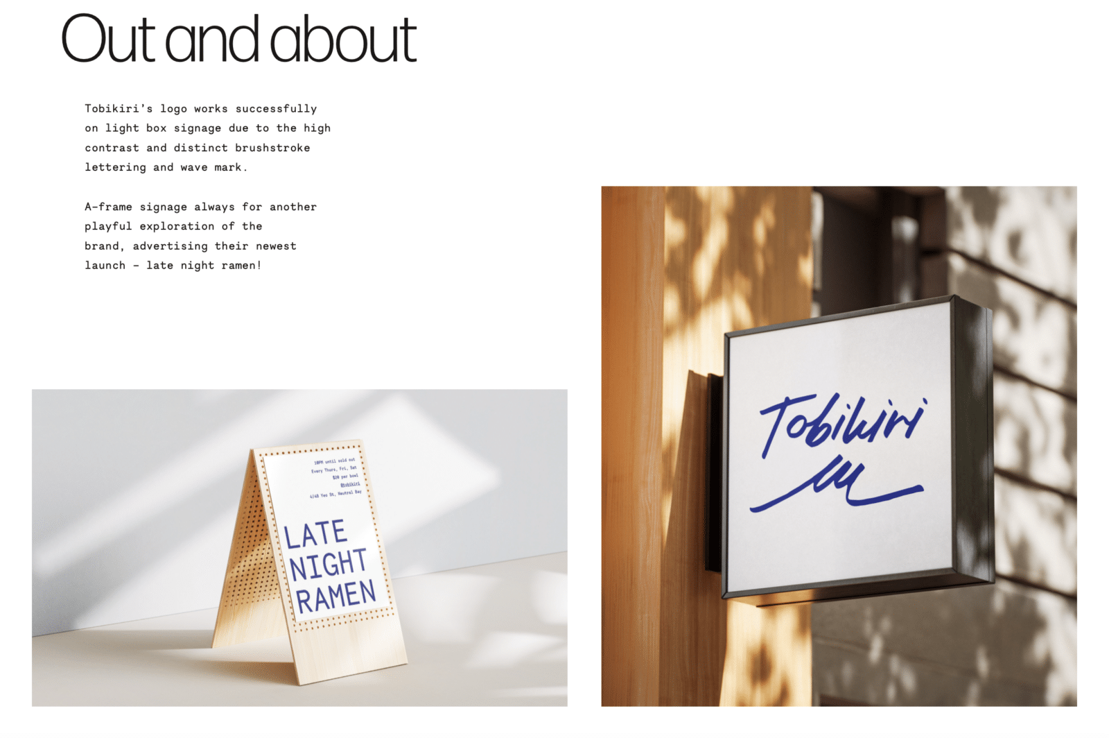
signage

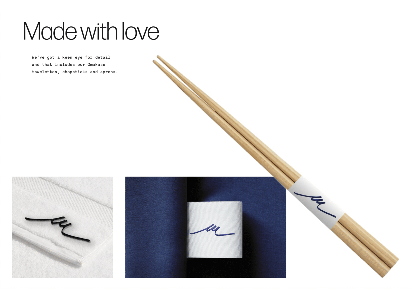
packaging + merchandise

Madeline Weale

Madeline is a proactive, hardworking designer with a strong interest in branding and creative direction. She graduates with a Bachelor of Design (Visual Communications) - International in 2026, having spent a year abroad at The University of Bristol. Shaped by life in three cities, she hopes to work overseas and specialise in hospitality design.

Vote For This Project

"*" indicates required fields

This field is for validation purposes and should be left unchanged.
This field is hidden when viewing the form
Project